


Read summarized version with
 ChatGPT
'%3e%3cpath%20fill-rule='evenodd'%20clip-rule='evenodd'%20d='M16.4875%200V6.06H18.75V14.6833H16.3042V20L10.44%2014.8383V19.9592H9.53083V14.8325L3.66%2020V14.6125H1.25V5.99H3.65333V0L9.53083%205.41167V0.158333H10.4392V5.56667L16.4875%200ZM10.44%207.53667V13.6358L15.395%2017.9975V12.0333L10.44%207.53667ZM9.52417%207.47L4.56917%2011.9683V17.9975L9.52417%2013.6358V7.47083V7.47ZM16.3042%2013.7867H17.8408V6.9575H11.2167L16.3042%2011.5742V13.7867ZM8.81917%206.88667H2.15833V13.7158H3.65833V11.5692L8.81833%206.88583L8.81917%206.88667ZM4.5625%202.06333V5.98833H8.825L4.5625%202.06333ZM15.5783%202.06333L11.3158%205.98833H15.5783V2.06333Z'%20fill='black'/%3e%3c/g%3e%3cdefs%3e%3cclipPath%20id='clip0_4212_18220'%3e%3crect%20width='20'%20height='20'%20fill='white'/%3e%3c/clipPath%3e%3c/defs%3e%3c/svg%3e) Perplexity
Perplexity'%3e%3cpath%20d='M9.996%2019.992C9.996%2018.6068%209.73182%2017.3074%209.19632%2016.0936C8.68224%2014.8798%207.96824%2013.8159%207.0686%2012.9163C6.16896%2012.0166%205.11224%2011.3098%203.89844%2010.7957C2.68464%2010.2602%201.38516%209.996%200%209.996C1.38516%209.996%202.68464%209.73896%203.89844%209.21774C5.11224%208.68224%206.1761%207.96824%207.0686%207.0686C7.96824%206.16896%208.6751%205.11224%209.19632%203.89844C9.73182%202.68464%209.996%201.38516%209.996%200C9.996%201.38516%2010.253%202.68464%2010.7743%203.89844C11.3098%205.11224%2012.0238%206.1761%2012.9234%207.0686C13.823%207.96824%2014.8798%208.68224%2016.1007%209.21774C17.3145%209.73182%2018.614%209.996%2019.9991%209.996C18.614%209.996%2017.3145%2010.2602%2016.1007%2010.7957C14.8869%2011.3098%2013.823%2012.0166%2012.9234%2012.9163C12.0238%2013.8159%2011.3098%2014.8726%2010.7743%2016.0936C10.2538%2017.327%209.98905%2018.6533%209.996%2019.992Z'%20fill='url(%23paint0_radial_4212_18233)'/%3e%3c/g%3e%3cdefs%3e%3cradialGradient%20id='paint0_radial_4212_18233'%20cx='0'%20cy='0'%20r='1'%20gradientUnits='userSpaceOnUse'%20gradientTransform='translate(-1.13275%205.96185)%20rotate(18.68)%20scale(21.2772%20170.46)'%3e%3cstop%20offset='0.07'%20stop-color='%239168C0'/%3e%3cstop%20offset='0.34'%20stop-color='%235684D1'/%3e%3cstop%20offset='0.67'%20stop-color='%231BA1E3'/%3e%3c/radialGradient%3e%3cclipPath%20id='clip0_4212_18233'%3e%3crect%20width='20'%20height='19.992'%20fill='white'/%3e%3c/clipPath%3e%3c/defs%3e%3c/svg%3e) Gemini
Gemini'%3e%3cpath%20d='M3.92888%2013.2962L7.86008%2011.0903L7.92585%2010.8981L7.86008%2010.7918H7.66782L7.01009%2010.7513L4.76369%2010.6906L2.81581%2010.6097L0.928632%2010.5085L0.453044%2010.4073L0.0078125%209.82039L0.0533475%209.52694L0.453044%209.25879L1.02476%209.30939L2.28962%209.3954L4.18692%209.52694L5.56309%209.60789L7.60204%209.82039H7.92585L7.97138%209.68884L7.86008%209.60789L7.77407%209.52694L5.811%208.19631L3.68603%206.78978L2.57295%205.98027L1.97088%205.57045L1.66731%205.18593L1.53577%204.34607L2.08219%203.74399L2.81581%203.79459L3.00301%203.84518L3.74674%204.4169L5.33541%205.64634L7.40979%207.1743L7.71335%207.42727L7.83478%207.34126L7.84996%207.28055L7.71335%207.05287L6.5851%205.01391L5.38095%202.93954L4.84465%202.07943L4.70298%201.56337C4.65239%201.35087%204.61697%201.17379%204.61697%200.956236L5.23928%200.111308L5.58332%200L6.41307%200.111308L6.76218%200.414875L7.27824%201.59373L8.11305%203.45054L9.40827%205.97521L9.78773%206.72401L9.9901%207.41715L10.066%207.62965H10.1975V7.50822L10.3038%206.08652L10.5011%204.34101L10.6934%202.09461L10.7591%201.46218L11.0728%200.703263L11.6951%200.293448L12.1808%200.526183L12.5805%201.0979L12.5249%201.46724L12.2871%203.01037L11.8216%205.42879L11.5181%207.04781H11.6951L11.8975%206.84543L12.7171%205.75765L14.0933%204.03744L14.7005%203.35441L15.4088%202.60056L15.8641%202.24134H16.7242L17.3567%203.18239L17.0733%204.15381L16.1879%205.277L15.4543%206.22818L14.4019%207.64483L13.7442%208.77814L13.8049%208.86921L13.9618%208.85403L16.3397%208.34809L17.6248%208.11536L19.1578%207.85226L19.851%208.17607L19.9269%208.50493L19.6537%209.17784L18.0144%209.5826L16.0918%209.96711L13.2282%2010.6451L13.1927%2010.6704L13.2332%2010.721L14.5234%2010.8424L15.0749%2010.8728H16.4257L18.9403%2011.06L19.598%2011.4951L19.9926%2012.0263L19.9269%2012.4311L18.915%2012.9471L17.5489%2012.6233L14.3615%2011.8644L13.2686%2011.5912H13.1168V11.6823L14.0275%2012.5727L15.6972%2014.0804L17.7867%2016.0233L17.893%2016.5039L17.6248%2016.8834L17.3415%2016.8429L15.5049%2015.4617L14.7966%2014.8394L13.1927%2013.4885H13.0865V13.6302L13.4558%2014.1715L15.4088%2017.106L15.51%2018.0066L15.3683%2018.3L14.8624%2018.4771L14.3058%2018.3759L13.1624%2016.7721L11.9835%2014.9658L11.0324%2013.3468L10.916%2013.4126L10.3544%2019.4586L10.0913%2019.7673L9.48416%2020L8.97821%2019.6155L8.71006%2018.9932L8.97821%2017.7637L9.30202%2016.1599L9.56511%2014.8849L9.80291%2013.3013L9.94457%2012.7751L9.93445%2012.7397L9.81808%2012.7549L8.62405%2014.3941L6.80771%2016.848L5.37083%2018.386L5.02679%2018.5226L4.42977%2018.214L4.48542%2017.6625L4.81935%2017.1718L6.80771%2014.642L8.0068%2013.0736L8.7809%2012.168L8.77584%2012.0364H8.7303L3.44824%2015.4667L2.50718%2015.5882L2.10242%2015.2087L2.15302%2014.5864L2.34528%2014.384L3.93394%2013.2912L3.92888%2013.2962Z'%20fill='%23D97757'/%3e%3c/g%3e%3cdefs%3e%3cclipPath%20id='clip0_4212_18270'%3e%3crect%20width='20'%20height='20'%20fill='white'/%3e%3c/clipPath%3e%3c/defs%3e%3c/svg%3e) Claude
Claude'%3e%3cpath%20d='M7.77353%2012.0388L14.278%207.23827C14.5972%207.00347%2015.0534%207.09396%2015.205%207.46044C16.0048%209.38782%2015.6469%2011.7045%2014.0559%2013.296C12.4648%2014.8862%2010.2512%2015.2348%208.22684%2014.4407L6.01614%2015.4643C9.18686%2017.631%2013.0375%2017.0949%2015.4431%2014.6885C17.3517%2012.7811%2017.9424%2010.1807%2017.3896%207.83507L17.3941%207.83956C16.5927%204.39408%2017.5906%203.01744%2019.6366%200.202196C19.6839%200.135341%2019.7332%200.0676703%2019.7821%200L17.0908%202.6901V2.68113L7.7719%2012.04M6.43072%2013.2047C4.15521%2011.0323%204.54778%207.66916%206.48861%205.72874C7.92395%204.29299%2010.2773%203.7076%2012.3307%204.56815L14.5369%203.55024C14.1398%203.26326%2013.6303%202.95507%2013.0453%202.73738C10.4045%201.65058%207.24114%202.19113%205.09403%204.3362C3.02927%206.40055%202.37948%209.57493%203.49441%2012.2838C4.32765%2014.3078%202.9616%2015.7407%201.58578%2017.185C1.097%2017.6966%200.609043%2018.2098%200.214844%2018.752L6.42787%2013.2047'%20fill='black'/%3e%3c/g%3e%3cdefs%3e%3cclipPath%20id='clip0_4212_18265'%3e%3crect%20width='20'%20height='18.752'%20fill='white'/%3e%3c/clipPath%3e%3c/defs%3e%3c/svg%3e) Grok
GrokShopify popups have become a must to:
grow email and phone number lists
reduce cart abandonment
deliver coupon codes
offer customer support
...and do much more.
But anyone who’s ever tried creating popups for Shopify would agree, engaging customers visiting the site to collect their email addresses is harder than it seems.
That’s why we’ve created this guide.
Below, you’ll find inspiring Shopify pop-up designs showcasing the best practices in converting visitors.
Go to sections:
Customize, publish, track revenue and leads
Get 150+ templates with one-click install. Syncs with your product and customer data, plus native targeting rules to show the right popup to the right customer.
No cc required • 14-day free trial • Used by 1,500+ businesses

More tips and insights for Shopify store owners:
But why use Shopify popups?
Shopify popups are one of the most effective strategies for capturing leads, promoting time-limited offers, and, improving sales.
In fact, the average conversion rate of Shopify popups is around 8%.
For example, we reviewed 500 popular Shopify stores and found that 62% of them had at least one active popup campaign:

But here's the interesting part that shows that why popups are worth implementing.
Most of the top Shopify stores we've seen used popups not only for email capture but for a wide range of strategic goals like:
announcing product launches
offering exclusive discounts to returning visitors
reducing cart abandonment with timely reminders
promoting limited-time sales
showing upsell offers
In other words, popups aren’t just about growing your email and phone number list—they’re about guiding the onsite customer journey in real time, with context-aware messaging that drives action.

Use popups. They work! By not doing any popups on your website, you are leaving money on the table. Because those 98% of visitors that didn’t buy today left without leaving their email or phone.
VP of eCommerce, Overstockart
Shopify popup playbook
This playbook breaks down the highest-performing upsell popup campaigns we see Shopify stores using today. Click them to see how they work.

Welcome Offer
Turn new visitors into subscribers with an instant discount + social proof

Shopping Suggestions
Personalized recommendations displayed on product pages

AI-Powered Cart Recovery
Predict cart abandonment before it happens with AI to maximize recovery
1. L'Atelier d'Amaya
This example shows how a jewelry business promotes a special time-sensitive offer: free delivery on children collections. What's really great for conversions here is that the popup allows for one-click copying of the promo code.
The campaign is beautifully made to reflect the branding, contains the essential terms of the deal, and contains a link to the items eligible for the promo.
This campaign was also a part of a successful onsite engagement strategy that generated 20% of the store's revenue.

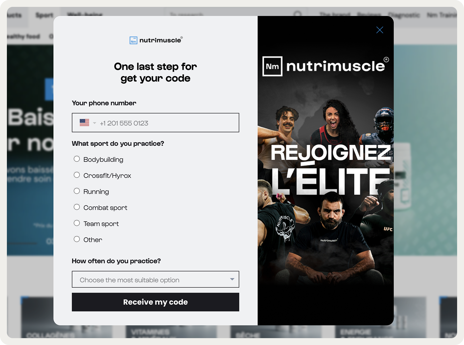
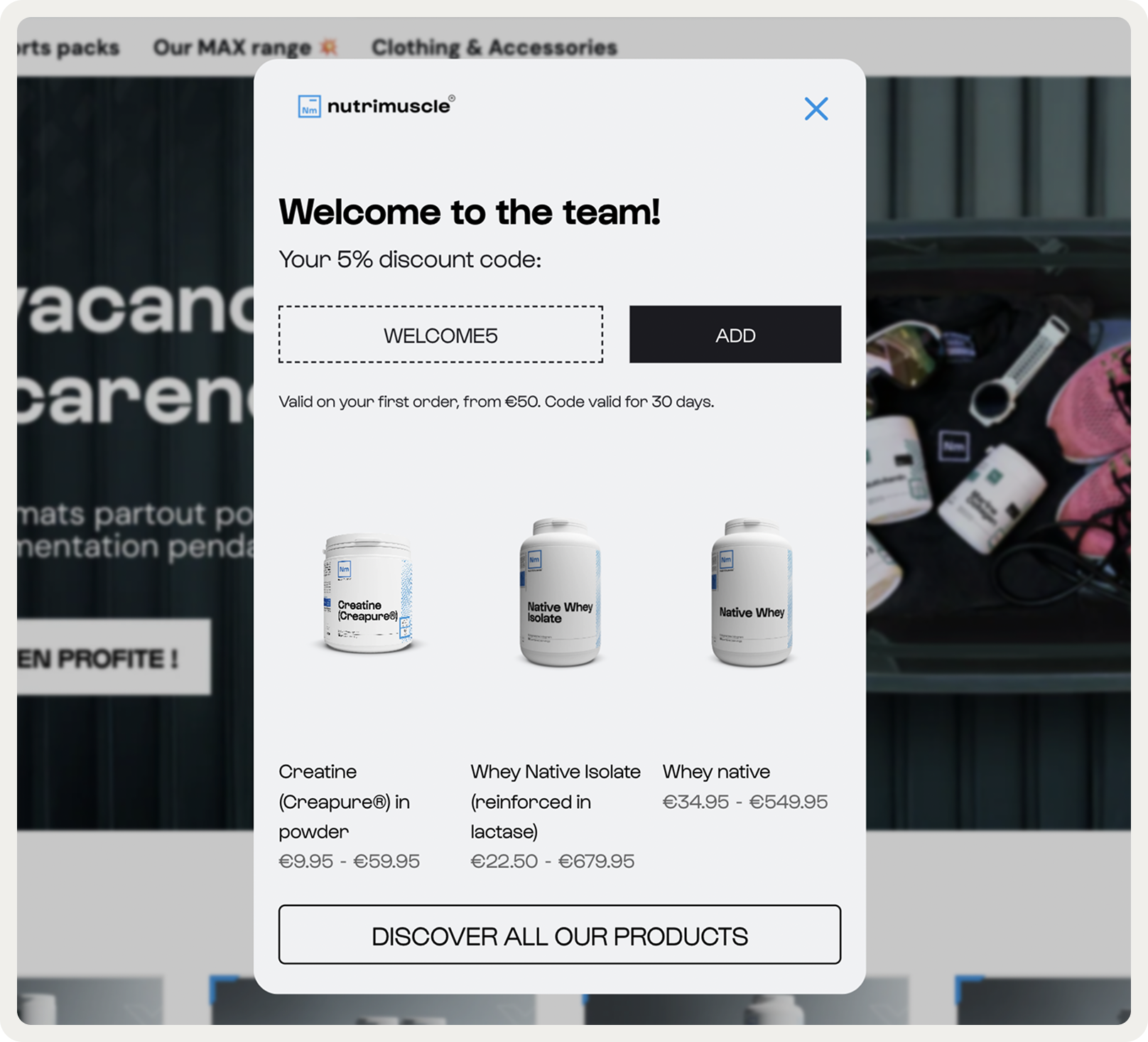
2. Nutrimuscle
This Shopify popup combines a welcome discount for new visitors and product recommendations to increase first-time orders. This is not just a popup, it's a welcome workflow that allows to build an engaged email list and generate sales.
In fact, this Shopify campaign achieved an average signup rate of 4.1% and captured over 7,000 emails and 3,000 phone numbers within one year.
Let's see this campaign in action:
Step one collects the visitor's email address:

Step two captured the phone number, type of sport practiced by the visitor, and the frequency of activity:
Step three had a discount code is displayed directly in the campaign and allowed to apply it to the cart upon click.
Note that there are three product recommendations to encourage browsing right away:
3. OddBalls
This is a creative example of a Shopify popup design that gets attention—exactly what you'd want for a sale promotion campaign.
It's got a great image, conveys the message well, and makes it easy to go to the products on sale.

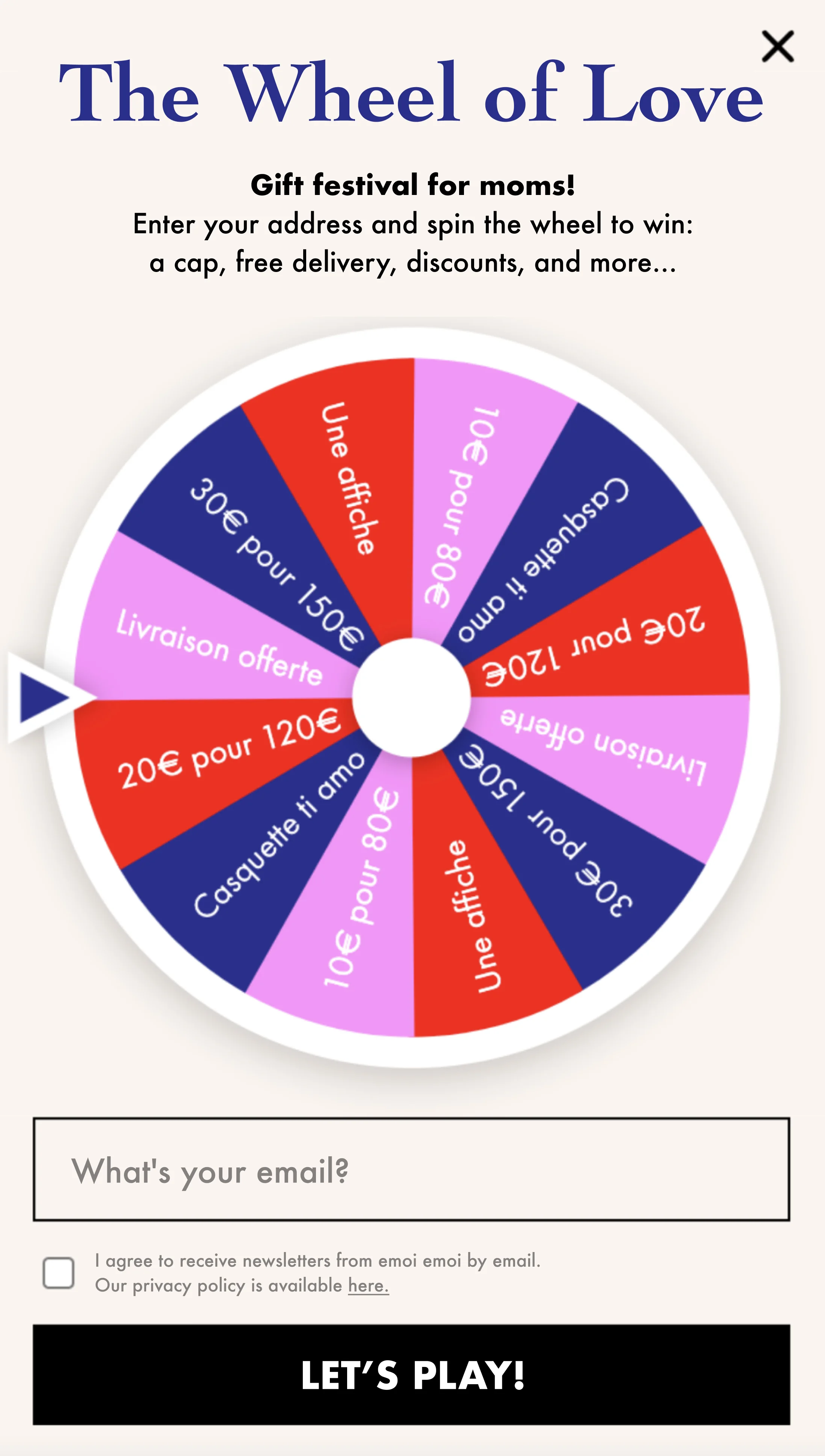
4. émoi émoi
This Shopify popup form campaign shows how to use a special occasion to collect more emails in a fun, engaging way.
In fact, this spin-to-win popup captured over 8,000 new emails in just 30 days.
5. Nkuku
This Shopify popup contains a lot of great elements:
Visible headline that states the reward
Short sentence with incentive description
Overlay effect to make visitors focus on the popup
Plus, it’s a simple traditional layout; with the right website pop-up software, anyone can design this kind of Shopify popup.

6. Intelligentsia
This Shopify popup design is made to collect both emails and phone numbers.
A few elements got our attention:
The popup mentions a convincing reason to join the newsletter
The brand states the terms and conditions of the subscription, which is essential for trust
An awesome colorful image featuring a few products

7. The Frankie Shop
Does your Shopify popup need visuals?
Well, this example proves that’s not always the case. The colors are black and white, they contrast with the background, and match the website color theme. Plus, as it doesn’t include any pictures, loads super fast.
Not only is their design eye-catching, but their ecommerce copy also conveys all the potential benefits of subscribing to the newsletter.
If I ever publish a book about email popups on fashion websites, I will consider picking this one for the cover.

8. Aime
This campaign uses gamification with "THE GAME OF THE SUMMER" and mystery card selection to create engagement beyond typical discount offers. The playful imagery and "DRAW A CARD" CTA creates an interactive experience that feels like winning rather than subscribing.

The second screen delivers immediate gratification with "BRAVO!" and a reward.
The multiple-step popup approach likely increases Shopify conversions by turning discount distribution into an engaging game rather than a standard newsletter popup.
This popup was also a part of an effective strategy that captured over 20,000 emails in one year.

9. Pierre Hardy
Another great example of how fashion brands on Shopify use popups that feel elegant and comply with branding guidelines.
This popup blends seamlessly into the site’s aesthetic—minimalist design, refined typography, and a black-and-white color palette that mirrors the luxury feel of the brand.

10. Blume
This Shopify popup converts 5% of visitors on Blume. It's simple yet good-looking, and fits the website perfectly.
The strongest point of this campaign is the popup message: it packs enough perks (a promo code, free returns, and free shipping) to consider signing up.

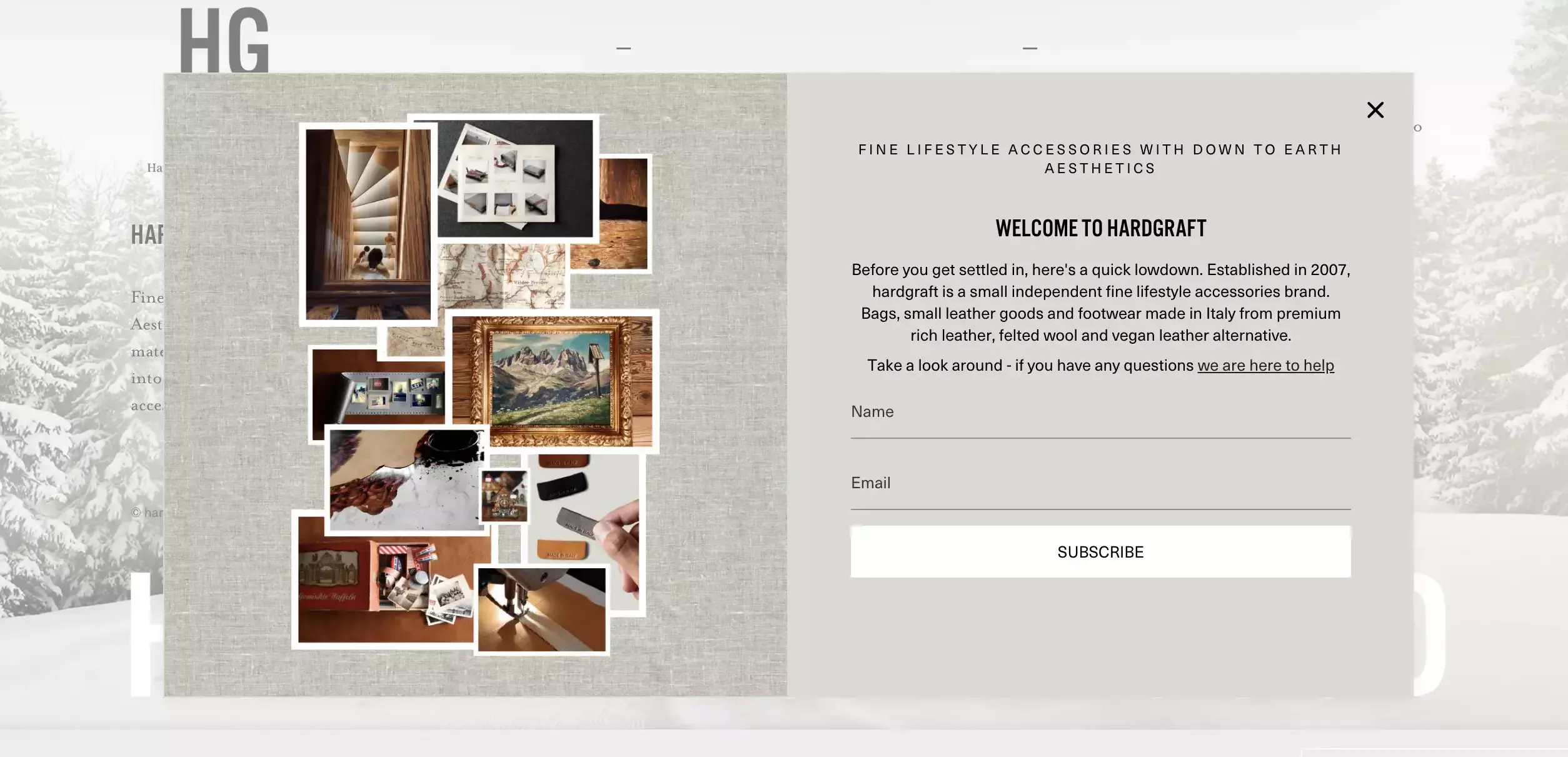
11. Hardgraft
This is one of the best Shopify popup form examples if you're looking for something that feels like a natural extension of the brand.
It goes beyond simple lead generation—doubling as a brand introduction and offering a direct way to connect through the support link:
12. Asphalte
After focusing on design and wording, let’s focus on the format. Asphalte, a Shopify store that converts 4,000 leads with popups, chose a full-screen campaign to drive visitors to the product survey.
While full-screen popup campaigns are often seen as intrusive, you can you can flip that perception if the content feels genuinely valuable. In this case, the campaign invites us to help shape the next collection—a message that empowers the visitors rather than interrupting them.

13. CODAGE Paris
Another simple yet good-looking Shopify popup campaign. It's made by using just two elements: a background image and a quick text.
It's a good one to keep in mind if you want to let all your store visitors about a limited-time offer.

14. Stumptown Coffee Roasters
This exit-intent campaign uses a true-and-tested scarcity technique by telling the visitors that the products they just viewed are in high demand.
This marketing technique, although may not be incredibly effective at first, is surely worth A/B testing!

15. Only Natural Pet
Two things make this example stand out from the rest.
The first one is the countdown timer. It's a way to use another tested technique in marketing—a sense of urgency—and convince the visitor to stay.
The second one are product recommendations. Popups are a common channel to share product recommendations on Shopify websites, including AI-generated ones.

16. Rouje
This campaign balances aspirational lifestyle photography with conversion elements. The split-screen design showcases the brand aesthetic while the right side focuses on capture: clear 10% discount, email input field, and CTA button create a streamlined conversion path.
The key differentiator is the preference checkboxes for Fashion and Beauty content, allowing customers to self-segment their interests. This personalization approach likely increases engagement and reduces unsubscribes.

This popup also has a second step where Rouje collects phone numbers and date of birth. That's an effective way to get useful info for marketing.

17. Soi Paris
This popup excels through design consistency—the desert setting and blue checkered dress mirror the lifestyle imagery, creating brand immersion.
The left side focuses on conversion with nice "-10%" typography, clear value, and streamlined email capture with a confident "TAKING ADVANTAGE" CTA.
The popup converts well by removing friction and decision fatigue—no additional choices or complex forms, just email for immediate 10% off.

18. Tula
This mobile Shopify popup example comes from Tula, an online skin care store. Using a pink background, they made this small campaign super visible. And from a visitor’s standpoint, the offer they included is irresistible!

19. Good American
Good American is one of the best performing Shopify stores worldwide. And their Shopify popup is an excellent example of good design. It takes a reasonable amount of screen estate, its message is short and clear, and its black background makes it unmissable.

20. A.P.C.
This brand prioritizes relationship building over immediate conversion by requesting feedback instead of pushing discounts.
While it won't generate immediate revenue, this approach builds brand trust with A.P.C's customer base and provides actionable data to optimize the overall shopping experience and reduce future exit rates.

Shopify popup best practices
Popups don’t always enjoy a great reputation. Many visitors complain about how popups disturb their shopping experience. You can prevent it though, and still deliver successful Shopify popup campaigns if you follow these simple rules.
I've also added links to helpful resources to show you how you can implement these practices using popup software for Shopify.
Make your campaigns contextual
Use campaign targeting options such as page visited, exit intent, number of visits, etc. to make your offers more personalized—this can be done in a few clicks in popup software.
Learn more: page targeting

Sync your Shopify store data with your popup app to personalize offers
This way, you can create offers based on triggers like the date of the last order, the number of previous orders, etc. To do that, your popup app needs to have native Shopify campaign display rules (also called Shopify properties).
For example, the settings below are for a campaign displayed to a registered customer who have not bought anything in 30 days.
Learn more: Shopify display rules

Delay your popup (by seconds or number of visited pages)
Your offer doesn’t have to appear the moment someone lands on the site. Give them time to browse around and learn more about your brand and products.
In fact, great campaigns target visitors who have engaged with products or visited at least two pages (this popup timing guide will help).

Match the offer to a specific target customer segment for personalization
Launching a popup to target all visitors is a surefire way to low conversions. Choose new/returning, paid/organic, email campaign, direct visitors, etc. to make your campaigns feel more personalized.
Learn more: audience targeting

Apply your branding
Your brand's color palette, a unique font, product images—these will make your Shopify popups look like a natural extension of your store.
Learn more: guide to designing popups

Want to know how add a popup window on Shopify right now?
Consider these:

Common mistakes to avoid with Shopify popups
Showing campaigns on every page makes your site feel spammy; add delays or teaser tabs
Not segmenting your audience means everyone sees the same offer; customize by visitor type, traffic source, or visited pages
Showing popups too early annoys visitors; wait for scroll or specific time on page
Ignoring mobile design makes popups hard to use; choose mobile-friendly formats
Running only one campaign wastes chances; try welcome campaigns, exit intent cart recovery, product promotion, AI product recommendations, or seasonal offers
Not A/B testing campaigns often leads to abandoning this strategy or poor results; Fact: A/B testing improves conversions by 38% in popups
Summary
Want to supercharge your Shopify store with popups, too?
Give Wisepops a try. We’re Shopify’s top-rated popup app (5 stars). And you can test us risk-free: we offer a 14-day free trial and don’t ask for your credit card.
Get started
in minutes
Start converting more visitors today.
Get started in minutes and see results right after.