Discount Popup: 8 Examples & Best Practices [+How to Create]
Read summarized version with
There are many ways to share discounts…
Yet, a discount popup is the second most popular channel in ecommerce:


Here’s why: discount popups have an unmatched ability to focus visitors’ attention on marketing offers. That’s essential for motivating them to become customers.
But it’s not just about invading the screen and getting attention. Discount popups can be a versatile tool for converting traffic with sales promos of your choice.
Here, you’ll learn how to use discount popups the right way.
Click to go to sections:
Set up professional discount popups in 30 minutes
Use 150+ ready-made templates and AI recommendations to personalize offers for your visitors. Connect your unique Shopify discounts easily.


What’s a discount popup?
A discount popup is a popup window whose goal is to convince website visitors to convert (signup for a newsletter or make a purchase) by giving them a discount or a coupon. Over 60% of ecommerce businesses use discount popups to motivate visitors to make purchases.
With discounts being one of the top reasons for buying online, many ecommerce stores rely on promotion popups to get sales with this incentive. Discount popups are a great tool here because they grab and focus the attention of visitors.

Original study of 500 stores: The State of Visitor Engagement on Shopify
How many Shopify businesses use discounts
The most popular discount sizes they use
How they share discounts and coupons
Discount popup playbook
This playbook breaks down the highest-performing discount popup campaigns we see online brands using today. Click them to see how they work.

Countdown Offer
Boost engagement with a countdown popup that creates urgency and excitement

Discount Survey
Engage users with a survey that offers a discount as a reward

AI-Powered Cart Recovery
Predict cart abandonment before it happens with AI to maximize recovery
Why discount popups are a effective strategy for increasing conversions
Everybody loves to save.
Discounts are a tried-and-tested way to get window shoppers thinking about buying. But it’s not just the anecdotal evidence we rely on: ecommerce research gives us these insights into what customers think.


These findings mean that discount popups can:
Increase your sales

Help you get new customers faster

Improve customer satisfaction with shopping

So, the takeaway here is—
Offering discounts with popups encourages customers to buy and, because of the savings, many of them will even be likely to spend a bit more (because they believe they’re getting a great deal).
Now, let’s see how successful businesses sell with discount popups.
Case study
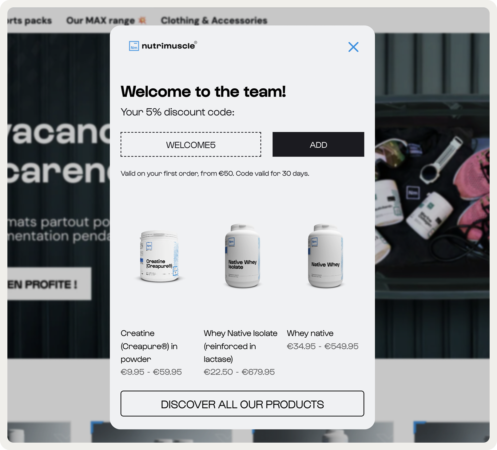
See a discount popup strategy that helped increase average order value with a welcome offer:

Discount popup examples
We’ll take a look at these examples of discount popups:
Email subscription discount popup
“Buy one, get one free” popup
Discount popup with segmentation form
Minimum purchase discount popup
Gamified (spin the wheel) discount popup
Free shipping popup
Product category discount popup
Customer referral discount popup
1. Email subscription discount popup
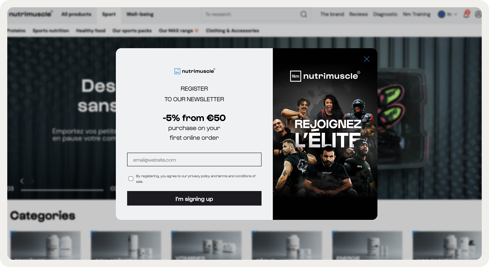

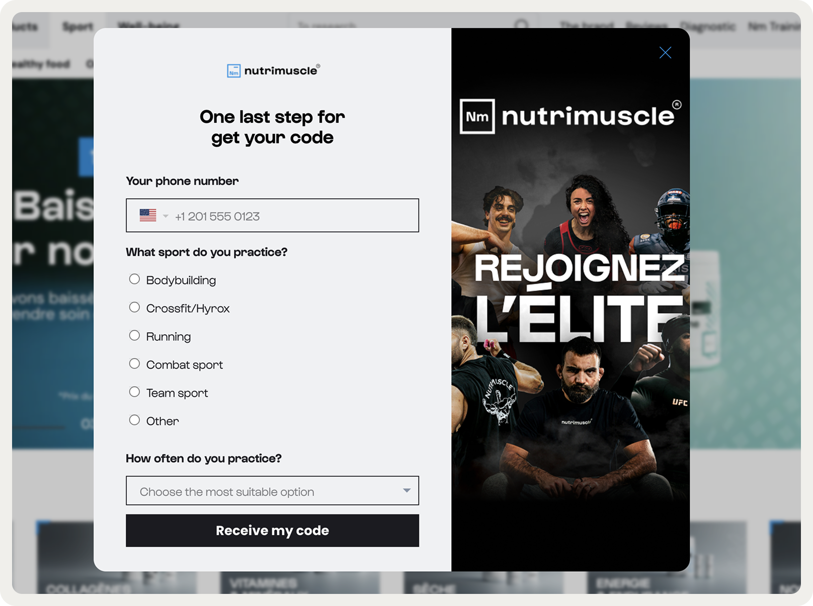


Website: Nutrimuscle
Goal: Capture new leads and convert visitors into subscribers/customers
This popup gives a 5% discount on the first order for email and phone number signup. To make the offer more compelling, the campaign also emphasizes access to exclusive content, like nutrition tips, workout guides, and early access to product launches.
Why this discount popup works:
Value-packed headline: Clearly communicates the reward (“Get 15% off your first order”).
Relevant product imagery: Shows popular supplements and protein powders, aligning with the visitor’s interests.
Highlighting the main benefit: The discount percentage stands out with a bold color, making it instantly noticeable.
Extra perks: Access to guides and early product launches increases perceived value and encourages signups beyond just the monetary incentive.
Discount popup best practice:
For Nutrimuscle, a percentage discount works better than a fixed amount because the average order size is moderate, making the discount feel substantial but not eroding profit margins.
Pairing the discount with exclusive content or early access makes the offer feel premium rather than just transactional.
2. “Buy two get one free” discount popup


Website: Blume
Goal: Increase sales by generating a sense of urgency
Blume, a self-care brand, invites customers to buy two products and get the third one for free. Such discount popups are popular because online shoppers perceive this offer as a great value. Blume showed this discount offer popup on the homepage for one weekend to maximize the awareness of the deal.
Why this discount popup works:
Enticing headline
Beautiful design and branded color scheme
Simple explanation of the terms
Discount popup best practice:
Use discount popups for time-limited “Buy one, get one free” promotions.
Such promos are great for selling items that need regular replenishment (like self-care), and products that complement each other.
The total price of the promo should be a bit over the average order value (AOV) at your store. For example, if your AOV is $50, go for no more than $60. Because if the difference is significant, many customers are likely to pass on the offer.
Related:
3. Discount popup with subscriber segmentation form


Website: Primal Pet Foods
Goal: Convert first-time visitors and segment them
A discount popup is also a nice opportunity to collect some information about visitors. In this example, the popup also asks to choose a pet along with their preferences—just what the brand needs to personalize future marketing emails.
Why this discount popup works:
Visitor info collection form
Creative format thanks to an awesome image of pets
Quick to fill out—it takes only two clicks to answer the two questions
Discount popup best practice:
Use discount popups to also collect information about your potential customers. You can ask about their product preferences just like the example above. This info will be super helpful for your email marketing team to move visitors down the website conversion funnel.
Related: What is a website conversion funnel?
4. Minimum purchase popup
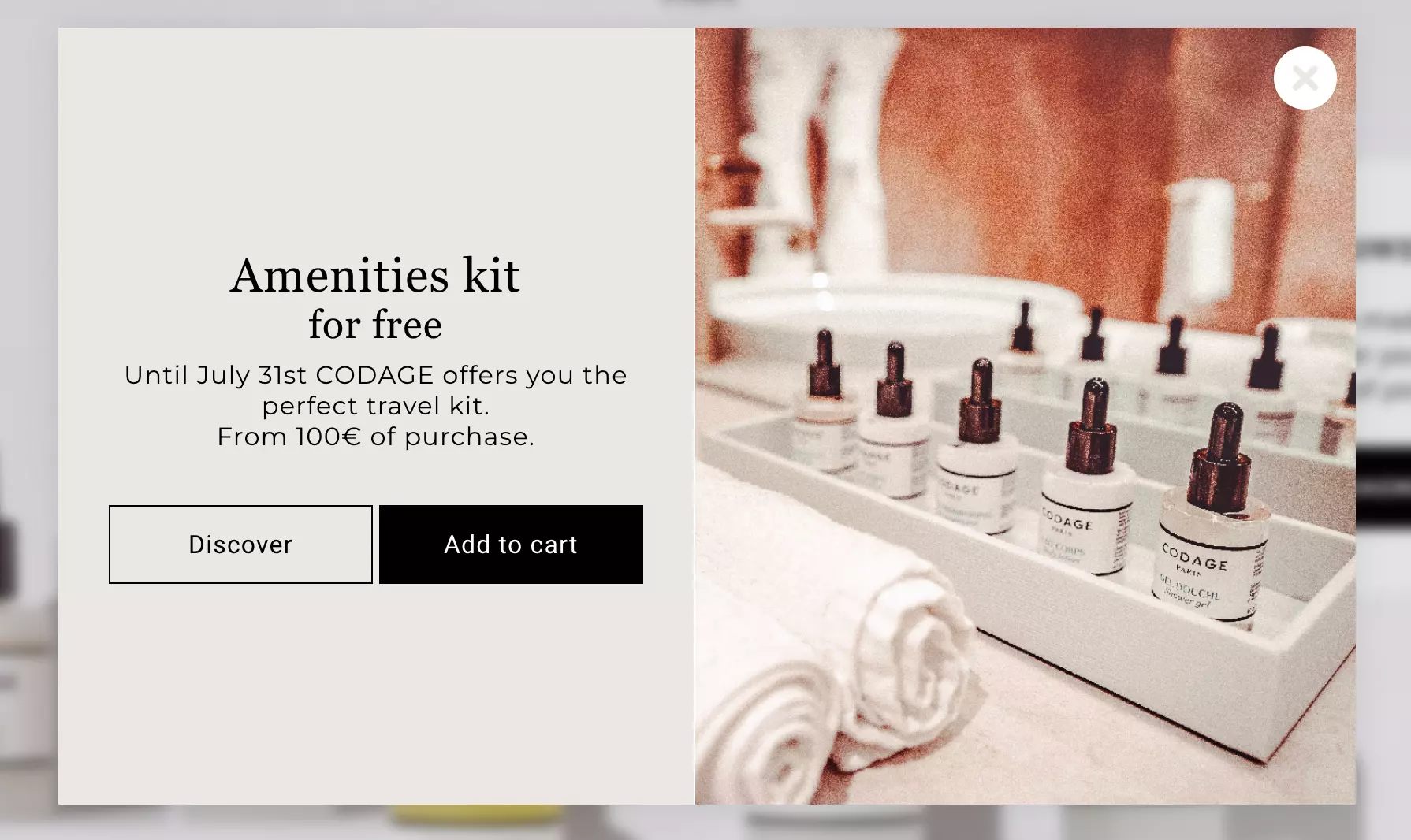

Website: CODAGE Paris
Goal: Get more orders over €100 in value
This discount popup example helps the brand upsell and increase the average order value. To motivate visitors to buy, it offers a 100% discount on a specific product. The choice of a product (a travel kit) is also right: it would introduce customers to multiple products.
Why this discount popup works:
Limited-time, enticing offer
Easy navigation thanks to the “Discover” button
Convenient addition of the free product to the cart
Discount popup best practice:
Apply a minimum purchase discount or a free product for items that need to be regularly replenished or refilled. Add this offer to your discount popup and place the campaign on your homepage to raise maximum awareness.
5. Gamified (spin the wheel) discount popup
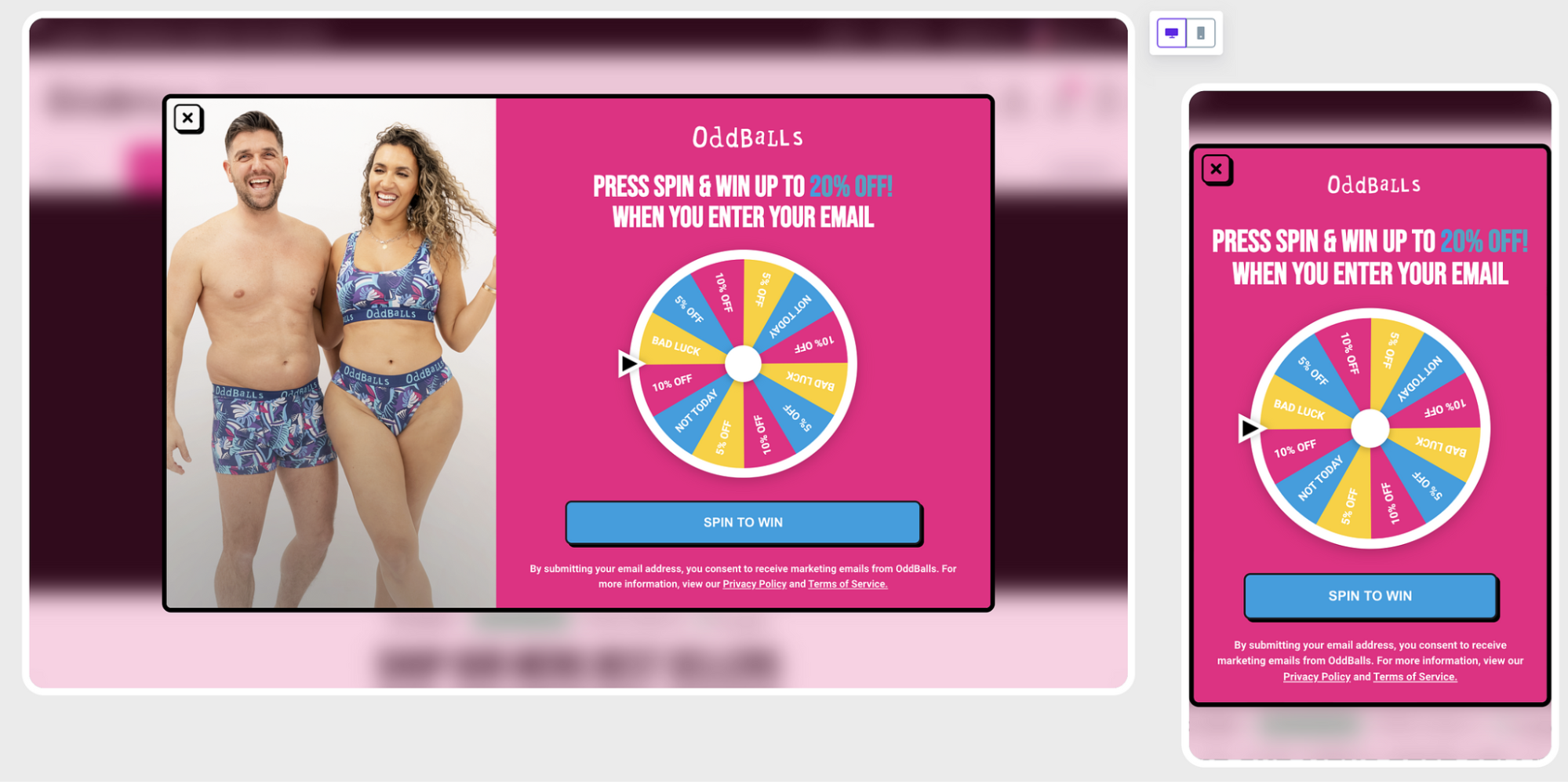

Website: OddBalls
Goal: Increase sales with discounts
Enter, spin, and win. That’s what spin-the-wheel popups are all about. A great thing about them is that you can choose to share any kinds of discounts or include perks like free shipping. Also, these discount popups can be extremely effective, converting up to 30% of visitors.
Why this discount popup example works:
Gamification is a unique way to engage shoppers
Colorful and eye-catching popup design
Very easy to participate (only email required)
Discount popup best practice:
Use a spin-the-wheel discount popup to gamify the shopping experience on your website.
It’s a proven way to generate leads. For example, this wheel popup campaign, generated 5,000 emails in one month. No worries about discount cheating, too: you can just limit the number of spins per visitor.
6. Free shipping popup
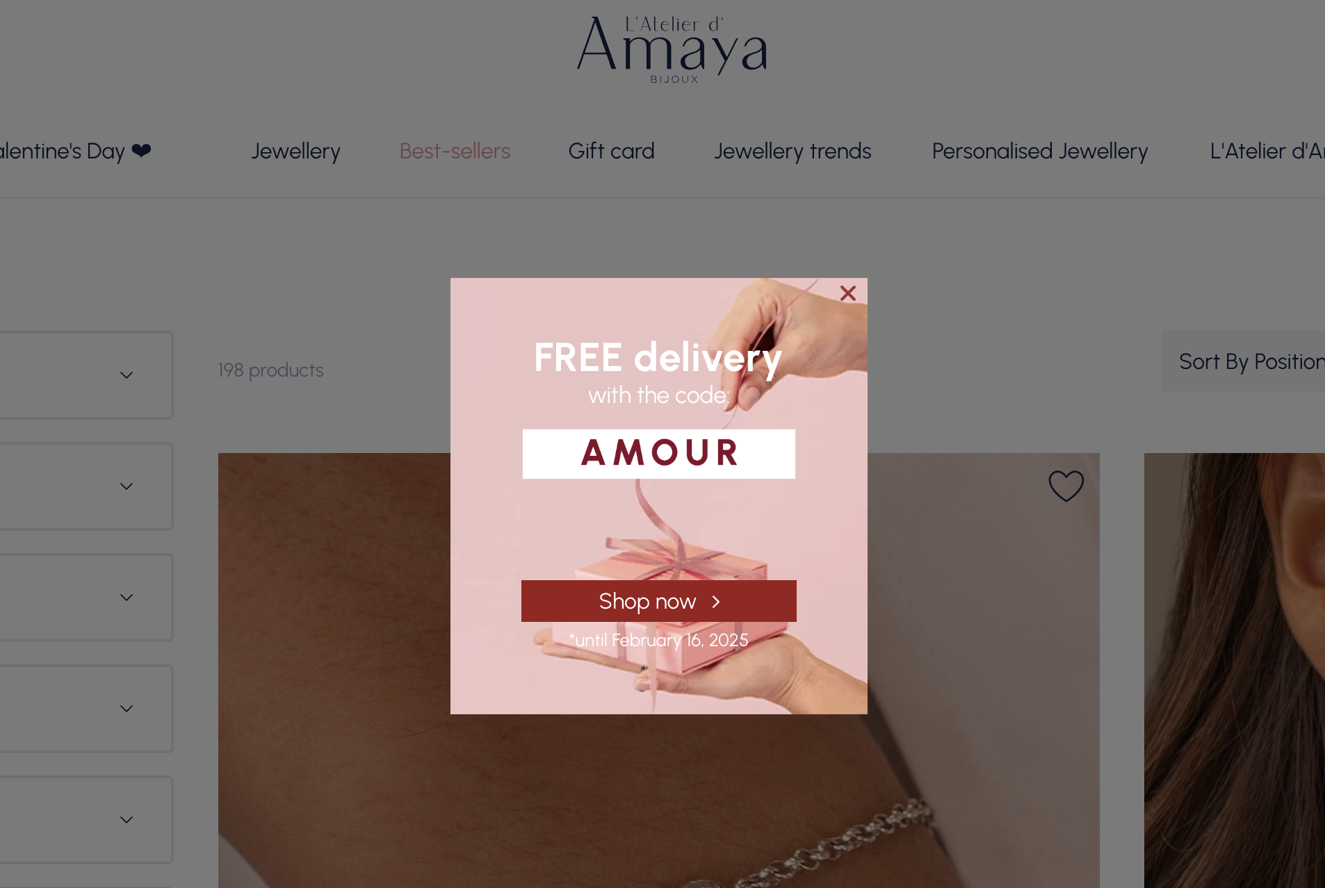

Website: Atelier D'amaya
Goal: Reduce hesitation to buy among first-time visitors
Extra costs like shipping are the top reason why online shoppers leave even after adding a product to the shopping cart. You can encourage your customers to buy with a free shipping discount popup like this.
Why this discount popup example works:
Minimum copy to make the details of the offer clear
Large field for the discount makes it super readable
Multiple ways to close the popup: the CTA button and the "close" button
Discount popup best practice:
Show your free shipping offer on product category menu or on specific product pages. Viewing those pages suggests a real buying intent + you can reserve the homepage for other campaigns.
7. Product category discount popup


Website: Shutterstock
Goal: Generate more sales of a product category
This discount coupon popup motivates customers to buy a particular product category. A campaign like this can drive traffic to that category and encourage visitors to explore more of your website. Note that this promotion popup requires no signup.
Why this discount popup works:
Clearly stated benefit in the headline
Brief but comprehensive description of the offer
Easily available discount code
Discount popup best practice:
Use discount popups to drive visitors to specific pages, product categories, or products.
When visitors click Redeem now in the Shutterstock popup, they go straight to the product category. It’s an effective way to help your business grow by driving visitors to explore more pages from the homepage.
8. Customer referral discount popup
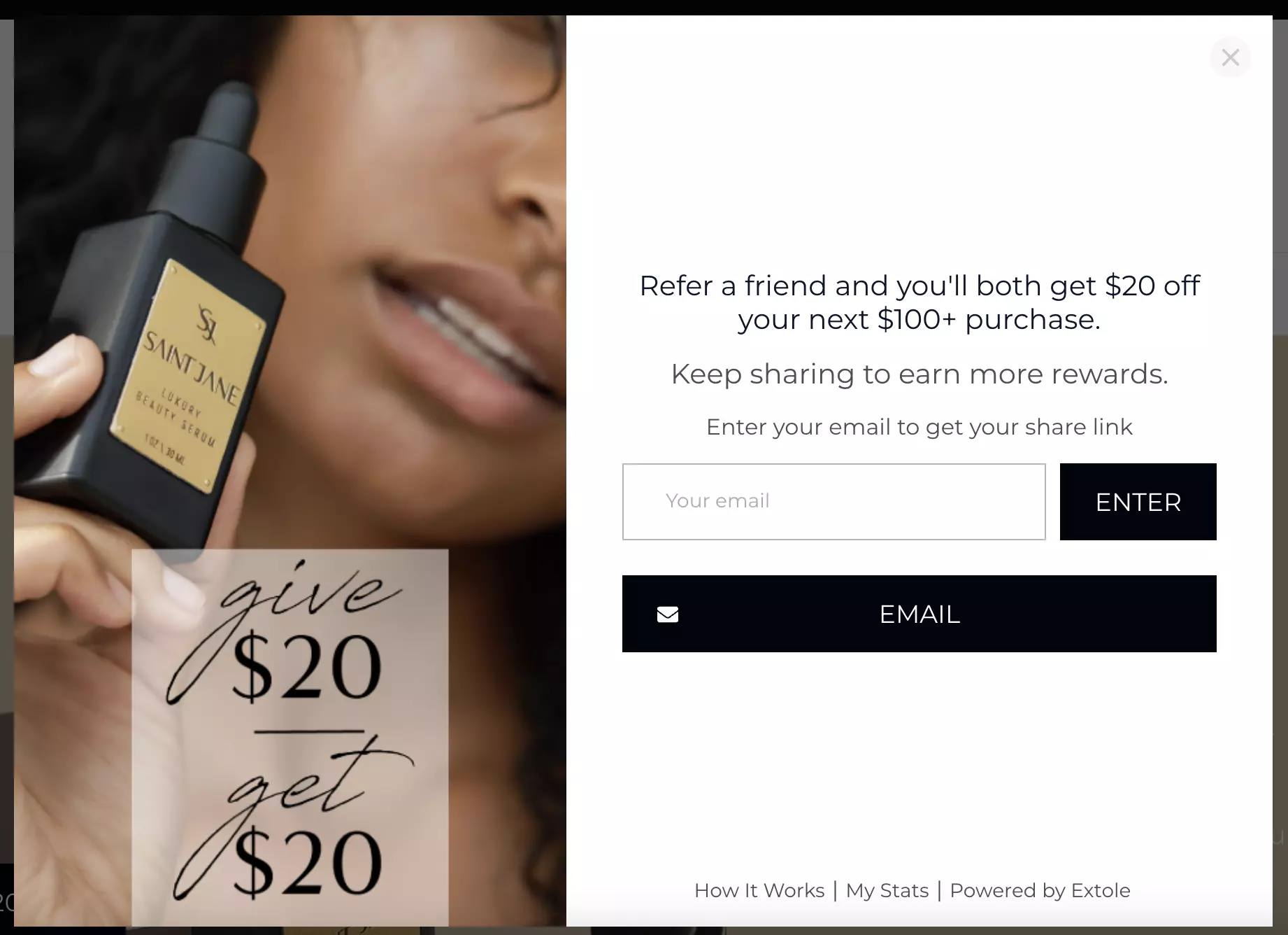

Website: Saint Jane Beauty
Goal: Encourage customers to refer friends
Want to build a popular customer referral program? You can drive referrals with a discount popup like this example from Saint Jane Beauty. This way, you can let every visitor know about this offer and get sales on autopilot.
Why this discount popup example works:
Clear description of the benefit
Makes friend referral easy with the share link
Encourages customers to advocate for the brand
Discount popup best practice:
Use discount popups to motivate your loyal customers to spread the word about your business. It’s a win-win, really: both shoppers will get a nice discount coupon and you will also get two more orders (and possibly more loyal customers).
How to create a discount popup
Let’s create an email subscription discount popup, the most common campaign type.
I’ll be using Wisepops, a popup software rated 4.9 stars on Capterra and 4.8 Shopify (see examples of campaigns you can launch today).
Get an account to begin:


Step 1: Choose a popup template
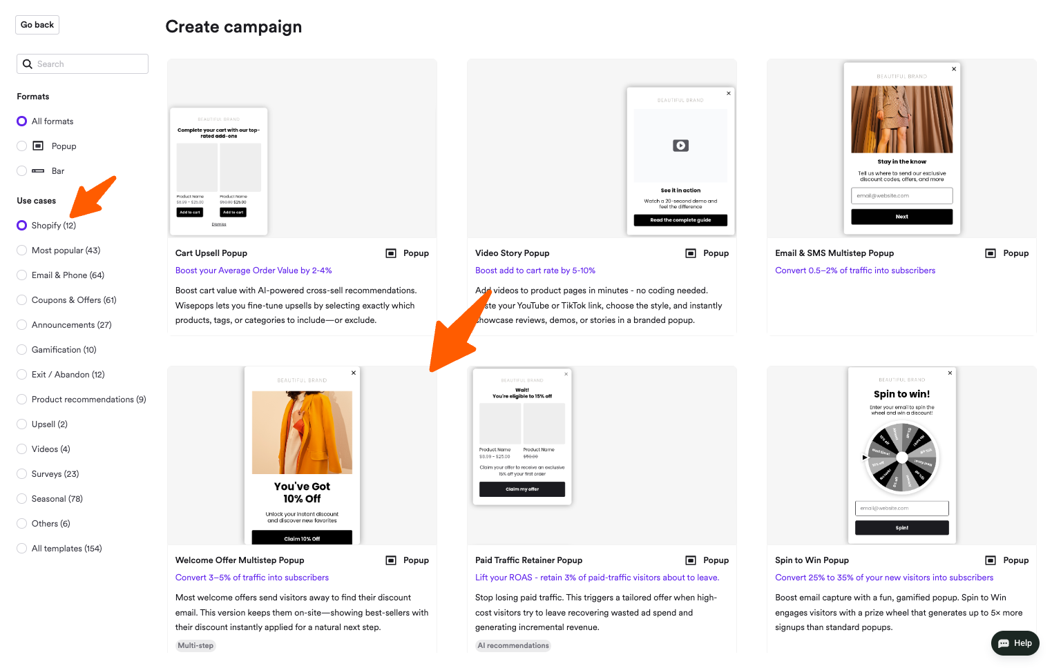
Once in Wisepops popups dashboard, choose New popup campaign.


Next, you’ll see a selection of popup templates—I'll choose this one in the Shopify category:

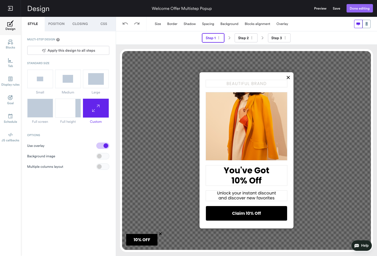
Step 2: Customize your popup design
Of course, we need to make our discount popup look natural and good-looking. It’s easy thanks to the drag & drop popup editor in Wisepops: just click the element and start customizing.

Best practices for designing discount popups
Source: popup personalization study
Discount size and product price
Percentage discount works better for lower-priced products, while fixed-dollar discounts work better for higher-priced items.
This aligns perceived value with actual product cost, optimizing both conversion and profit margin.
Timing and placement
Popups triggered after 40–50s on mobile or after users browse a few pages perform better than instant popups.
Example: Timing adjustment increased engagement +24% on mobile and reduced early exits –38%.
Insight: Even a great discount loses impact if shown too early or interruptively.
Content context
Embedding a discount in a product-page banner or contextual offer can outperform generic popups.
Example: Bundling a free add-on with a product produced +43% revenue per visitor and 155% engagement spike, often without using a popup at all.
Creative A/B testing
A/B tests focused purely on popup images or copy moved metrics by <5% in 60% of cases.
Biggest levers: timing, placement, offer type (discount vs gift), and value communication.
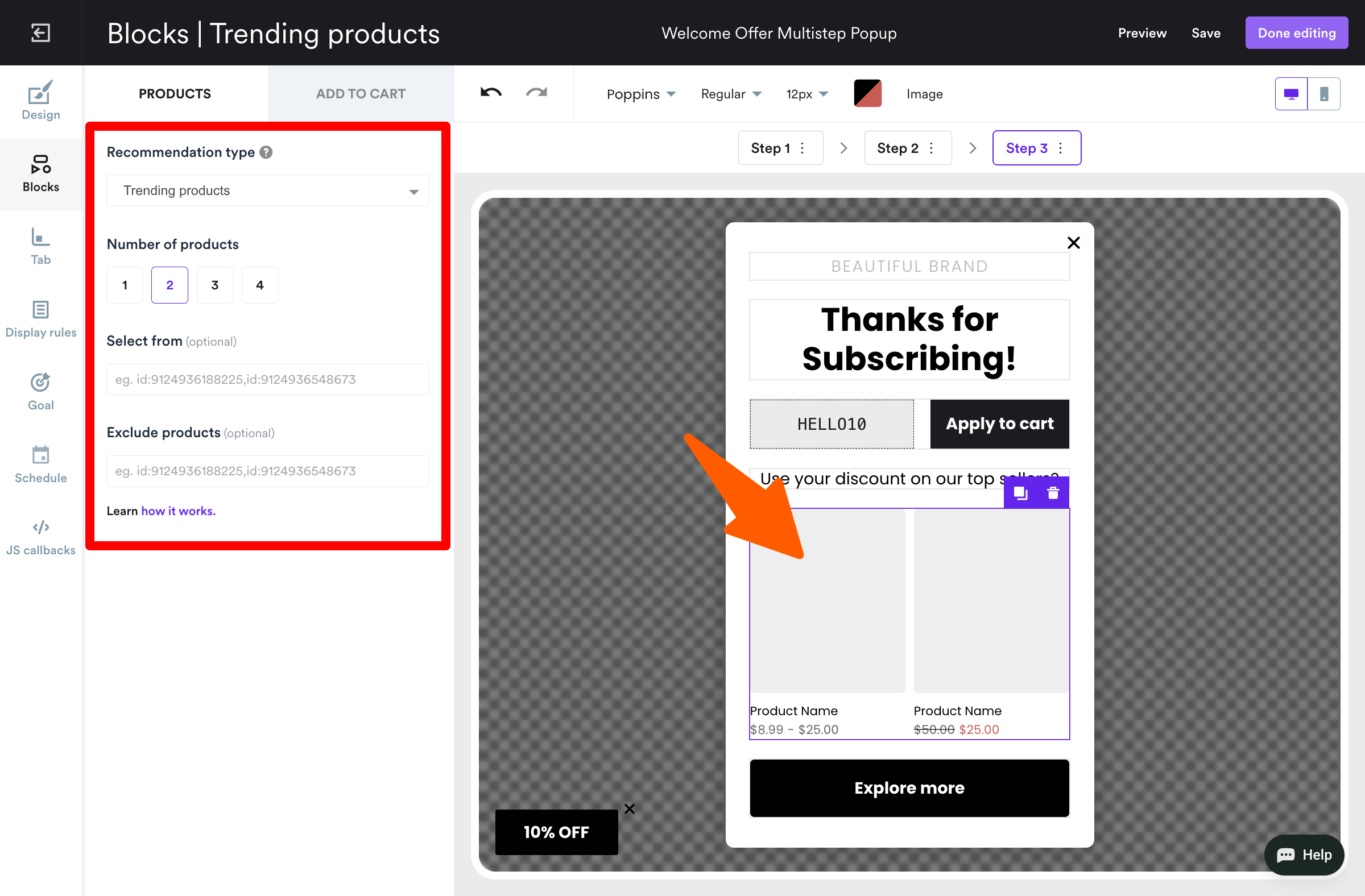
Step 3: Add the discount code in the last step
A thank-you window appears when the visitors submit their emails and click Sign up in our campaign. That’s where you give the discount to them.
To customize this window, go to the Step 3 tab.
Once there, write the message and add the discount code. Here are discount code ideas for you. And add product recommendations there—bestsellers are a great idea!

Step 4: Choose where to show your discount popup
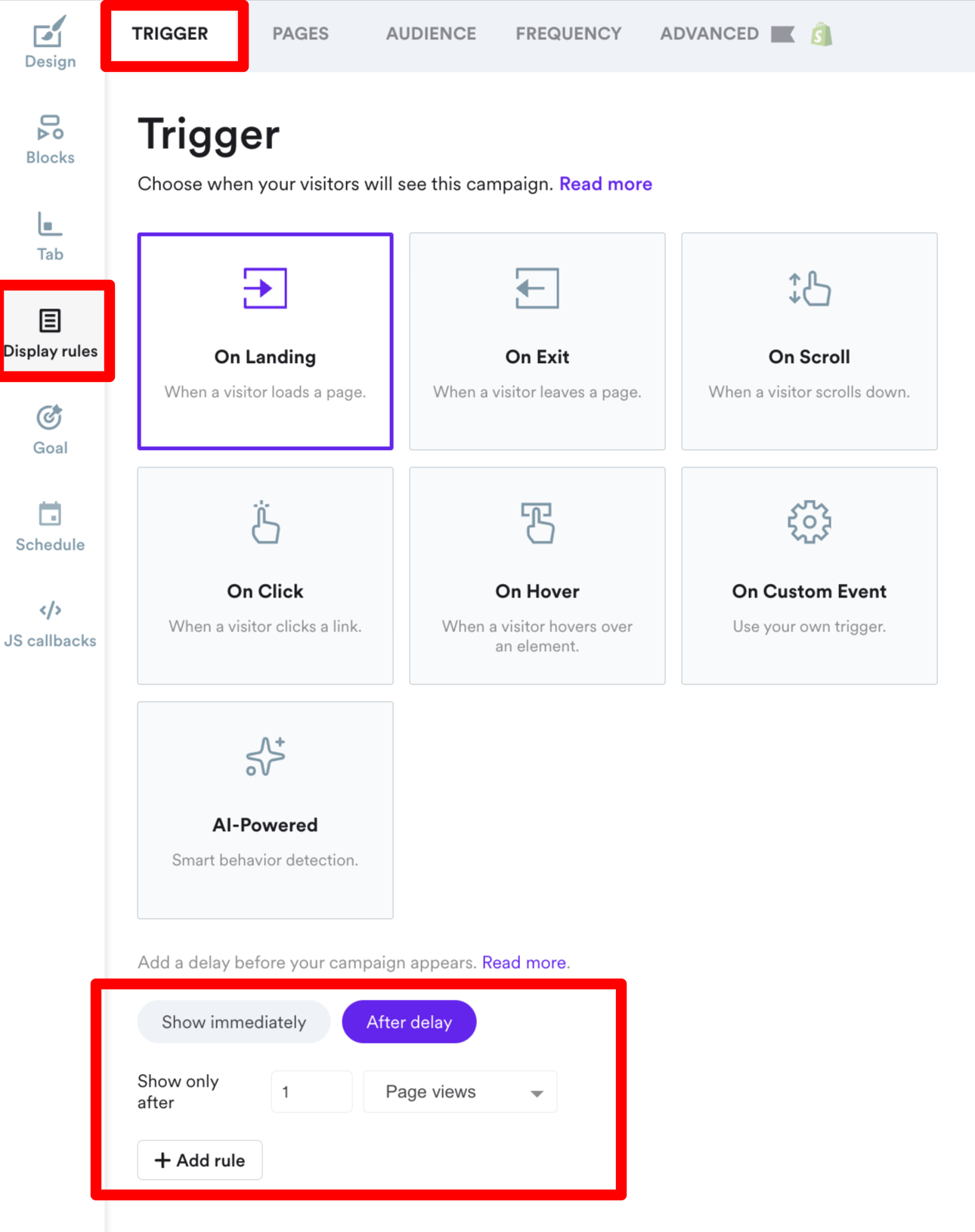
You should show your discount popup at the right time to maximize conversions.
By default, Wisepops will display your campaign:
Only one time
To every visitor
On all website pages
After they spend 5 seconds on your site
But you can make any changes: with Wisepops, you can trigger any visitor category and when the discount appears.
To change who will see your discount popup, go to Display Rules > Audience. For example, I chose to show the popup after one pageview:

Thinking about making your discounts personalized for specific customers?
Connect your Shopify account so you can use your store data to create custaom offers with native display rules.


Step 5: Publish your discount popup
Once you click Done Editing, Wisepops will take you to the campaign overview.
There, click Publish to activate your discount popup.
To actually add the campaign on your website, just insert the Wisepops code snippet with a few clicks.
Additionally, if you prefer to have the gathered emails sent directly to your email application, you can easily set up the integration.
Discount popup: your next steps
Want more info about how to create and use discount popups to get sales?
We got you covered.
Detailed instructions for your website:
If you prefer a plugin, here’s our WordPress popup plugin for you.
Also, see more useful posts:
Get started
in minutes
Start converting more visitors today.
Get started in minutes and see results right after.


