


Read summarized version with
 ChatGPT
'%3e%3cpath%20fill-rule='evenodd'%20clip-rule='evenodd'%20d='M16.4875%200V6.06H18.75V14.6833H16.3042V20L10.44%2014.8383V19.9592H9.53083V14.8325L3.66%2020V14.6125H1.25V5.99H3.65333V0L9.53083%205.41167V0.158333H10.4392V5.56667L16.4875%200ZM10.44%207.53667V13.6358L15.395%2017.9975V12.0333L10.44%207.53667ZM9.52417%207.47L4.56917%2011.9683V17.9975L9.52417%2013.6358V7.47083V7.47ZM16.3042%2013.7867H17.8408V6.9575H11.2167L16.3042%2011.5742V13.7867ZM8.81917%206.88667H2.15833V13.7158H3.65833V11.5692L8.81833%206.88583L8.81917%206.88667ZM4.5625%202.06333V5.98833H8.825L4.5625%202.06333ZM15.5783%202.06333L11.3158%205.98833H15.5783V2.06333Z'%20fill='black'/%3e%3c/g%3e%3cdefs%3e%3cclipPath%20id='clip0_4212_18220'%3e%3crect%20width='20'%20height='20'%20fill='white'/%3e%3c/clipPath%3e%3c/defs%3e%3c/svg%3e) Perplexity
Perplexity'%3e%3cpath%20d='M9.996%2019.992C9.996%2018.6068%209.73182%2017.3074%209.19632%2016.0936C8.68224%2014.8798%207.96824%2013.8159%207.0686%2012.9163C6.16896%2012.0166%205.11224%2011.3098%203.89844%2010.7957C2.68464%2010.2602%201.38516%209.996%200%209.996C1.38516%209.996%202.68464%209.73896%203.89844%209.21774C5.11224%208.68224%206.1761%207.96824%207.0686%207.0686C7.96824%206.16896%208.6751%205.11224%209.19632%203.89844C9.73182%202.68464%209.996%201.38516%209.996%200C9.996%201.38516%2010.253%202.68464%2010.7743%203.89844C11.3098%205.11224%2012.0238%206.1761%2012.9234%207.0686C13.823%207.96824%2014.8798%208.68224%2016.1007%209.21774C17.3145%209.73182%2018.614%209.996%2019.9991%209.996C18.614%209.996%2017.3145%2010.2602%2016.1007%2010.7957C14.8869%2011.3098%2013.823%2012.0166%2012.9234%2012.9163C12.0238%2013.8159%2011.3098%2014.8726%2010.7743%2016.0936C10.2538%2017.327%209.98905%2018.6533%209.996%2019.992Z'%20fill='url(%23paint0_radial_4212_18233)'/%3e%3c/g%3e%3cdefs%3e%3cradialGradient%20id='paint0_radial_4212_18233'%20cx='0'%20cy='0'%20r='1'%20gradientUnits='userSpaceOnUse'%20gradientTransform='translate(-1.13275%205.96185)%20rotate(18.68)%20scale(21.2772%20170.46)'%3e%3cstop%20offset='0.07'%20stop-color='%239168C0'/%3e%3cstop%20offset='0.34'%20stop-color='%235684D1'/%3e%3cstop%20offset='0.67'%20stop-color='%231BA1E3'/%3e%3c/radialGradient%3e%3cclipPath%20id='clip0_4212_18233'%3e%3crect%20width='20'%20height='19.992'%20fill='white'/%3e%3c/clipPath%3e%3c/defs%3e%3c/svg%3e) Gemini
Gemini'%3e%3cpath%20d='M3.92888%2013.2962L7.86008%2011.0903L7.92585%2010.8981L7.86008%2010.7918H7.66782L7.01009%2010.7513L4.76369%2010.6906L2.81581%2010.6097L0.928632%2010.5085L0.453044%2010.4073L0.0078125%209.82039L0.0533475%209.52694L0.453044%209.25879L1.02476%209.30939L2.28962%209.3954L4.18692%209.52694L5.56309%209.60789L7.60204%209.82039H7.92585L7.97138%209.68884L7.86008%209.60789L7.77407%209.52694L5.811%208.19631L3.68603%206.78978L2.57295%205.98027L1.97088%205.57045L1.66731%205.18593L1.53577%204.34607L2.08219%203.74399L2.81581%203.79459L3.00301%203.84518L3.74674%204.4169L5.33541%205.64634L7.40979%207.1743L7.71335%207.42727L7.83478%207.34126L7.84996%207.28055L7.71335%207.05287L6.5851%205.01391L5.38095%202.93954L4.84465%202.07943L4.70298%201.56337C4.65239%201.35087%204.61697%201.17379%204.61697%200.956236L5.23928%200.111308L5.58332%200L6.41307%200.111308L6.76218%200.414875L7.27824%201.59373L8.11305%203.45054L9.40827%205.97521L9.78773%206.72401L9.9901%207.41715L10.066%207.62965H10.1975V7.50822L10.3038%206.08652L10.5011%204.34101L10.6934%202.09461L10.7591%201.46218L11.0728%200.703263L11.6951%200.293448L12.1808%200.526183L12.5805%201.0979L12.5249%201.46724L12.2871%203.01037L11.8216%205.42879L11.5181%207.04781H11.6951L11.8975%206.84543L12.7171%205.75765L14.0933%204.03744L14.7005%203.35441L15.4088%202.60056L15.8641%202.24134H16.7242L17.3567%203.18239L17.0733%204.15381L16.1879%205.277L15.4543%206.22818L14.4019%207.64483L13.7442%208.77814L13.8049%208.86921L13.9618%208.85403L16.3397%208.34809L17.6248%208.11536L19.1578%207.85226L19.851%208.17607L19.9269%208.50493L19.6537%209.17784L18.0144%209.5826L16.0918%209.96711L13.2282%2010.6451L13.1927%2010.6704L13.2332%2010.721L14.5234%2010.8424L15.0749%2010.8728H16.4257L18.9403%2011.06L19.598%2011.4951L19.9926%2012.0263L19.9269%2012.4311L18.915%2012.9471L17.5489%2012.6233L14.3615%2011.8644L13.2686%2011.5912H13.1168V11.6823L14.0275%2012.5727L15.6972%2014.0804L17.7867%2016.0233L17.893%2016.5039L17.6248%2016.8834L17.3415%2016.8429L15.5049%2015.4617L14.7966%2014.8394L13.1927%2013.4885H13.0865V13.6302L13.4558%2014.1715L15.4088%2017.106L15.51%2018.0066L15.3683%2018.3L14.8624%2018.4771L14.3058%2018.3759L13.1624%2016.7721L11.9835%2014.9658L11.0324%2013.3468L10.916%2013.4126L10.3544%2019.4586L10.0913%2019.7673L9.48416%2020L8.97821%2019.6155L8.71006%2018.9932L8.97821%2017.7637L9.30202%2016.1599L9.56511%2014.8849L9.80291%2013.3013L9.94457%2012.7751L9.93445%2012.7397L9.81808%2012.7549L8.62405%2014.3941L6.80771%2016.848L5.37083%2018.386L5.02679%2018.5226L4.42977%2018.214L4.48542%2017.6625L4.81935%2017.1718L6.80771%2014.642L8.0068%2013.0736L8.7809%2012.168L8.77584%2012.0364H8.7303L3.44824%2015.4667L2.50718%2015.5882L2.10242%2015.2087L2.15302%2014.5864L2.34528%2014.384L3.93394%2013.2912L3.92888%2013.2962Z'%20fill='%23D97757'/%3e%3c/g%3e%3cdefs%3e%3cclipPath%20id='clip0_4212_18270'%3e%3crect%20width='20'%20height='20'%20fill='white'/%3e%3c/clipPath%3e%3c/defs%3e%3c/svg%3e) Claude
Claude'%3e%3cpath%20d='M7.77353%2012.0388L14.278%207.23827C14.5972%207.00347%2015.0534%207.09396%2015.205%207.46044C16.0048%209.38782%2015.6469%2011.7045%2014.0559%2013.296C12.4648%2014.8862%2010.2512%2015.2348%208.22684%2014.4407L6.01614%2015.4643C9.18686%2017.631%2013.0375%2017.0949%2015.4431%2014.6885C17.3517%2012.7811%2017.9424%2010.1807%2017.3896%207.83507L17.3941%207.83956C16.5927%204.39408%2017.5906%203.01744%2019.6366%200.202196C19.6839%200.135341%2019.7332%200.0676703%2019.7821%200L17.0908%202.6901V2.68113L7.7719%2012.04M6.43072%2013.2047C4.15521%2011.0323%204.54778%207.66916%206.48861%205.72874C7.92395%204.29299%2010.2773%203.7076%2012.3307%204.56815L14.5369%203.55024C14.1398%203.26326%2013.6303%202.95507%2013.0453%202.73738C10.4045%201.65058%207.24114%202.19113%205.09403%204.3362C3.02927%206.40055%202.37948%209.57493%203.49441%2012.2838C4.32765%2014.3078%202.9616%2015.7407%201.58578%2017.185C1.097%2017.6966%200.609043%2018.2098%200.214844%2018.752L6.42787%2013.2047'%20fill='black'/%3e%3c/g%3e%3cdefs%3e%3cclipPath%20id='clip0_4212_18265'%3e%3crect%20width='20'%20height='18.752'%20fill='white'/%3e%3c/clipPath%3e%3c/defs%3e%3c/svg%3e) Grok
GrokWebsite popups are one of the best-converting opt-ins, converting 4.6% visitors on average (in ecommerce, this figure is 8.11%). The top campaigns even reach around 20% CTR.
But, to get the best possible results, you need to build your popups according to the best design, timing, copy, and customer segmentation practices. They are what separates intrusive campaigns with 0.2% CTR from those converting 10% of visitors as soon as week one.
This deep guide will walk you through the exact best practices and insights we uncovered in our popup research—so you can reduce bounce rate, personalize your popups, improve average order rate, and achieve the highest possible conversions.
Get started:
1. Popup timing and frequency
2. Popup design and format
Use centered and bottom-centered screen positions for email & phone number capture
Choose different screen positions for mid-funnel visitor engagement
3. Copy and value framing
4. Micro-commitments and simplified forms
5. Targeting popups by visitor behavior and URL
6. Incentive structure and offer strategy
7. Best practices for mobile popups
Hide non-essential elements on mobile to improve conversions
Test mobile popup formats: narrow/tall vs. wide/short layouts
8. A/B testing popup elements
9. Segmentation by customer intent
10. Performance metrics to track and ROI calculation
Note: Consider these best practices as starting points, not hard rules. Your visitors and industry might respond differently to them, so A/B testing your campaigns is key.
Use popup templates with pre-set targeting for the best results
Improve CTR with AI product recommendations, cart recovery, Klaviyo segment targeting, native popup triggers, and revenue tracking.
Popup timing and frequency
The way you display your popup campaign is critical to conversion rate optimization. This is because every popup format has its advantages and disadvantages, and influences the visitor’s experience in different ways.
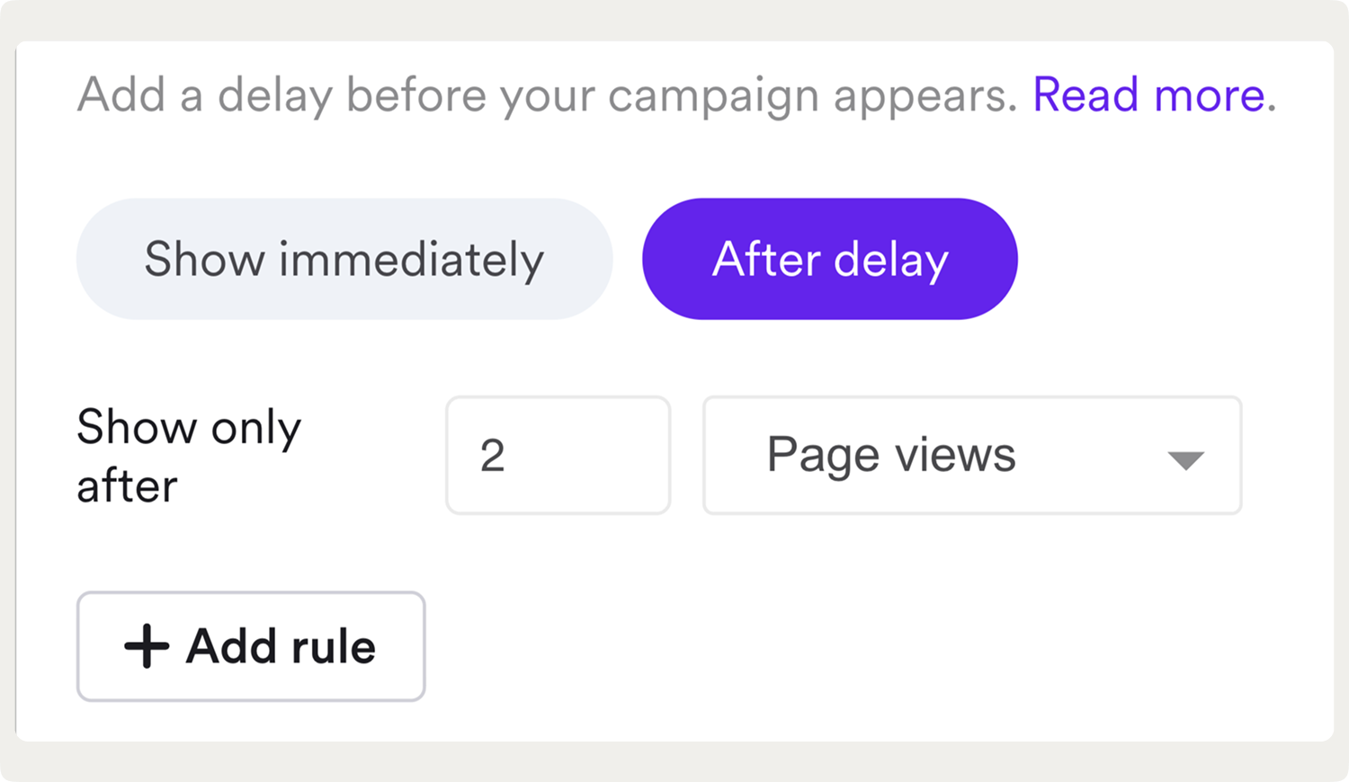
1. Wait 10–50 seconds before showing your first popup
Showing a popup in the first 5 seconds can increase bounce rate by up to 5x.
That's a major blow to conversions that's easily explained by the fact that a premature popup feels intrusive before any real engagement has happened.
So, when should popups appear for the best results?
Test a 10–50 second delay as your baseline.
You can easily set up the delay in the display rules in your ecommerce popup tool.
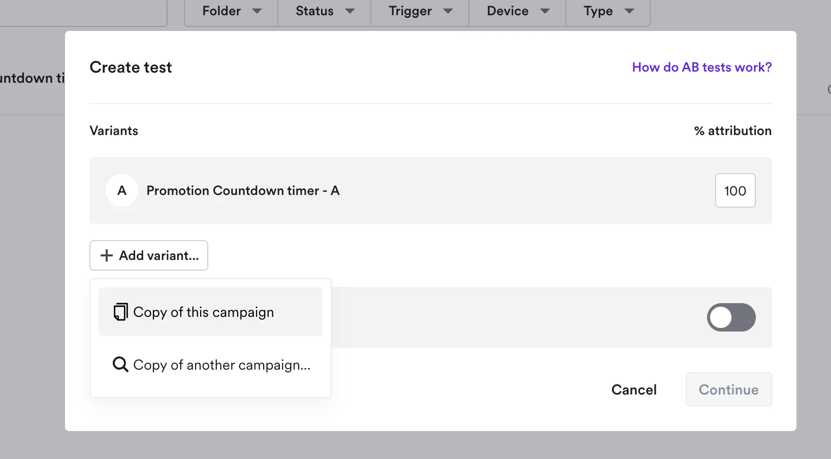
Example—
This is a setup for a campaign that appears after 10 seconds on the second website page viewed by the visitor:

Expert tip:
Find the average time on your website in Google Analytics (under Engagement > Pages and screens) and show your popup at about 50% of that time.
By using that time as a benchmark, you will target most visitors who are engaged but haven’t yet left. In other words, you catch them while they’re still actively browsing.
2. Trigger popups when visitors load a second page on your site
This is another best practice to make popups more relevant; this time, it's about page delay, or displaying popups when the visitor loads a second or next pages. This approach is more sophisticated: it signals genuine interest because the visitor went beyond the first page.
Example:
Triggering popups when visitors load a second page (a one-page delay) signals interest and is one of the best popup trigger options for increasing conversions, generating a 28.98% conversion rate in our study. On ecommerce stores, this approach increased attributed revenue by 39% on average compared to immediate display.
Also, a simple one-page delay generated a conversion rate of 28.98%, the highest in the sample: this makes a one-delay one of the best popup trigger options for increasing conversions:

Adding page delay in popup software takes seconds and is usually found is display settings.
Example:
A 60-day popup roadmap that proves ROI
Learn how to build an implementation plan to turn popups into a measurable growth channel.
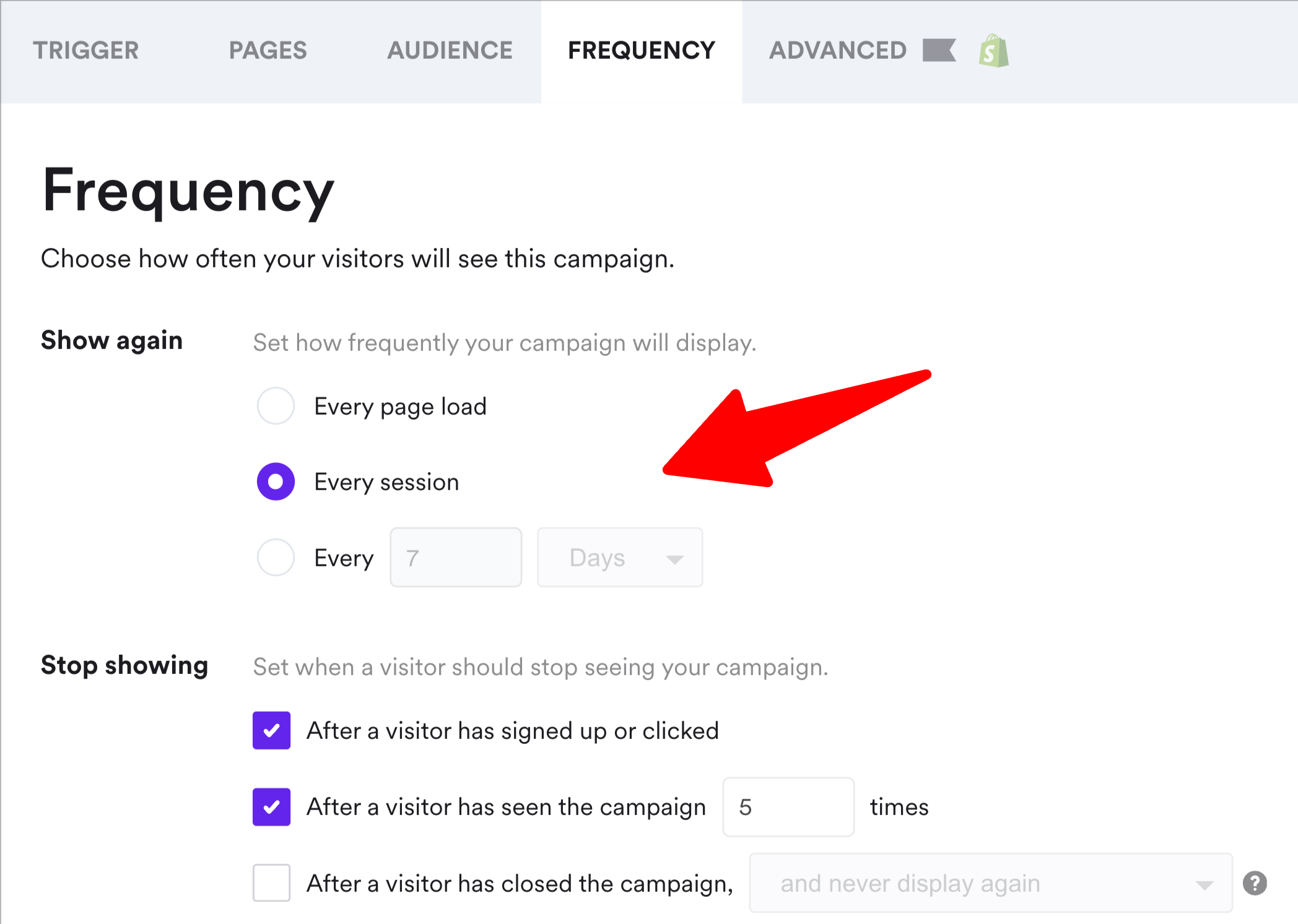
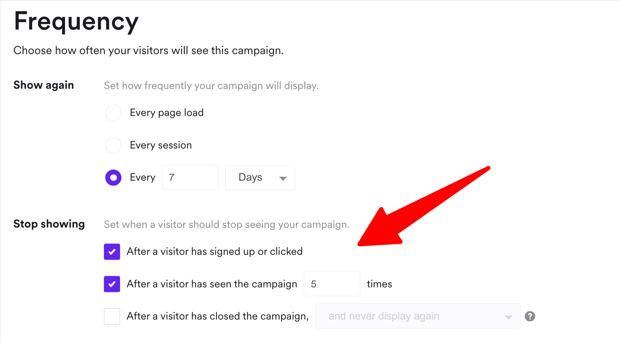
3. Set display frequency caps to avoid deal-seeking behavior
Running an ecommerce store?
If yes, consider showing your email capture popup with discounts once per session, then once every 7 days if the visitor doesn't sign up.
If you have discounts in exit-intent campaigns, for example, that means showing once per visit—this is your last chance to convert them.
(One visit may consist of multiple sessions when a user returns quickly, e.g. five minutes).
This best practice is easy to implement in display frequency settings in popup software:
Note:
It's also important to not show the same offer in popups more than twice to the same visitor in 24 hours, and always exclude recent purchasers from incentive popups (this is done in native Shopify targeting settings, for example).
One retailer who tested aggressive frequency (showing popups every 2 visits) saw a 20% lift in initial conversions but a 13% decline in average order value, so the short-term gain eroded long-term margin.
Popup design and format
Your popup's visual design determines not just whether visitors engage, but if they convert.
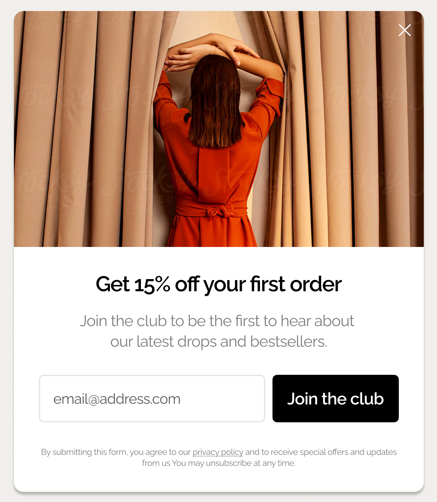
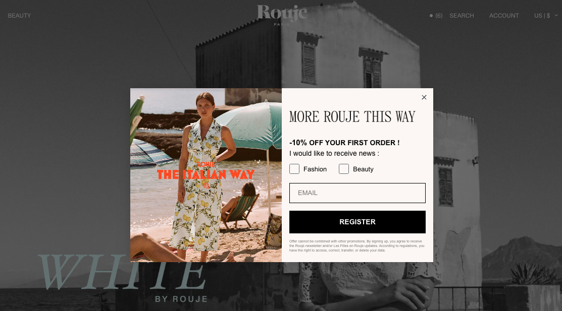
4. Use delayed full-screen popups for email list building
Full-screen popups are often feared as intrusive, but they often deliver real results if done right. For many ecommece businesses, for example, they increased email and phone capture by 48% and click-through rate by 52% on average.
By "done right," I mean:
delaying them by 10+ seconds
(or) displaying them on the second page
using the micro-commitment principle (e.g. having only one signup field or asking a yes/no question) and multi-step design with conversational copy
creating them in a way that presents your brand and matches your website design well
presenting an offer that's relevant to the visited page (e.g. a bestseller in rugs when a visitors is browsing rugs)
rotating them with other popups regularly (for example, a full-screen format is not the best way to share upsell offers or recover carts on exit)
We have found that even high-end and popular brands as SNOWE, Boll & Branch, Nicky Kehoe, and many others used full-screen campaigns for lead capture, customer surveys, collecting product preferences, and announcing sales.
Here are some examples (these are multi-step campaigns but I'm showing the first windows only):

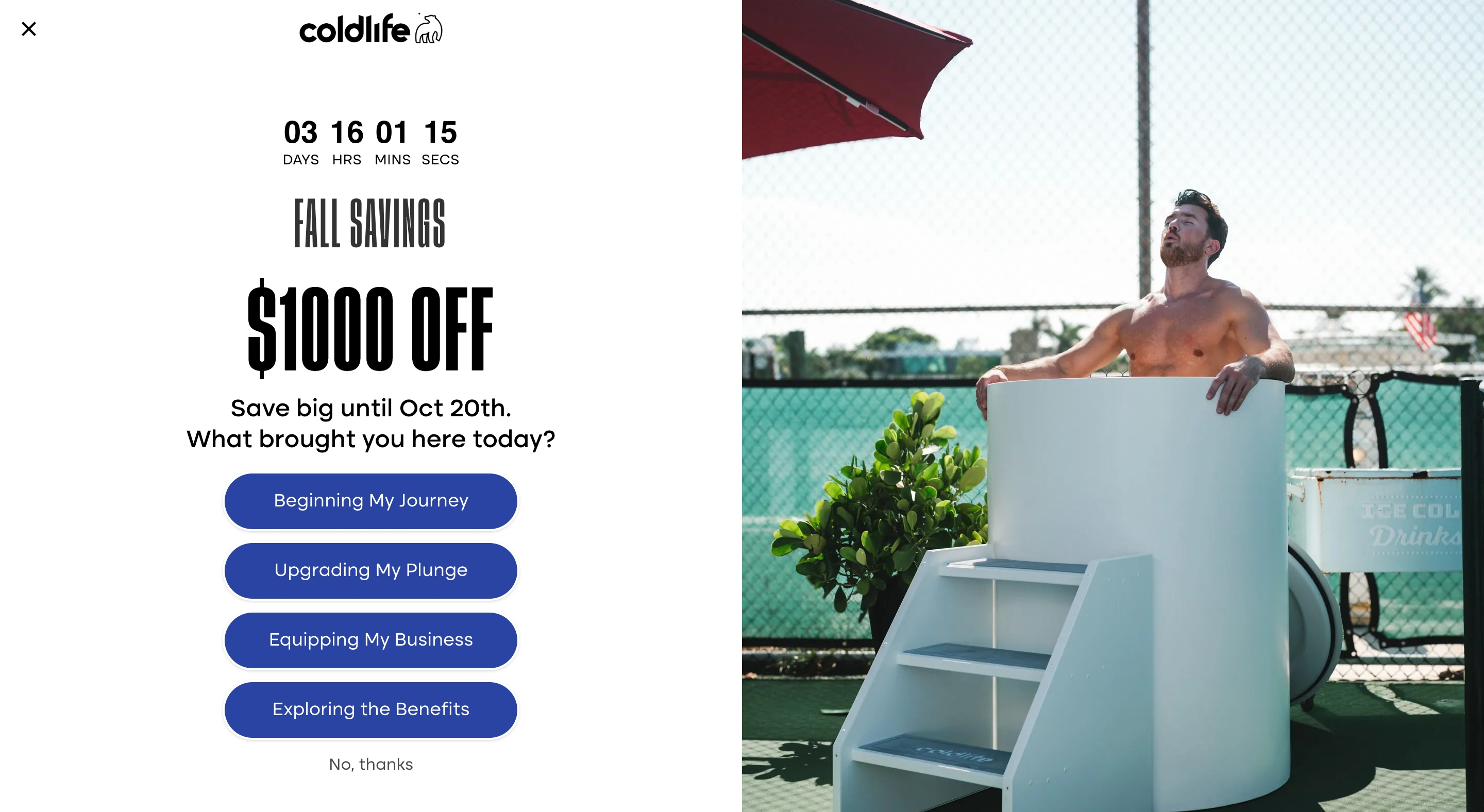
Expert tip:
Full-screen popups work best for top-of-funnel email capture, Black Friday early access list, giveaway announcements, and promoting loyalty programs. Our data suggests that using them mid-funnel (cart page, for example), reduced conversions by 18% on average.
Example:
Faguo, a fashion brand, used a full-screen popup to announce the monthly giveaway. In a few months, they started generating about 5,000 leads monthly with a 17.5% average CTR:

5. Use centered and bottom-centered screen positions for email & phone number capture
In our A/B test research, centered (those appearing in the center of the screen) and bottom-centered popups consistently outperformed cornered, half-screen, and slide-in formats.
For example, "bottom-right" placement (which is the popular slide-in format) converted at 1.56% on average—that's 11.32% less than centered!
So, although cornered popups are often seem as less aggressive, they tend to generate a much lower CTR. One reason is that their format simply makes it easier to ignore them.
Here's full data:

Let me show you a couple of examples.
Of course, we're familiar with the classic centered position—perfect for grabbing attention and effective in generating conversions:
And here's an example of a bottom-centered placement—
Uranus Wiper chose this position for their email capture campaign:

Takeaway:
If your goal is to capture leads (especially with multi-step campaigns), use a centered or bottom-centered placement.
If your goal is to share special offers, sales promotions, or reminders, cornered placements can be effective.
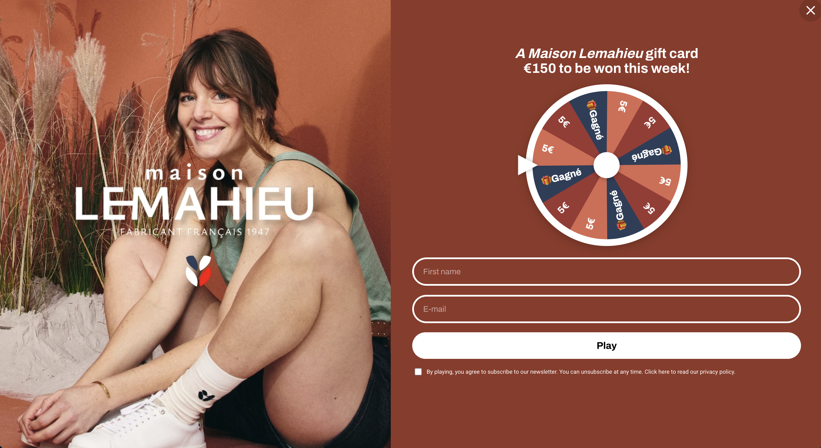
6. Use different screen positions for mid-funnel engagement
We know that cornered, half-screen, small teasers, and bottom-centered popup positions aren't as effective as centered, but they help maintain engagement-heavy flows without blocking navigation.
That makes them suitable for use cases like:
sharing product recommendations (including on exit)
recovering abandoned carts with exit offers,
generating urgency to buy during sales with countdown timers, or
sharing upsell and cross-sell offers.
Let me show you a few examples.
This left-cornered popup (below) at Atelier D'amaya offering a €6 discount for orders over €60 is designed to improve average order value—not capture emails. To make sure that the message is seen, the rest of the screen is blurred (this is the so-called lightbox effect).
Also, to make it more relevant to visitors and encourage them to buy, it's shown only on product category pages (that's another effective popup best practice!):

Next—
This cornered popup at OddBalls is used for lead capture, but only during the Christmas gift voucher giveaway. That means that the prize is good enough to generate meaningful conversions (so, its not a typical newsletter subscription campaign).
Besides, OddBalls is also using the lightbox effect to focus the attention of visitors on the offer:

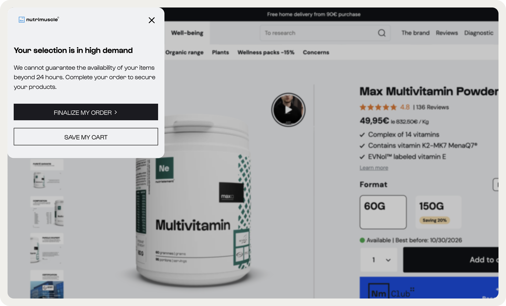
Next—
This is a cart recovery popup shown on exit. It generated an average 5.7% CTR, which is higher than the overall average popup conversion rate. Nutrimuscle uses this cornered campaign to also allow visitors save their carts for later (another best practice for website popups worth trying if you're ecommerce):
And finally, here's an example of a bottom-right corner campaign from Nkuku. It shares a birthday offer, so it's also not a typical lead generation campaign:
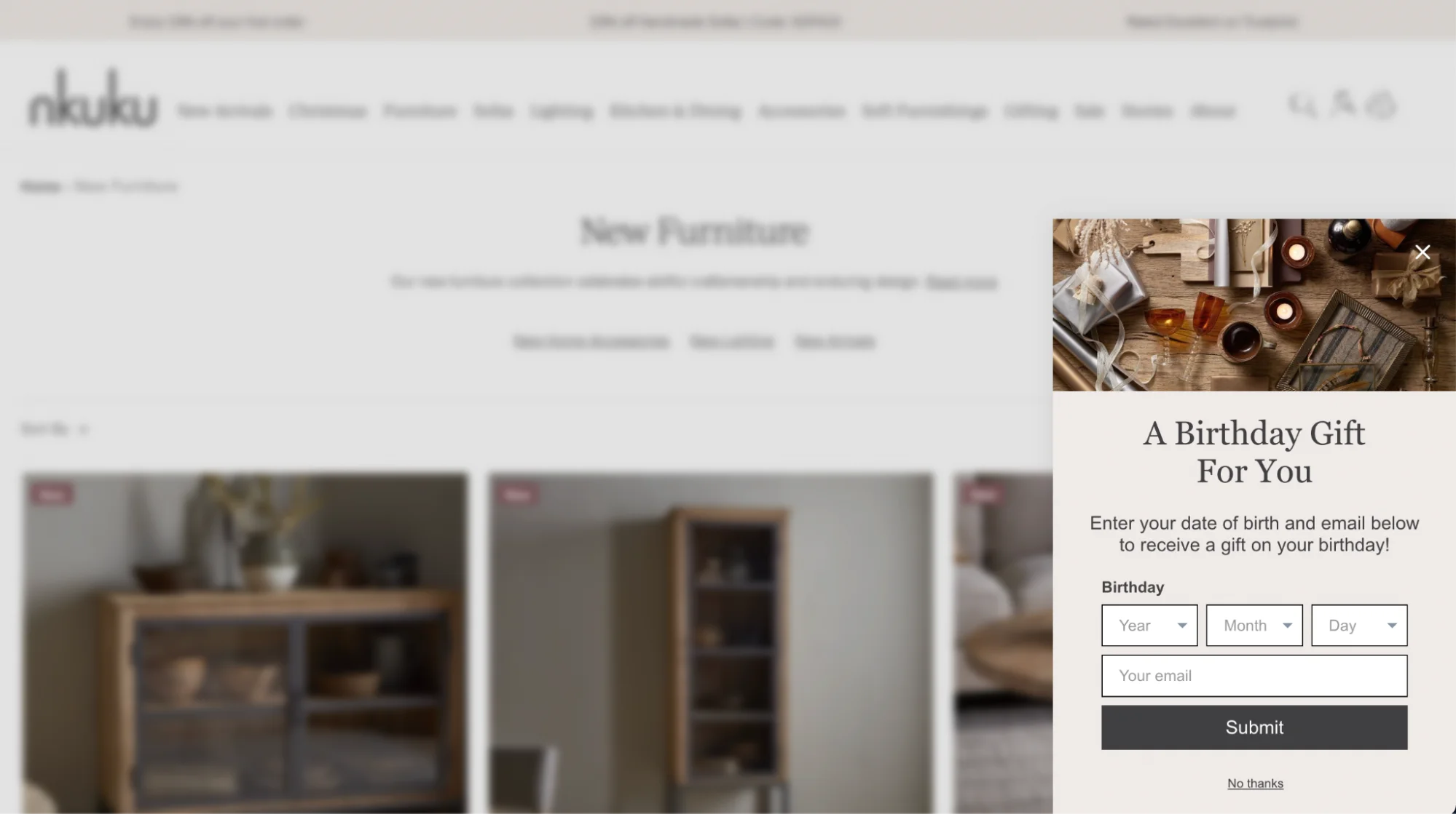
Takeaway:
Experiment with different positions for mid-funnel campaigns like personalized offers and cart recovery.
To choose the position, go to the design > position settings. Also, make sure to preview the campaign in the new position.

Copy and value description
Here, I'm listing the website popup best practices in terms of copy. Keep these in mind next time you're writing your popup messages.
7. Choose quantified value instead of emotional messaging
Quantified value copy outperformed emotive language in 68% of our tests of ecommerce popup campaigns. The best-performing messages had clear dollar savings described (e.g., "Save $20 on your first purchase") and increased downstream revenue by up to 15%, even when initial CTR remained flat.
This is an important best practice for popup copy: emotion can drive clicks, but a clear copy drives more conversions and revenue.
Let's see some examples—
Here's a good one with clear copy announcing the details of the sale:
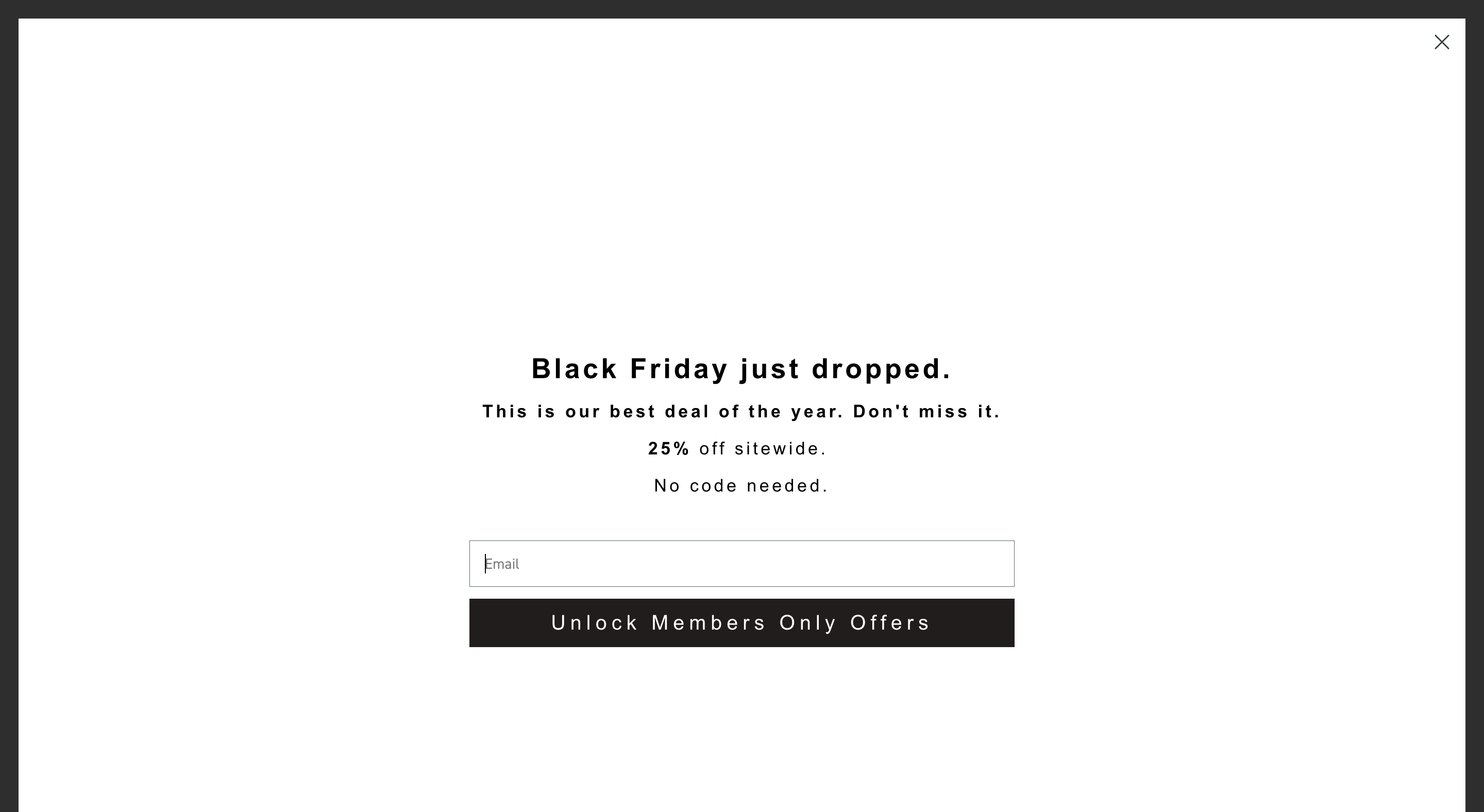
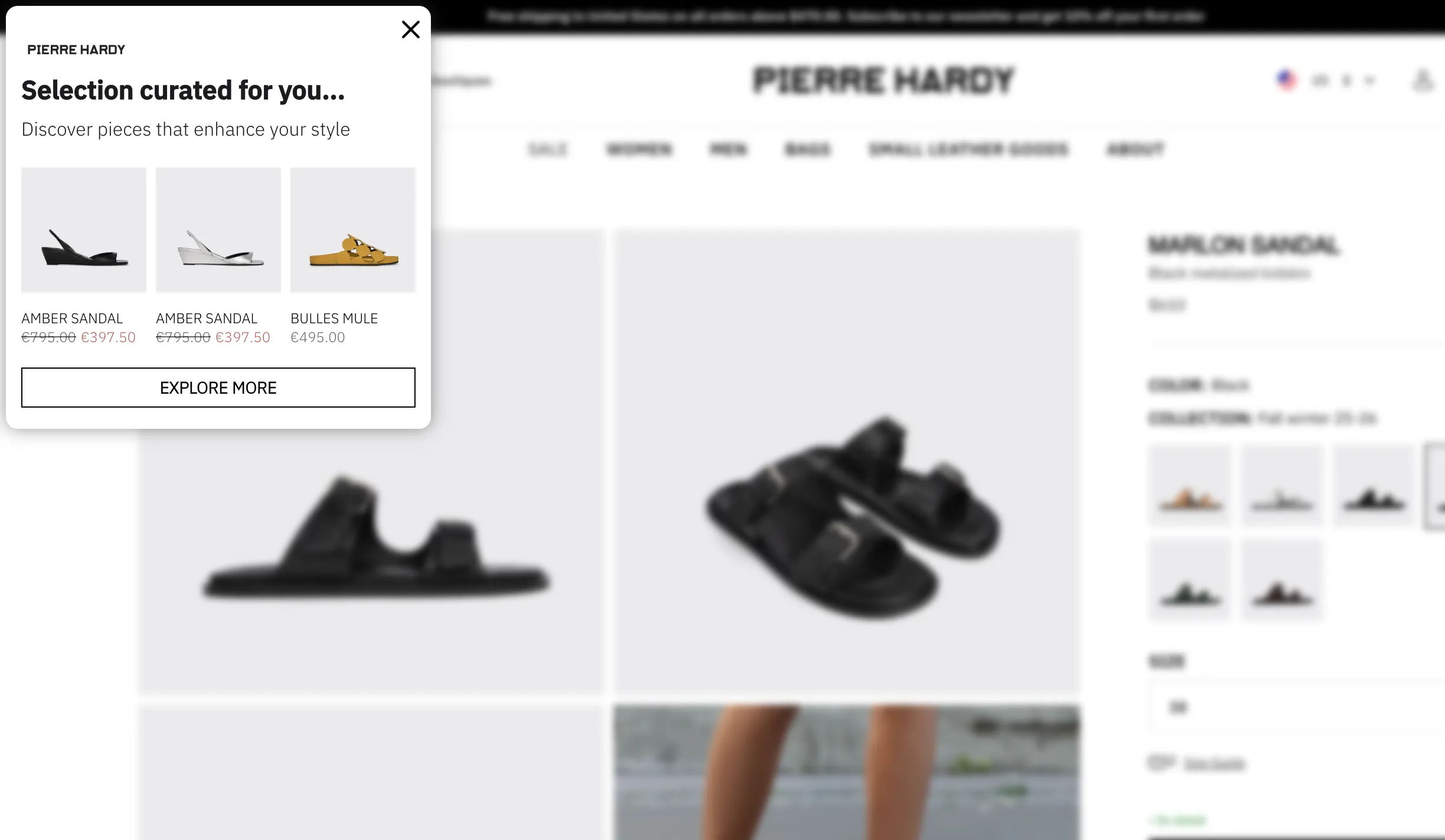
Next—
This one from Pierre Hardy is great—the hero image creates premium context while the stark black-and-white text hierarchy makes the 10% offer immediately scannable:

Another great example—
Atelier D'amaya lets its regular visitors know about a time-limited offer where they can get more loyalty points and a €15 voucher for buying over €100. Note how clear the offer is!

Takeaway:
Start your popup experiments by adding specific numbers or savings (like “Get $20 off your first order”) because they consistently outperform emotive language, driving more revenue.
Inspiration: 50 examples of website popups
8. Add short, numeric codes in discount popups
Numeric discount codes that can be copied or applied to the cart feel like a concrete reward—specific, and claimable, so it's no surprise they perform very well in ecommerce popups.
In fact, short, presenting numeric discount copy (e.g., "DISCOUNT10" or "15OFF") upfront boosts visitor engagement with popup to up to 20%.
Moreover, this best practice also applies for mobile popups—it recovers an additional 8–14% of mobile shoppers who were about to leave.
Here's some data from multiple markets:
United States: Messaging focused on numeric discounts boosted engagement +18% compared to generic or emotional copy
Germany: Numeric headlines lifted engagement +6–16% vs. empathetic tones, which even cut engagement by about 20%
Switzerland: Conversational exit copy generated up to 70% lower attributed revenue compared to numeric disconuts
France: Upfront discount messaging lifted engagement +11%, while the conversational variant reduced revenue per visitor by about 26%.
Let's see how online businesses are using this best practice for popup campaigns.
In this campaign, a jewelry brand on Shopify shares a code for free delivery, making the discount field just as big as the headline. Also, note that the discount is copyable:
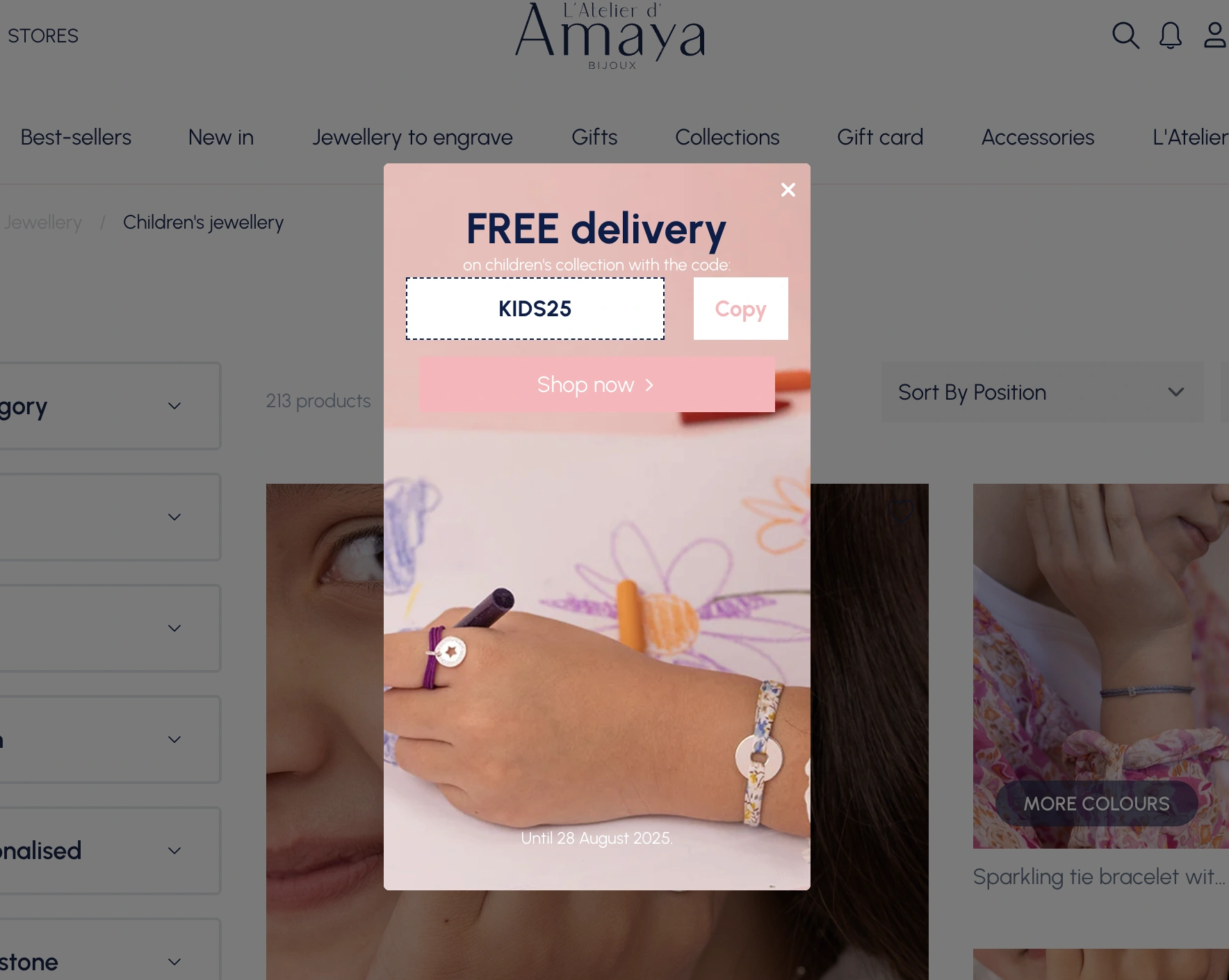
Next—
Look how well the popup explains the three tiered discount levels and shares the codes—that's a great popup practice to encourage higher spending:
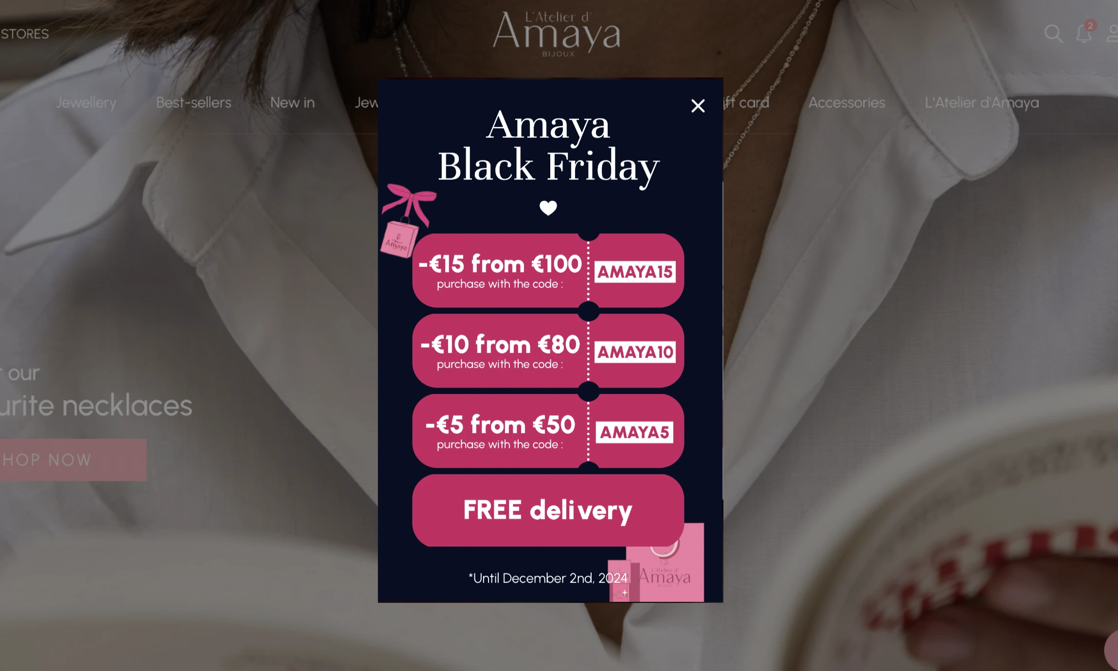
Takeaway:
Consider adding discount codes directly in your popups presenting time-limited offers and sales.
Short, numeric or alphanumeric codes (like SALE10 or 15OFF) feel concrete and easy to redeem, which increases visitor engagement and sales.
This can be done in two ways: by adding discounts manually or integrating your popup software with your Shopify account and syncing your codes from there.
9. Make exit-intent popup copy direct and clear
When it comes to cart recovery with popups, direct copy and numeric discounts ("10% OFF") also beat longer, playful and empathetic copy (e.g. "We know you love these items!").
In fact, numeric discounts received up to 27% more clicks and produced higher overall visitor engagement in our research.
With that said, empathetic copy still remains a great practice, especially if it's in line with your brand voice guidelines. We think that both approaches capture attention, but clarity and immediate savings messaging should be tested first.
This cart recovery popup below (it achieved an average CTR of 11%) shows both of these approaches in action. The playful copy is paired with a copyable discount code and a countdown timer to drive a sense of urgency:

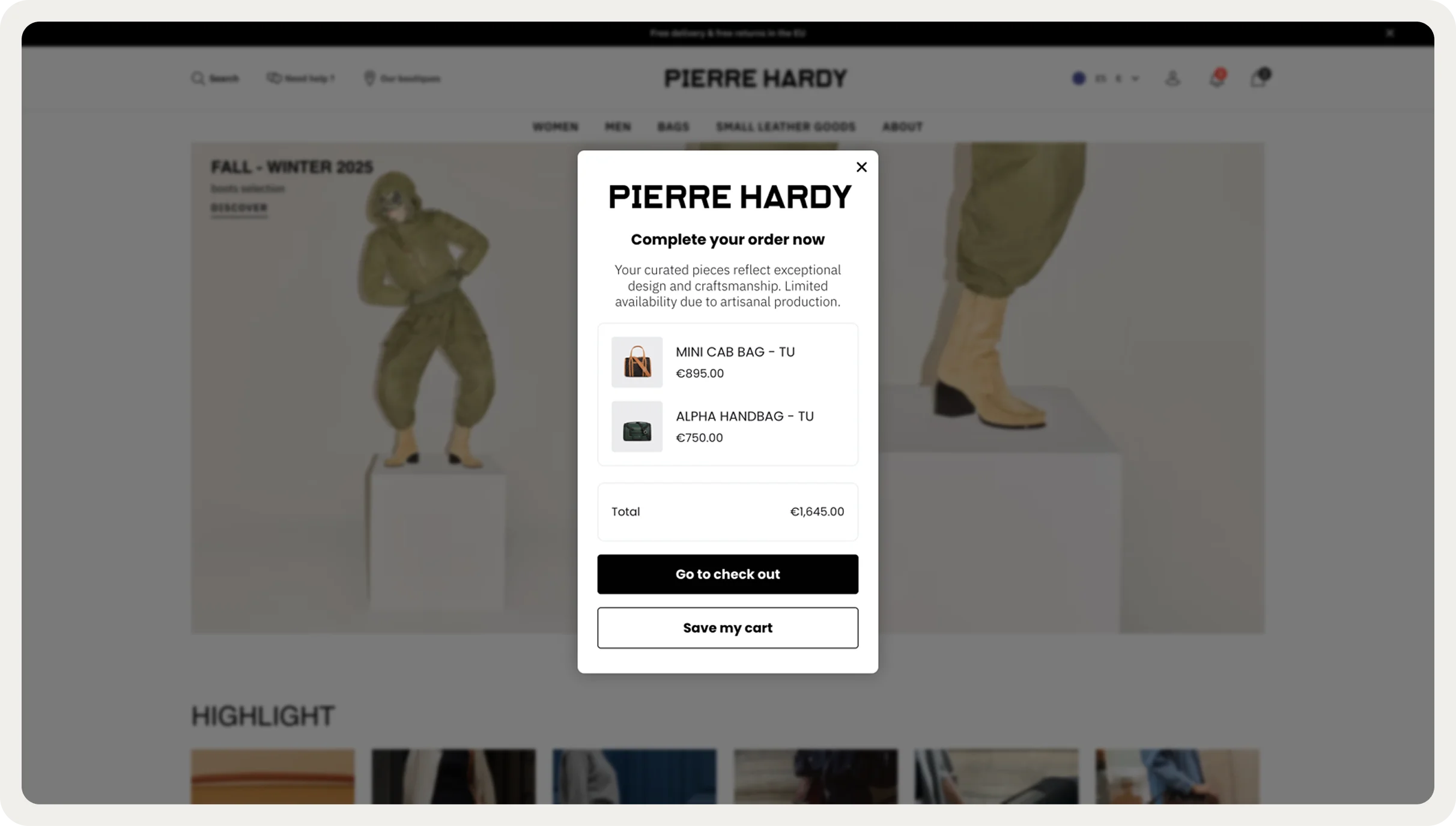
And here is a example of a clear and direct copy—
Pierre Hardy, a well-known French designer brand, offers product recommendations on exit. Just two super short sentences and a few personalized product suggestions:
Expert tip:
For your cart abandonment popups, add a countdown timer for no more than 24 hours to encourage shoppers to act. Countdowns are proven to boost website conversions—our study showed rates increase from 4.6% to 7.3% during sales.
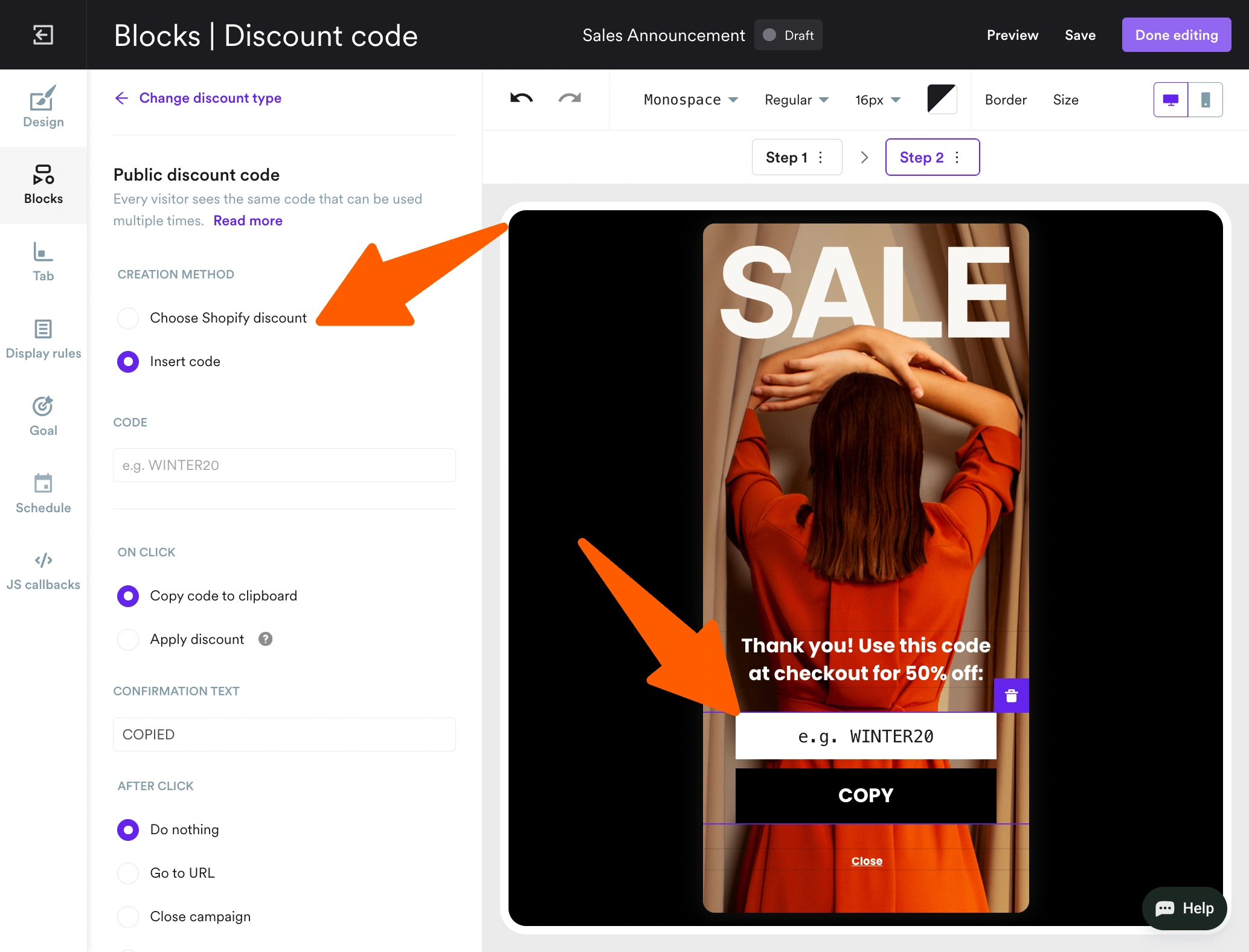
Micro-commitments and simplified forms
This is easily one of the most counterintuitive results of our research: adding steps to a form can increase conversions but only if the first step is a micro-commitment.
Note:
A micro-commitment popup design is a multi-step, conversational design with a simple question or action (presented as quick-tap buttons) the main offer in the second step. The idea behind this popup design is simple: once a visitor says “yes” to something small, they’re more likely to click “yes” to the main offer.
10. Add a yes/no micro-commitment question to the first popup window
This design really works for ecommerce and SaaS free trial popups—
Micro-commitment popups increased interactions by 8–9x and doubled signups while keeping bounce rates stable.
This works for increasing website conversions because micro-commitments lower the perceived cognitive load and create a sense of progress.
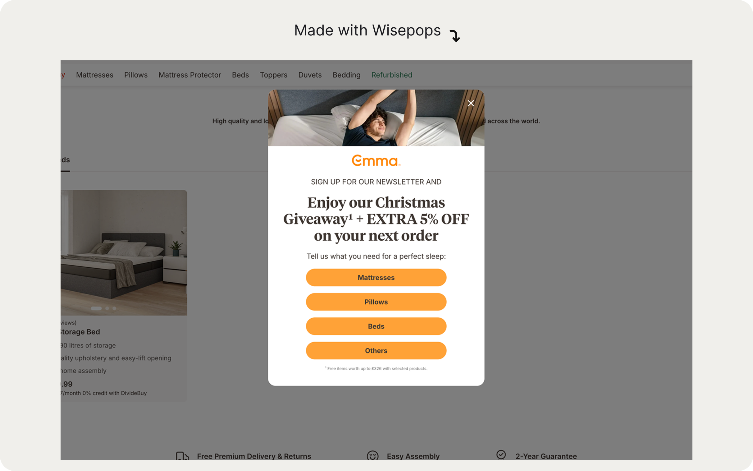
We noticed that more and more ecommerce brands are using the micro-commitment design to combine lead capture and data like product preferences. This popup format should become one of the best ways improve popup conversion rates on ecommerce sites in 2026.
Example:
Emma Sleep uses the micro-commitment, multi-step campaigns to promote their seasonal giveaways and first-order discounts:
Here's another example from Death Wish Coffee, one of the top brands on Shopify—the first window just requires one tap:


Expert tip for your popup marketing strategy:
If you're not using a micro-commitment format and want to improve conversions, consider simplifying your first screen in your popup.
Removing non-essential fields and showing a text-only first screen with a single signup field or button can improve conversions and engagement without increasing bounce.

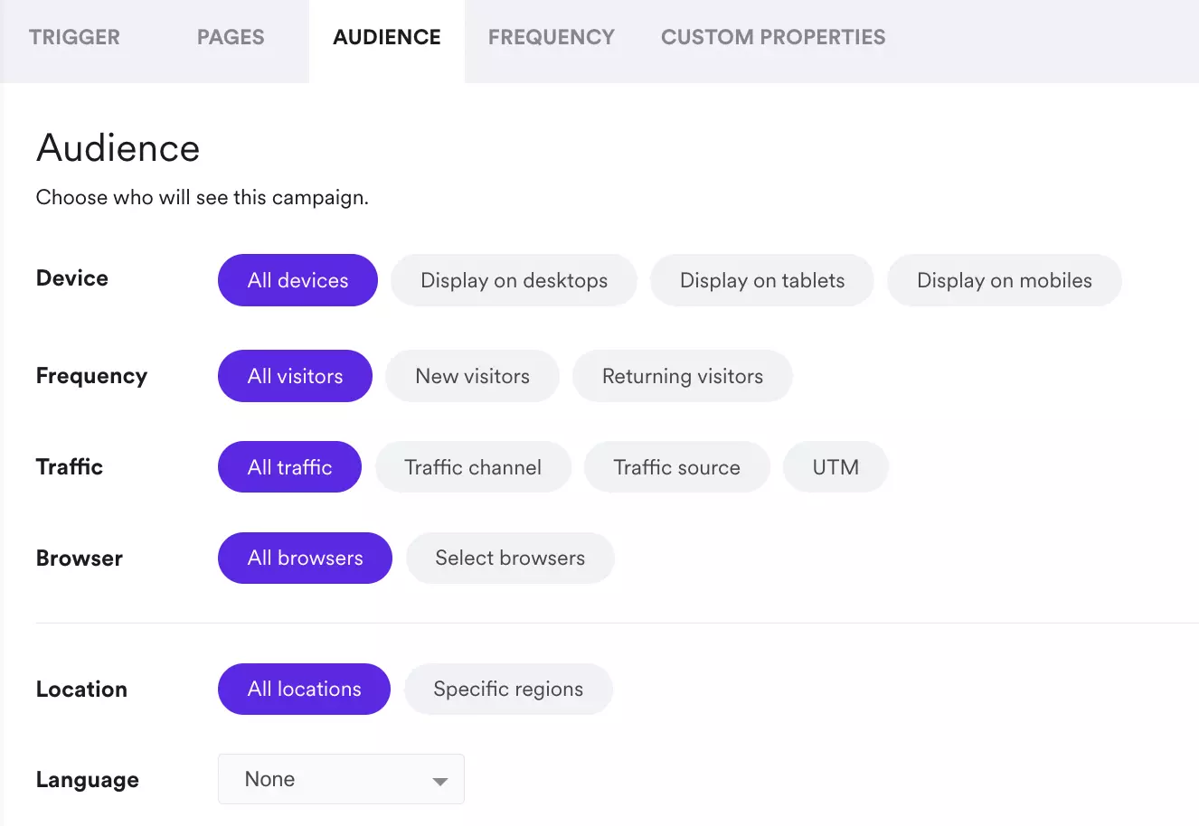
Targeting visitors by website behavior and URL
Behavioral and URL-based targeting is one of the best ways to show the right message to the right visitor and personalize your onsite marketing.
11. Tailor messaging to each page in the customer journey
Different pages signal different buying intent levels, and your popup marketing strategy should reflect that.
Here are a few best practices based on our research:
Homepage: Visitor intent is lowest. Use top-of-funnel popups here: email capture, welcome messages, or product recommendations. Consider a 10–50s delay or a one-page delay before showing
Product page: Visitor is researching. Use engagement popups (bestsellers from the same category, free shipping codes, related products) or incentive-to-add-to-cart messaging. Use page-level targeting to set up
Cart page: Visitor is very close to the buying decision. Exit-intent popups for abandonment recovery , product recommendations, and additional incentives are campaigns to consider at this point.
Second and subsequent visits. The visitor is now a customer. Use the "returning visitor" targeting to request reviews, promote your loyalty program, or share post-purchase upsells (e.g., "Items related to your last order"). If you're on Shopify, use targeting by purchase history, last order or visit date, or even customer name and location to create personalized offers
Let's see these best practices for popups in action.
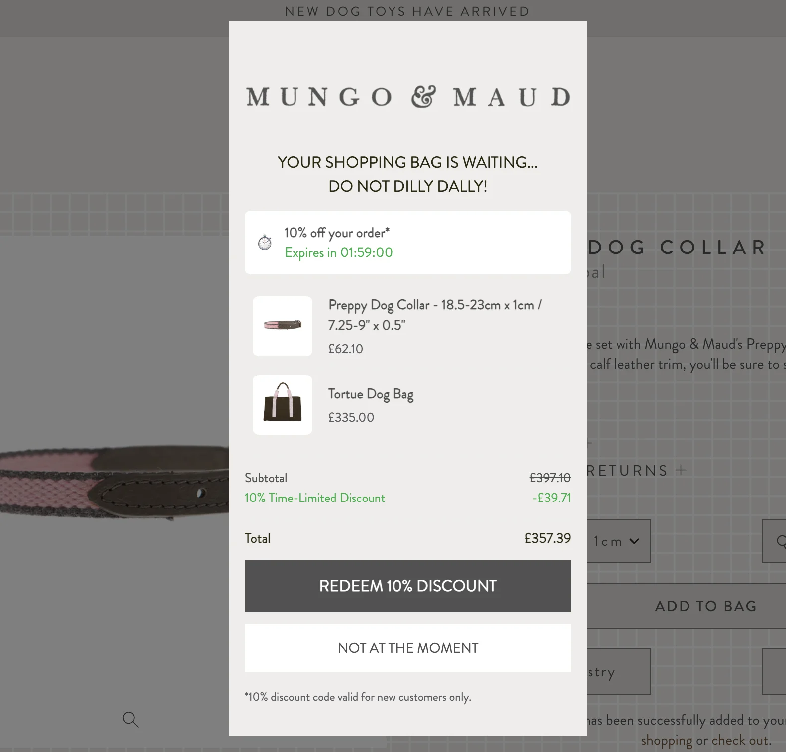
Mungo & Maud shows this cart recovery popup on the cart page to engage leaving visitors:
Next—
Makerflo used URL targeting to show a bundle offer only to visitors browsing products that qualified for the bundle. The popup appeared exclusively on those product pages, ensuring the offer felt relevant.
The results of applying this popup best practice were quite impressive: a 22.9% click-through rate, with 14.7% of those clicks leading to orders:

Note:
Set your new-customer discount popup to never show to a returning visitor who has already used it. There's a serious risk of repeat-visitor average order value drop due to offer fatigue.
Choose your frequency settings in your popup tool:
12. Target visitors based on browsing and shopping behavior
There are many more browsing-related targeting settings that will make your popups relevant, personalized, and more effective at generating clicks, leads and sales..
Here are some ideas on how to use popup triggers to personalize your marketing messaging:
Targeting option
Visitor behavior
Why show popups at this moment
Time on site
Visitor has spent 2+ minutes browsing
They're engaged with your products and ready for more conversion-focused messaging
Page visited
Visitor has viewed 3+ products
They're considering a purchase and showing some purchase intent.
Page scroll depth
Visitor has scrolled to 50% of page
They're interested in your website and actively engaging.
Visitors from email campaigns
Traffic source: email campaigns with UTM links; specific Klaviyo subscriber segments
These visitors arrived because they know your brand and products
Visitors from paid ads
Visit to your website from a specific paid ad campaign
They've shown some interest by clicking your ad, making them prospects.
Number of items in cart
Visitor has 1+ items in the shopping cart
They're more likely to buy or are saving items for later, so they may need a final nudge to complete checkout
Number of total orders
Customer has placed 3+ orders
They're a repeat customer that requires special treatment, exclusive offers, and loyalty perks.
Second visit
Visitor returned after leaving your site without taking any action (subscribing to newsletter, buying, etc.)
They're considering a purchase because they returned, so they need a special offer or proof that being a loyal customer has many perks
There are many more other targeting settings, especially ecommerce-focused, so you'll definitely find one that fits your CRO strategy.
Let's see some examples now.
Here's an upgrade offer shown only when a visitor adds an item to the cart:

Next—
This campaign promotes a bestselling item from the same category the visitor is browsing. It achieved a higher-than-average CTR of 6.8%, redirecting hundreds of visitors to the bestselling protein mix:

Next—
This campaign targets a repeat customer with a personalized offer including a free item. Note that the popup includes a minimum order threshold—this is how the brand encourages a higher-value purchase while still rewarding loyal shoppers:
Expert tip:
Activate targeting options for ecommerce in your popup platform to unlock deeper personalization of your popups.
Example:

Incentive structure and offer strategy
In our research, we also found a few important insights into using discounts and offers without eroding margins and overall revenue.
13. Tie all incentives and free items to minimum spend thresholds
Unconditional incentives like discount codes, free gifts, or bundle offers can attract deal-seekers and erode your margins very quickly. It's simple: with no purchase minimums, these offers attract many bargain hunters who wouldn't have bought otherwise.
A couple of examples from our tests:
#1:
Instant on-screen coupons in popups (e.g. "Enter code SAVE20 to get $20 off your first order") raised email capture by 14% in a few high-traffic A/B tests but decreased the average order value by almost 20%.
#2:
An upsell popup shown to all visitors with a code to get a free item reduced AOV by 11% and per-visitor revenue by 13%.
To improve popup conversions on your ecommerce site, use this best practice:
Tie all incentives to minimum spend thresholds or bundle requirements. This keeps your profit margins good while still capturing sales.
Good examples:
"Free shipping on orders $100+" (20% lift target) or "Spend $120+, get 15% off" (creates clear $40 upsell opportunity)
"Free delivery on purchases over $300" or "Spend $400+, get free delivery and assembly"
"Free premium pillowcase with duvet purchase ($150+)" or "$20 off when you bundle sheets + comforter"
Bad examples:
"Free tote bag with any purchase" (no AOV lift, attracts bargain hunters)
"Free candle with any order" (doesn't align with purchase value)
"Free pillowcase with any purchase" (no minimum, erodes margins on smaller orders)
Let's see some popup examples with this best practice in action.
Here's a free battery upgrade offer for buying one of two specific products (bikes). Note there's a link to learn more about the offer, meaning that the upgrade is not available for any purchases:
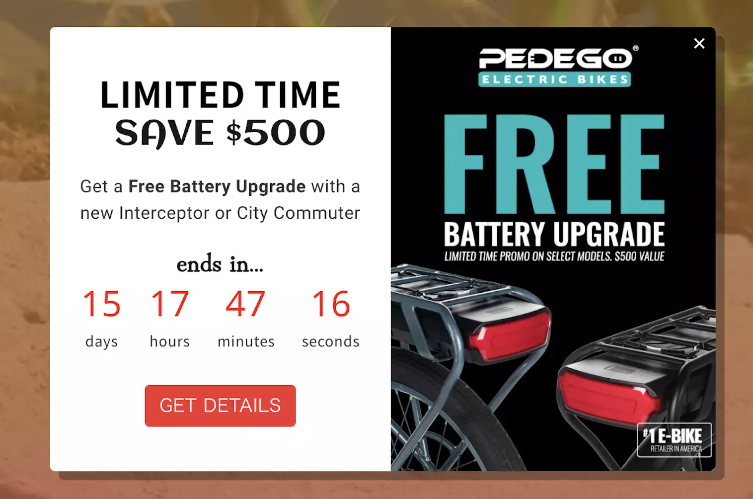
Protect your margins and sell more:
14. Focus more on concrete rewards rather than percentage discounts
This best practice is pretty straightforward: customers instantly understand the value of "Get a free pillow with purchase above $80." But offering a 5% discount may create a bit of friction. Some may calculate the savings in their head (especially when researching prices on multiple stores), hesitate, and move on.
Here's our research data to support this popup best practice:
Free-gift incentives captured emails 59% more effectively than 5% discounts for the first order
Cash-value rewards drove 19% higher revenue per visitor on average versus double loyalty points and codes for next purchases
Numeric discount codes (e.g., "WELCOME10") consistently outperformed conversational messaging (e.g. "Hey, want a little something off your first order?") by 10-40% on visitor engagement
What works:
"Limited-time free shipping on $100+ orders"
"Free pillow with duvet purchase"
"Spend $120+, get 15% off + double loyalty points"
Numeric codes like "WELCOME20" paired with clear savings amounts
What doesn't:
"Get 5% off by signing up" (vague, may require mental math)
"Save big, browse our sale" (meaningless without extra context)
Fixed percentage discounts without a threshold (attracts bargain hunters, erodes AOV)
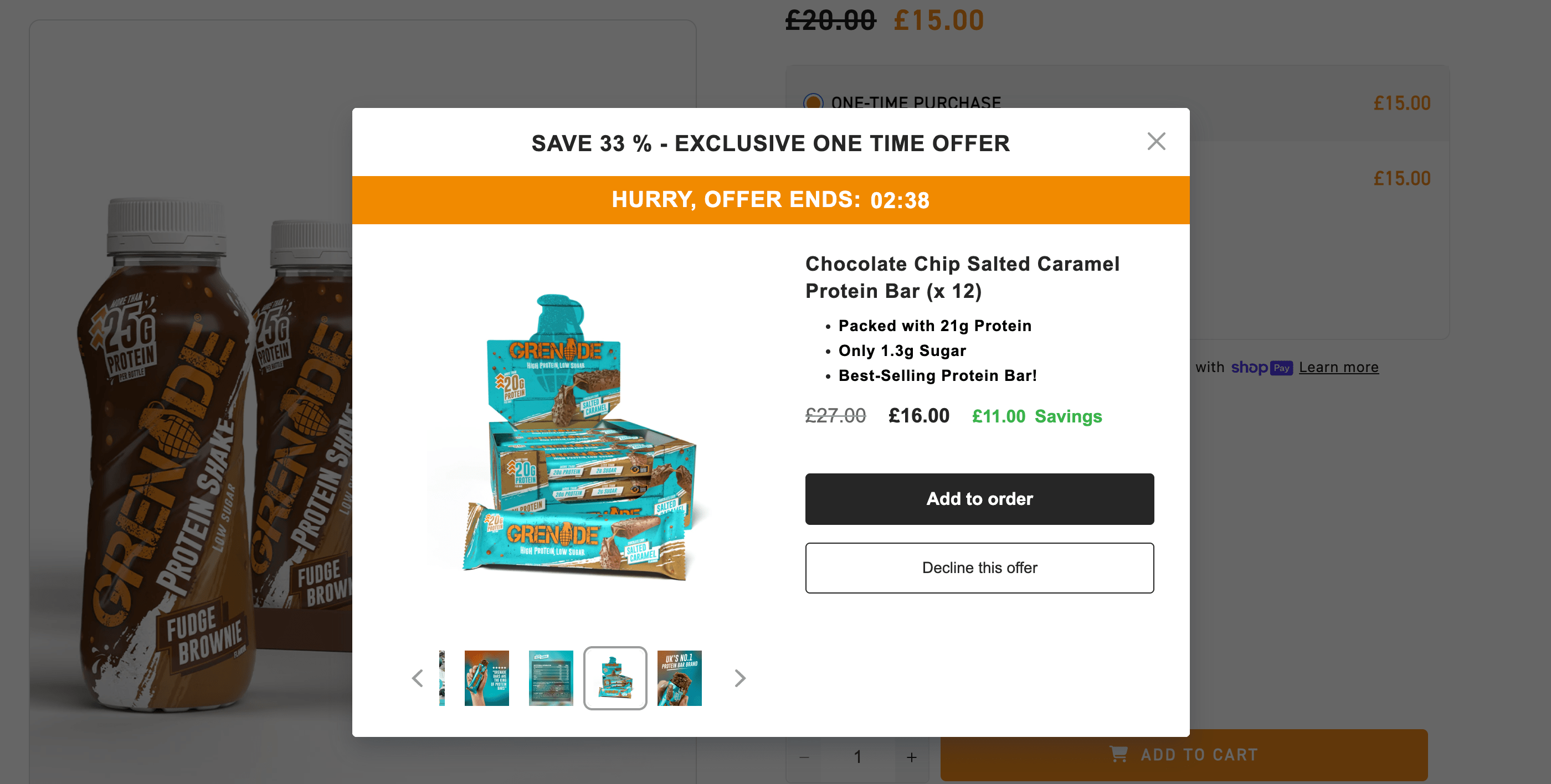
Here's an example:
Grenade uses this best practice for website popups in their upsell offer—we understand exactly what we're getting right away:
Next—
This lead generation campaign offers a free item instead of a discount (that's a good idea for A/B testing popups for ecommerce, btw):
Next—
This product promotion popup, although a bit wordy, clearly describes the conditions of the limited-time offer:
Takeaway:
To make your ecommerce popup copy convert more, be specific with your incentives. "15% off orders $50+" wins over "Get a discount" because visitors know exactly what they're getting.
Mobile popup best practices
Mobile traffic often represents 50%+ of ecommerce volume, yet many popups are designed only for desktop viewing.
15. Hide non-essential elements on mobile to improve conversions
Large hero images extra signup fields can easily eat up screen real estate and force visitors to ignore and close your campaigns right away.
In fact, our data shows that:
Popups with large images on mobile reduced revenue per visitor by 40% in several high-traffic tests
Removing non-essential form fields boosted sign-ups by 2-3× with no bounce change
Follow these mobile best practices to convert more visitors:
Choose to hide the blocks with images; keep text-focused designs
Remove video and gifs; use static images or remove visuals
Reduce form fields to email only (add phone number and other fields to second or third window if necessary)
Use shorter headlines; make the CTA button larger to make it easier to tap
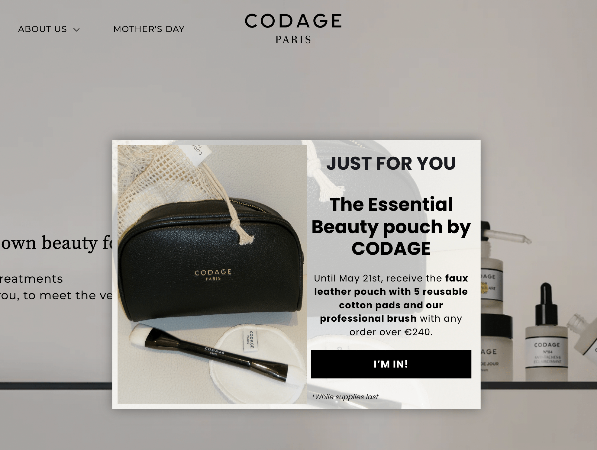
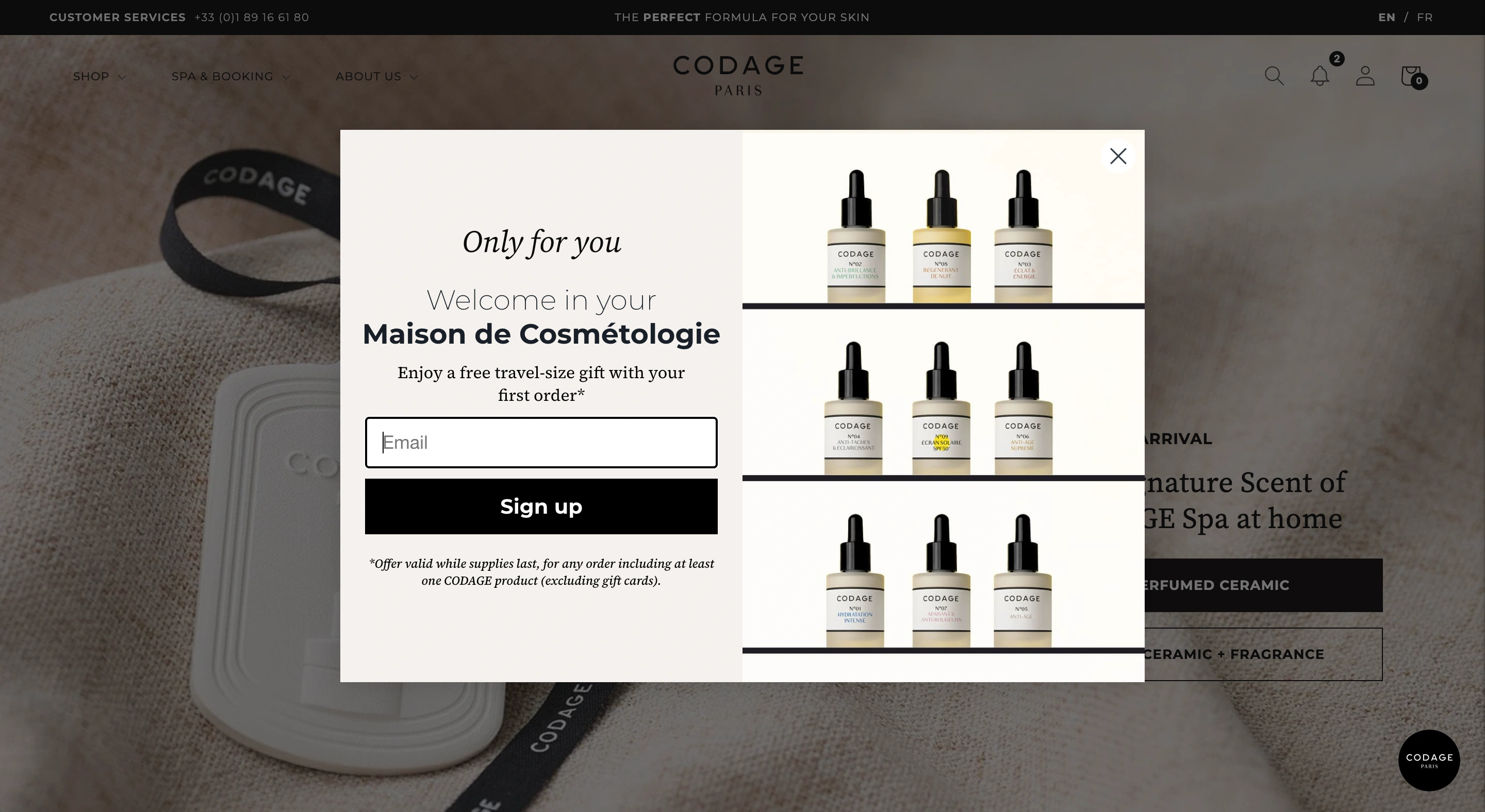
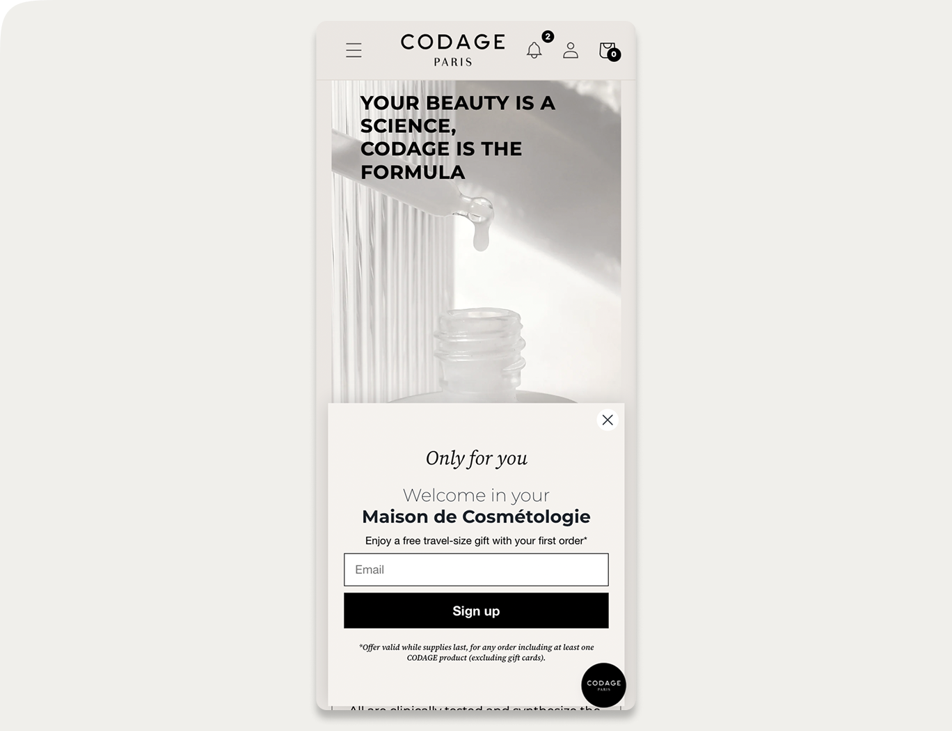
Here's a good example of how different desktop and mobile popups should be to ensure positive visitor experience.
On desktop, the email capture campaign from CODAGE looks like this (note the large image with products):
And—
Look at the mobile design of the same campaign. The image has been removed to make the text more readable on smaller screens:
Expert tip:
Use your popup builder’s visibility controls to hide certain elements (such as large images) on mobile. In Wisepops, for example, you can do this by selecting the element and choosing which platforms it should or shouldn’t appear on:

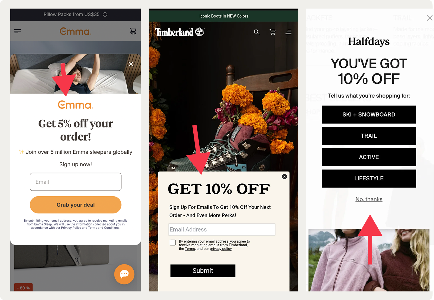
16. Test mobile popup formats: narrow/tall vs. wide/short layouts
Our research shows that the layout of mobile popups matters more than we previously thought.
Here are the two most important results:
#1:
Narrow/tall popup designs (portrait-style) and wider/short designs (landscape-style, compact) lifted engagement by 40-84% in tests, with some reaching +83% CTR without increasing bounce rates.
#2:
Wide bottom banners raised bounce by 7-15% and reduced revenue in ecommerce tests
The key best practice here is that we shouldn't assume one mobile format works for every campaign goal.
We advise you to test both orientations and placements on your audience. You might find that a tall, centered popup converts better for email capture while a nice, banner-type popup at the bottom of the screen hurts conversions.
Most popup tools let you preview and A/B test these layouts easily.
Example: in Wisepops, you can preview all campaigns on mobile in one click:

Here are a few examples of different mobile popup layouts online businesses use: centered, at the bottom, and on the top:

A/B testing popup elements
I mentioned A/B testing a few times, but we really can’t overstate how important this popup best practice is. The thing is, even a small change can make a difference, so testing popup design and offers to find the best versions is a must.
17. Prioritize your A/B tests by expected impact on conversions
Deciding which elements to test in your popups can be challenging, especially when you're running multiple campaigns.
I suggest start with the variables that can have the biggest measurable impact:
Variable
What to test
Observed range in our studies
Timing
10–50s delay vs. 2-page delay
20–45% variance in bounce rate; 20–43% lift in email capture
Copy
Numeric discount ("15% off") vs. FOMO-driven ("Don't miss out") vs. benefit-focused ("Free shipping")
10–30% variance in engagement; 8–15% variance in revenue per visitor
Design layout
Full-screen vs. exit-intent; centered vs. cornered
40–150% variance in CTR; 48–52% lift in email/phone capture (on desktop)
Structure
Multi-step with micro-commitment vs. single direct form; field count optimization
100–300% variance in signups; 2–3× engagement improvement; micro-commitment increased interactions by 8–9x
CTA button
Color, text, size, placement
5–20% difference in clicks
Incentive type
Tangible (free item, free shipping, etc.) vs. percentage discount
59% higher contact capture for tangible; 19% higher revenue with monetary/percentage discounts
Improve your popup performance:
18. Reach statistical significance with proper sample size
You need at least 500 interactions per variant before results matter. At 100 clicks, for example, the results are unreliable at best.
Timeframes to reach 500 interactions per variant:
High-traffic sites (10K+ daily visitors): 2–3 days
Moderate-traffic sites (2–10K daily): 1–2 weeks
Low-traffic sites (under 2K daily): 3–4 weeks
Also, consider using a control group for your tests (meaning adding a group of visitors that will not see your campaign). Without it, you can't tell if lift came from your popup or from a traffic spike that happened anyway.
Use our statistical significance calculator to make sure your traffic is enough to measure real impact:
Calculator
Results
Variant B vs Variant A (Control)
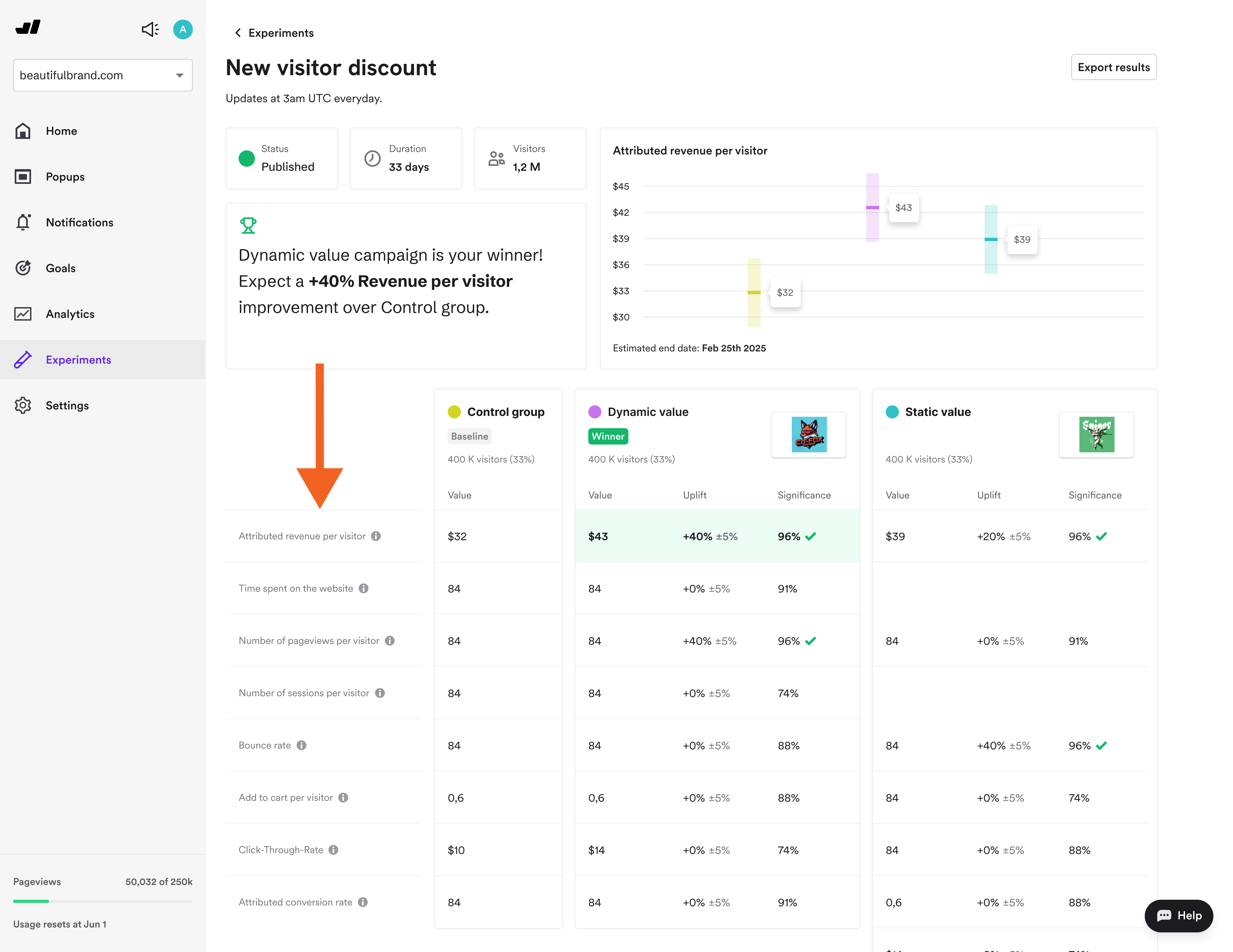
19. Measure attributed revenue, not just engagement
This advanced best practice for popups is about measuring attributed revenue, or the downstream conversions tied to the visitors who engaged with your campaigns.
Set up a control group (33% of traffic sees no popup, for example) and compare these in your results report:
Incremental revenue: visitors who have seen the popups vs. control group
Average order value: this helps define if the popup attract discount-seekers or real buyers
Attributed revenue per visitor: how much each visitor spent after interacting with your campaign
Here's an example of a popup A/B test result with a control group (from Wisepops Experiments):

Learn more about popup A/B testing with control groups:
Segmentation by customer intent
Not every visitor should see the same popup. Here are the popup best practices for customer segmentation to improve personalization on your website.
20. Target browsing visitors with top-of-funnel email capture
"Browsers" (homepage, first visit, low engagement) can be engaged with a campaign like this:
Offer: Email capture ("Get exclusive updates + 15% off")
Format: centered, delayed 30s
Copy: Benefit-focused, not discount-heavy
Expected capture rate: 8–15%

21. Engage researchers with educational popups
Consider this design for "researchers" (visiting product page, 2+ products viewed already, 2+ minutes on site overall):
Offer: Engagement nudges ("See reviews," "Try our product quiz," "View the bestseller")
Format: Slide-in or cornered, non-blocking
Copy: Informational, not pushy
Expected engagement: 15–25%
Example:
This campaign guides visitors to a product quiz to help them choose the best coffee blend based on their preferences. It appears only on product pages to ensure relevancy:

22. Use exit-intent campaigns for cart abandoners
And for "cart abandoners" who added at least one item to cart but leaving the site, consider these best practices for exit popups:
Offer: Exit-intent discount ("SAVE15" or "Free shipping") or scarcity-based message
Format: Centered popup or cornered lightbox; with countdown timer
Copy: Direct, numeric, time-sensitive
Expected recovery: 5% of abandoned carts
23. Show VIP treatment to loyal repeat customers
Loyal repeat customers (3+ purchases, known high LTV)
Offer: VIP access, loyalty rewards, early access to sales, helpful holiday gift guides
Format: cornered, half-screen, or centered popup
Copy: "You're invited" messaging, not "Get a first-order discount"
Expected engagement: up to 20% (higher intent audience)
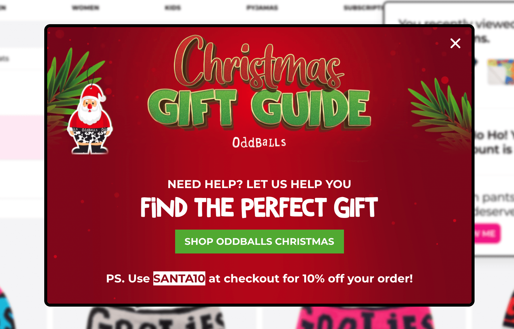
Example:
This campaign from a popular UK-based lifestyle brand offers help with finding a perfect Christmas gift and gives 10% off as a token of appreciation. With 53% of Christmas shoppers in the UK saying they find choosing gifts difficult, this campaign can indeed be helpful for many:
Expert tip:
Use ecommerce targeting setting in your popup platform to choose exactly what you define as "loyal" customer.
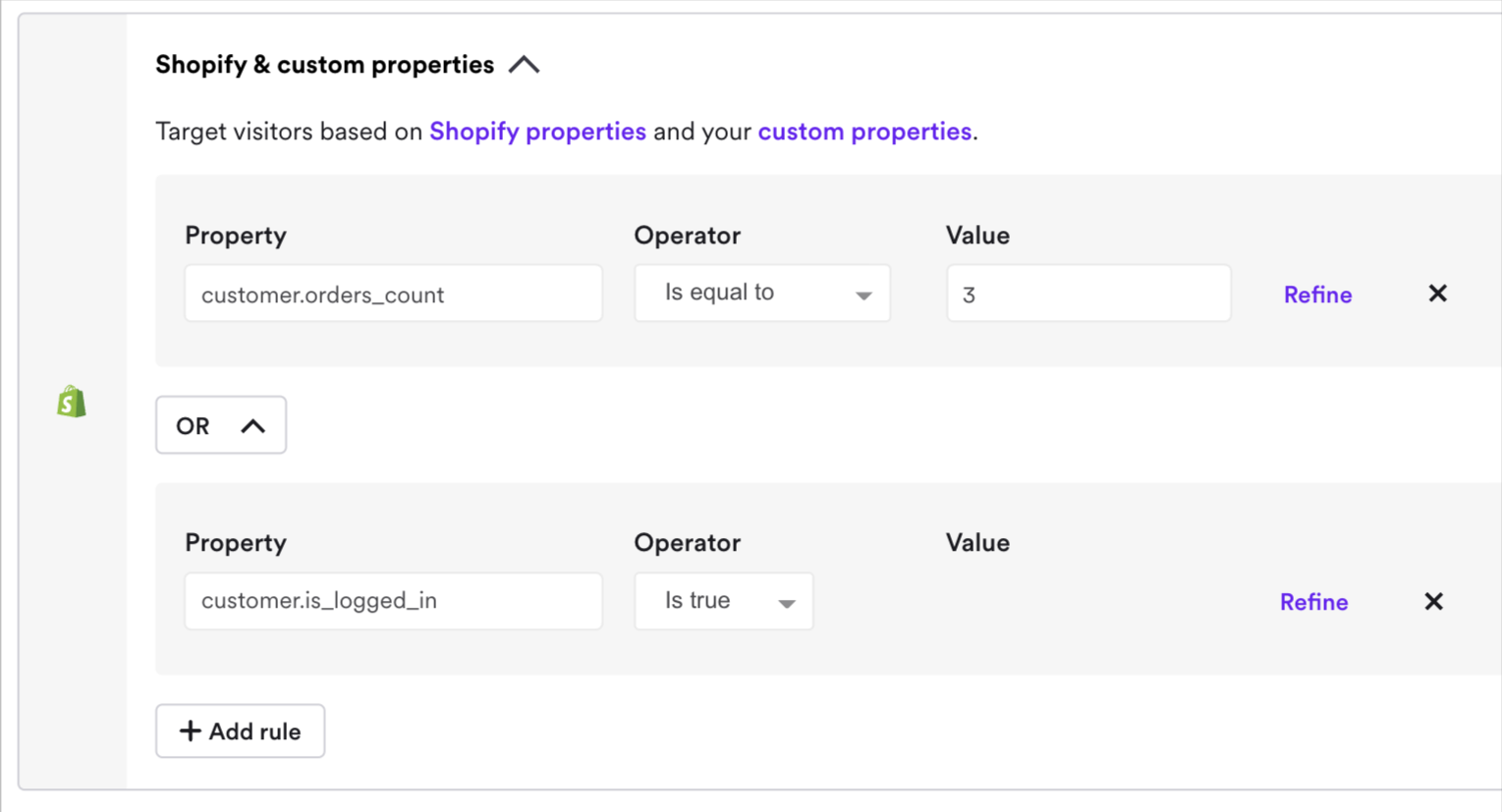
Example:
Shopify-specific popup campaign settings with an offer for customers who logged in to their accounts and previously made three purchases:
24. Show the right offer at the right customer stage
Just like every other part of your ecommerce marketing plan, your popup strategy should be planned for every customer lifecycle stage.
These are the essential lifecycle stages to consider for customer segmentation with popup platforms if you're ecommerce:
New visitor (first visit): Goal is email capture + brand familiarity. Offer 10–15% discount or free shipping. Timing: anywhere between 10 and 50s delay or on second page after 10 seconds
Returning visitor (visited 2–5 times, no purchase): Goal is convert to first purchase. Offer 15–20% discount or free-shipping incentive. Timing: Exit intent or 10 seconds after landing on product pages
First-time buyer (just purchased): Goal is to deliver some post-purchase engagement and encourage a repeat purchase. Offer loyalty signup, review request, or complementary free shipping for orders over a certain amount. Timing: Second or third visit after purchasing; after landing on product pages
Repeat buyer (2+ purchases): Goal is increase order frequency + average order value. Offer loyalty rewards, member-only discounts, or early-access sales. Timing: On homepage or quarterly (not weekly—avoid fatigue).
At-risk (high LTV, but hasn't purchased in 60+ days): Goal is win-back. Offer "We miss you—20% off your next order". Format: Email + retargeting ad (not on-site, unless they return)
Let me show you a great example of segmentation for returning visitors and existing subscribers in ecommerce.
OddBalls, a lifestyle brand on Shopify, had two similar yet strategically different gamified campaigns for building email list and sales in preparation for the shopping season.
The first popup campaign was displayed to returning visitors (both on mobile and desktop, of course)—since the main goal was to capture emails, it offered a 10% discount and had only one signup field:

The second campaign's goal was to get sales, so it was displayed to existing subscribers who who made at least one purchase.
The popup's design made sure the visitors could get the discount easily.
It:
Had bigger discount (20%)
Didn't have signup fields
Let shoppers spin the wheel with a single click
Here's the design:

The results of this popup strategy (also note that it was published in preparation to the holiday shopping season):
2.1K new subscribers
25.3% overall CTR
558 conversions
£31,443 in revenue generated

The "Spin to Win" campaigns not only grew our list but also generated immediate sales and positive brand engagement. By gamifying email capture and promotions, we transformed routine processes into delightful interactions that drove real results. These insights will shape our future marketing strategies, encouraging us to explore more interactive ways to connect with our audience.
OddBalls
Takeaway:
Automate customer segmentation and personalization through your popup platform with audience targeting to align your campaigns with visitor's lifecycle stage.
Review the audience targeting settings in your popup tool to see your options:
Metrics to track and ROI calculation
Follow these best practices to actually measure the performance of your campaigns and present real numbers on every aspect from clicks and revenue per visitor.
25. Track the essential six metrics
Your popup tool's analytics dashboard is your source of data about the performance of your campaigns. Using analytics on a regular basis to check and improve performance is a must-do best practice for businesses running popups.
Displays. How many times visitors saw your campaign. If a popup shows 10,000 times but gets zero clicks, the offer or timing should be adjusted
Clicks. This shows the count of times when visitors clicked CTA buttons in your popups (this metric defines how engaging they are)
Reach. The percentage of sessions where at least one campaign appeared. If you're running multiple campaigns with different triggers, this metric tells you how often visitors see any of them. Low reach might mean your triggers may be too specific (which also might be good, depends on CTR and emails captured). High reach means your campaigns cover most visitor journeys. The reach of 30–50% is good if you're running several campaigns and higher is good if you're running one or two
Click-through rate (CTR). Clicks divided by displays as a percentage. Most popups average 4% CTR. Good ones hit between 8 and 20%. If CTR is less than 1%, timing, copy, or targeting needs adjustments
Emails captured. New email addresses from campaigns. Pay attention to both the raw number and the conversion rate. 20% signup rate on 100 visitors is better than 5% on 1,000, for example
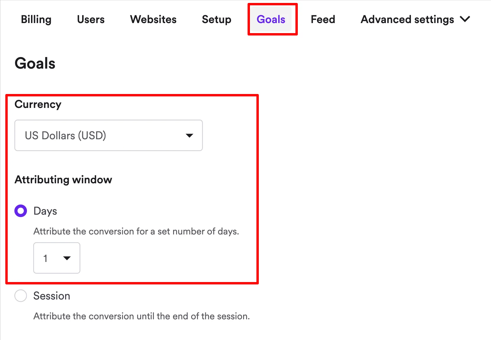
Attributed revenue. Revenue directly connected to campaign interactions. This is what proves the popup had an impact on your revenue. Most ecommerce popup tools track revenue automatically (although you'll have to choose your currency and attribution window first).
You can track all of these metrics and more in your popup platform's analytics and export them in CSV format for further analysis:

26. Measure advanced ecommerce metrics for deeper insights
CTR and emails captured are essential metrics but since we're talking about the best practices to maximize your conversions with popups, I'll cover a range of advanced ones that help understand the real, full impact of your campaigns.
Note that these metrics become available only if you run A/B tests with your campaigns.
Attributed revenue per visitor. Revenue directly tied to your campaign (within your set revenue attribution window), divided by total visitors who have interacted with it
Time spent on website. How long visitors browsed after seeing your popup. If time on site drops, your popup might be driving visitors away. If it stays flat or increases, the campaign didn't disrupt the experience
Number of pageviews per visitor. How many pages visitors explored. A campaign that increases pageviews means it's guiding visitors deeper into your site and they explore more of your products
Bounce rate. Percentage of visitors who left without further action. If the rate stays flat or drops, the timing and positioning are working. If it spikes, reconsider when or where the popup appears
Add to cart per visitor. Items added to cart, averaged across all visitors. This measures purchase intent. A flat rate means the popup didn't push more people toward buying and a positive lift means you're moving visitors closer to checkout
Here's an example—
A popup A/B test with all of these advanced metrics and more:
Example of successful advanced popup A/B testing:
Nutrimuscle achieved 23,970 conversions, partly through A/B testing different incentives in welcome popups. Their three-step popup (email > phone > sport type > instant discount code +bestseller recommendations) was a part of the strategy that generated 7,600+ email leads with a 5.7% average CTR.

27. Calculate popup ROI
The best way to calculate the ROI of your popup tool investment is to track these metrics:
Revenue per visitor: how much each site visitors generated on average within 24-48 hours after engaging with your campaigns
Attributed incremental revenue: revenue directly driven by popup interactions within 24-48 hours, beyond baseline sales
Conversion rate: a percentage of visitors who complete the desired action (email signup, purchase, or form submission)
You can track these metrics and more uing the analytics and A/B testing features in your popup platform.
Wisepops, for example, tracks everything automatically—plus, you can choose your primary metrics to focus your A/B tests on:

Do you feel like your popup tool is reporting inflated attributed revenue numbers?
This guide can help solve that: the revenue attribution problem in popup software
Summary
Our popup research confirms that popups work, but only when built with the best practices in mind. In that case, you know what can work and why something may not be working.
If you'd like to learn more about popup strategies for conversions, consider these guides from Wisepops blog:
Get started
in minutes
Start converting more visitors today.
Get started in minutes and see results right after.