


50+ Website Pop-up Examples [+Templates for Conversions]


Read summarized version with
 ChatGPT
'%3e%3cpath%20fill-rule='evenodd'%20clip-rule='evenodd'%20d='M16.4875%200V6.06H18.75V14.6833H16.3042V20L10.44%2014.8383V19.9592H9.53083V14.8325L3.66%2020V14.6125H1.25V5.99H3.65333V0L9.53083%205.41167V0.158333H10.4392V5.56667L16.4875%200ZM10.44%207.53667V13.6358L15.395%2017.9975V12.0333L10.44%207.53667ZM9.52417%207.47L4.56917%2011.9683V17.9975L9.52417%2013.6358V7.47083V7.47ZM16.3042%2013.7867H17.8408V6.9575H11.2167L16.3042%2011.5742V13.7867ZM8.81917%206.88667H2.15833V13.7158H3.65833V11.5692L8.81833%206.88583L8.81917%206.88667ZM4.5625%202.06333V5.98833H8.825L4.5625%202.06333ZM15.5783%202.06333L11.3158%205.98833H15.5783V2.06333Z'%20fill='black'/%3e%3c/g%3e%3cdefs%3e%3cclipPath%20id='clip0_4212_18220'%3e%3crect%20width='20'%20height='20'%20fill='white'/%3e%3c/clipPath%3e%3c/defs%3e%3c/svg%3e) Perplexity
Perplexity'%3e%3cpath%20d='M9.996%2019.992C9.996%2018.6068%209.73182%2017.3074%209.19632%2016.0936C8.68224%2014.8798%207.96824%2013.8159%207.0686%2012.9163C6.16896%2012.0166%205.11224%2011.3098%203.89844%2010.7957C2.68464%2010.2602%201.38516%209.996%200%209.996C1.38516%209.996%202.68464%209.73896%203.89844%209.21774C5.11224%208.68224%206.1761%207.96824%207.0686%207.0686C7.96824%206.16896%208.6751%205.11224%209.19632%203.89844C9.73182%202.68464%209.996%201.38516%209.996%200C9.996%201.38516%2010.253%202.68464%2010.7743%203.89844C11.3098%205.11224%2012.0238%206.1761%2012.9234%207.0686C13.823%207.96824%2014.8798%208.68224%2016.1007%209.21774C17.3145%209.73182%2018.614%209.996%2019.9991%209.996C18.614%209.996%2017.3145%2010.2602%2016.1007%2010.7957C14.8869%2011.3098%2013.823%2012.0166%2012.9234%2012.9163C12.0238%2013.8159%2011.3098%2014.8726%2010.7743%2016.0936C10.2538%2017.327%209.98905%2018.6533%209.996%2019.992Z'%20fill='url(%23paint0_radial_4212_18233)'/%3e%3c/g%3e%3cdefs%3e%3cradialGradient%20id='paint0_radial_4212_18233'%20cx='0'%20cy='0'%20r='1'%20gradientUnits='userSpaceOnUse'%20gradientTransform='translate(-1.13275%205.96185)%20rotate(18.68)%20scale(21.2772%20170.46)'%3e%3cstop%20offset='0.07'%20stop-color='%239168C0'/%3e%3cstop%20offset='0.34'%20stop-color='%235684D1'/%3e%3cstop%20offset='0.67'%20stop-color='%231BA1E3'/%3e%3c/radialGradient%3e%3cclipPath%20id='clip0_4212_18233'%3e%3crect%20width='20'%20height='19.992'%20fill='white'/%3e%3c/clipPath%3e%3c/defs%3e%3c/svg%3e) Gemini
Gemini'%3e%3cpath%20d='M3.92888%2013.2962L7.86008%2011.0903L7.92585%2010.8981L7.86008%2010.7918H7.66782L7.01009%2010.7513L4.76369%2010.6906L2.81581%2010.6097L0.928632%2010.5085L0.453044%2010.4073L0.0078125%209.82039L0.0533475%209.52694L0.453044%209.25879L1.02476%209.30939L2.28962%209.3954L4.18692%209.52694L5.56309%209.60789L7.60204%209.82039H7.92585L7.97138%209.68884L7.86008%209.60789L7.77407%209.52694L5.811%208.19631L3.68603%206.78978L2.57295%205.98027L1.97088%205.57045L1.66731%205.18593L1.53577%204.34607L2.08219%203.74399L2.81581%203.79459L3.00301%203.84518L3.74674%204.4169L5.33541%205.64634L7.40979%207.1743L7.71335%207.42727L7.83478%207.34126L7.84996%207.28055L7.71335%207.05287L6.5851%205.01391L5.38095%202.93954L4.84465%202.07943L4.70298%201.56337C4.65239%201.35087%204.61697%201.17379%204.61697%200.956236L5.23928%200.111308L5.58332%200L6.41307%200.111308L6.76218%200.414875L7.27824%201.59373L8.11305%203.45054L9.40827%205.97521L9.78773%206.72401L9.9901%207.41715L10.066%207.62965H10.1975V7.50822L10.3038%206.08652L10.5011%204.34101L10.6934%202.09461L10.7591%201.46218L11.0728%200.703263L11.6951%200.293448L12.1808%200.526183L12.5805%201.0979L12.5249%201.46724L12.2871%203.01037L11.8216%205.42879L11.5181%207.04781H11.6951L11.8975%206.84543L12.7171%205.75765L14.0933%204.03744L14.7005%203.35441L15.4088%202.60056L15.8641%202.24134H16.7242L17.3567%203.18239L17.0733%204.15381L16.1879%205.277L15.4543%206.22818L14.4019%207.64483L13.7442%208.77814L13.8049%208.86921L13.9618%208.85403L16.3397%208.34809L17.6248%208.11536L19.1578%207.85226L19.851%208.17607L19.9269%208.50493L19.6537%209.17784L18.0144%209.5826L16.0918%209.96711L13.2282%2010.6451L13.1927%2010.6704L13.2332%2010.721L14.5234%2010.8424L15.0749%2010.8728H16.4257L18.9403%2011.06L19.598%2011.4951L19.9926%2012.0263L19.9269%2012.4311L18.915%2012.9471L17.5489%2012.6233L14.3615%2011.8644L13.2686%2011.5912H13.1168V11.6823L14.0275%2012.5727L15.6972%2014.0804L17.7867%2016.0233L17.893%2016.5039L17.6248%2016.8834L17.3415%2016.8429L15.5049%2015.4617L14.7966%2014.8394L13.1927%2013.4885H13.0865V13.6302L13.4558%2014.1715L15.4088%2017.106L15.51%2018.0066L15.3683%2018.3L14.8624%2018.4771L14.3058%2018.3759L13.1624%2016.7721L11.9835%2014.9658L11.0324%2013.3468L10.916%2013.4126L10.3544%2019.4586L10.0913%2019.7673L9.48416%2020L8.97821%2019.6155L8.71006%2018.9932L8.97821%2017.7637L9.30202%2016.1599L9.56511%2014.8849L9.80291%2013.3013L9.94457%2012.7751L9.93445%2012.7397L9.81808%2012.7549L8.62405%2014.3941L6.80771%2016.848L5.37083%2018.386L5.02679%2018.5226L4.42977%2018.214L4.48542%2017.6625L4.81935%2017.1718L6.80771%2014.642L8.0068%2013.0736L8.7809%2012.168L8.77584%2012.0364H8.7303L3.44824%2015.4667L2.50718%2015.5882L2.10242%2015.2087L2.15302%2014.5864L2.34528%2014.384L3.93394%2013.2912L3.92888%2013.2962Z'%20fill='%23D97757'/%3e%3c/g%3e%3cdefs%3e%3cclipPath%20id='clip0_4212_18270'%3e%3crect%20width='20'%20height='20'%20fill='white'/%3e%3c/clipPath%3e%3c/defs%3e%3c/svg%3e) Claude
Claude'%3e%3cpath%20d='M7.77353%2012.0388L14.278%207.23827C14.5972%207.00347%2015.0534%207.09396%2015.205%207.46044C16.0048%209.38782%2015.6469%2011.7045%2014.0559%2013.296C12.4648%2014.8862%2010.2512%2015.2348%208.22684%2014.4407L6.01614%2015.4643C9.18686%2017.631%2013.0375%2017.0949%2015.4431%2014.6885C17.3517%2012.7811%2017.9424%2010.1807%2017.3896%207.83507L17.3941%207.83956C16.5927%204.39408%2017.5906%203.01744%2019.6366%200.202196C19.6839%200.135341%2019.7332%200.0676703%2019.7821%200L17.0908%202.6901V2.68113L7.7719%2012.04M6.43072%2013.2047C4.15521%2011.0323%204.54778%207.66916%206.48861%205.72874C7.92395%204.29299%2010.2773%203.7076%2012.3307%204.56815L14.5369%203.55024C14.1398%203.26326%2013.6303%202.95507%2013.0453%202.73738C10.4045%201.65058%207.24114%202.19113%205.09403%204.3362C3.02927%206.40055%202.37948%209.57493%203.49441%2012.2838C4.32765%2014.3078%202.9616%2015.7407%201.58578%2017.185C1.097%2017.6966%200.609043%2018.2098%200.214844%2018.752L6.42787%2013.2047'%20fill='black'/%3e%3c/g%3e%3cdefs%3e%3cclipPath%20id='clip0_4212_18265'%3e%3crect%20width='20'%20height='18.752'%20fill='white'/%3e%3c/clipPath%3e%3c/defs%3e%3c/svg%3e) Grok
GrokWant to see website popups that can improve your website conversions and visitor engagement?
If you’re on the fence about using a popup on your site or just want to see a collection of website popups made by experienced marketers, this guide is for you.
Scroll down for a list of website popup examples from different businesses (from online stores to B2B businesses and personal blogs)—and what makes them effective.
Sections:
Customize, publish, and track revenue and leads
Browse 150+ templates, customize with an easy drag-and-drop editor, and install on your site in minutes. No coding required.


What’s a website popup?
A website popup is a window that overlays a website on a screen, usually intentionally, and offers a marketing or informational message to engage the visitor. Website popups can appear as small windows, full-screen takeovers, windows that slide in from the side, or opt-in bars.
Popups are completely customizable both in terms of design and website placement. It is possible to choose where to display them and to which visitor group (e.g. new or returning visitors). The most effective popups use personalized designs and visitor targeting to be contextual and relevant to visitors.

Popups on websites are defined by a few features:
A web popup does not disappear until the visitor closes it or clicks anywhere on screen
Each website popup has adjustable appearance options (design, size, colors, etc.) that one can tailor to match the style of the website
Popups can be used not only for business growth goals like email collection but for upsell, customer surveys, cart recovery, and website navigation
Popups can have different formats, including full-screen windows, small boxes, banners, sticky bars, and spin wheels. A combination of multiple formats (a full-screen campaign with a spin wheel) is also popular
Popups are made using HTML, CSS, and JavaScript, but no coding experience is needed to make and launch them using popup software
See how to make a website popup campaign in this interactive demo (or trying building one yourself):

A 60-day popup roadmap that proves real ROI
Learn how to build an implementation plan to turn your website popups into a measurable lead generation and revenue channel.
Types of website popups
Email capture popups. These focus on growing your email list with incentives like discounts. They convert best when delayed 10–50 seconds and use centered or bottom-centered placements to maximize engagement
Exit-intent popups. Triggered when visitors are about to leave, these campaigns recover abandoned carts with offers and countdown timers. Our research shows exit-intent messaging can achieve around 5.7% CTR on average when paired with discounts
Product recommendation popups. These campaigns suggest bestsellers or related items to guide visitors deeper into your site. Product recommendation popups aim to improve average order value by showcasing relevant products at key moments like adding a product to the cart
Welcome popups. First-visit campaigns that establish brand familiarity and capture initial interest. Effective welcome popups have multi-step designs with micro-commitments have shown a significant increase in interaction
Full-screen popups. High-impact formats that are ideal for major announcements and giveaways. When delayed properly and paired with relevant offers, they can increased email and phone capture
AI-powered popups. These use behavioral data and machine learning to predict purchase intent and personalize messaging in real time. They adapt offers and timing based on visitor actions, improving relevance
Survey popups. These gather customer data like product preferences or feedback through simple yes/no questions or multiple-choice questions.

Did you know that there are over 30 types of website popups?
See which types can support your goals:

Website popup playbook
This playbook breaks down the highest-performing website popup campaigns we see businesses using today. Click them to see how they work.

Email & SMS
Turn new visitors into subscribers and collect their emails + phone numbers

Shopping Suggestions
Personalized recommendations displayed on your product pages

AI-Powered Cart Recovery
Predict cart abandonment before it happens with AI to maximize recovery
More helpful resources for later:
B2B popup examples (if you're a B2B)
How to add a popup on Shopify (if you're on Shopify)
Conversion optimization tips for ecommerce websites (examples and best practices from online stores)

Here’s how I can explain this:
If you personalize the design, display trigger, and add something valuable for your target audience, you can create effective website popups that generate conversions.
Here are some more facts about website popups based on research:
They are effective: Web popups convert 4.65% of visitors on average (and around 8% on Shopify)
They can get sales: Sharing discounts with popups can convert around 4.87% of visitors on average
They can be relevant to visitors: targeting options allow to make context-based pop-ups (i.e. the ones that appear only on specific pages or to specific groups of visitors)
They can be non-intrusive: website popups can appear as a sticky bar or a slide-in, so there’s no need to interrupt the browsing experience
They can help educate customers: popups promoting educational resources can reach 7.1% CTR and bring hundreds of orders as a result
They can show real results: with attributed revenue tracking in popup software, you’ll know exactly how much each popup contributes to your revenue
There are pros and cons to website popups, but the point is—
Popups don’t have to be annoying. You can easily make them relevant and valuable for your visitors.
I know a lot of people are worried about popups and customer experience and I agree. But if you do popups right, then you can have them done tastefully, and you will reap the rewards.
VP of ecommerce at Overstockart.com
The State of Visitor Engagement on Shopify [Study]
See how Shopify businesses use website popups to get leads and sales

Website popup examples
Here are examples of popup campaigns made by folks who have a good idea about design personalization and targeting, added with best practices, performance figures, and practical tips for you.
1. Flaus
If you sell one or just a few products on your website, you’ll find this pop-up example interesting. The message focuses on the main value of the product (an electric flosser!) and emphasizes the bonus for buying right away ($10 off):
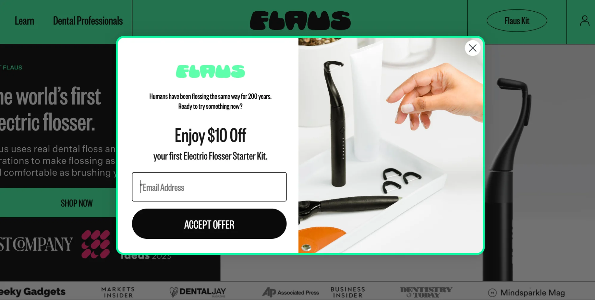
Flaus made this popup example with Wisepops, our own popup builder.
You can build one in minutes, too. Just drag and drop, or use templates designed to various common marketing goals:
2. Nutrimuscle
This Nutrimuscle popup appears only on protein product pages, ensuring relevance for visitors already browsing the category. The clean design highlights the bestselling product with benefit bullets and team endorsement, while the blue CTA provides clear visual contrast.
The 6.8% click-through rate reflects the targeted approach - showing protein recommendations to protein shoppers creates higher engagement than generic popups campaigns.

Looking for inspiration?
See examples of high-performing website popups from ecommerce and service businesses.

3. L'Atelier d'Amaya
This popup shows a special time-limited free shipping offer to website visitors viewing product pages. It's a popular tactic to boost average order value by offering a code for free delivery.
L'Atelier d'Amaya's effective website popup strategy achieved a 25.2% signup rate—well above the industry average.

See how other businesses promote products:
How to promote a product [creative ideas and examples]
Guide to time-limited deals (+examples and tips from business owners)
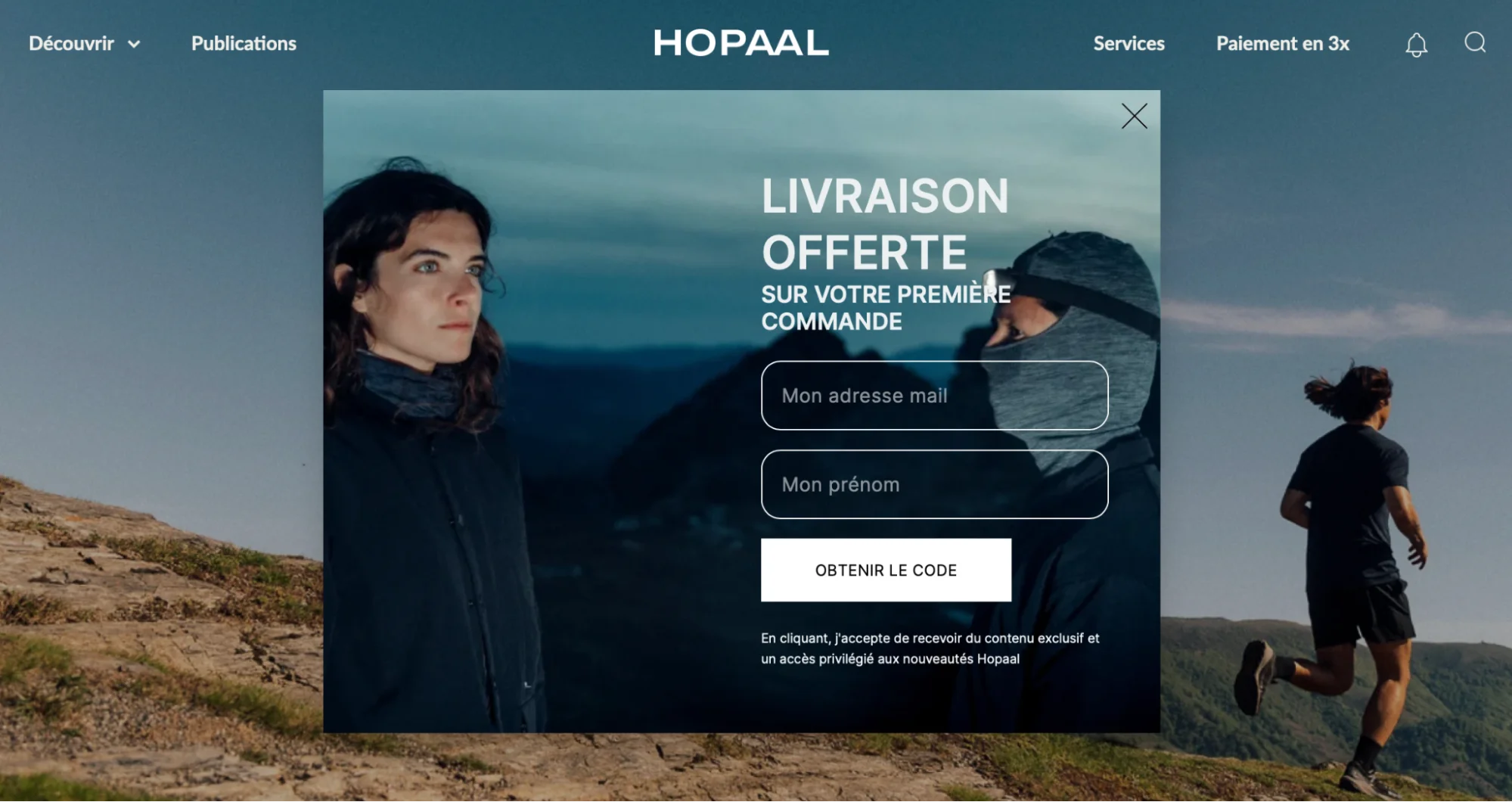
4. Hopaal
This popup window example shows us how just one image can be a recipe for a super cool-looking design. The whole background is just one properly positioned visual—and it makes the entire popup window simply gorgeous. Also, kudos for making sure that the image doesn’t make the text hard to read!
5. Elder Statesman
A nice, inviting, and friendly pop-up message here. A visually striking image and the font that matches the store’s (both are must-dos to make good pop-up messages) make this campaign feel like a natural extension of the website.

Elder Statesman is one of the most successful Shopify stores, generating about $11 million in revenue.
See more examples: list of the biggest and best Shopify stores by revenue [2025]
6. Charlotte Bio
The most compelling thing about this mobile website pop-up box is the discount code that visitors can apply to the cart with a single click.
That’s really convenient—in fact, this website popup example with a flash sale announcement helped get 17% of the monthly revenue in six hours.

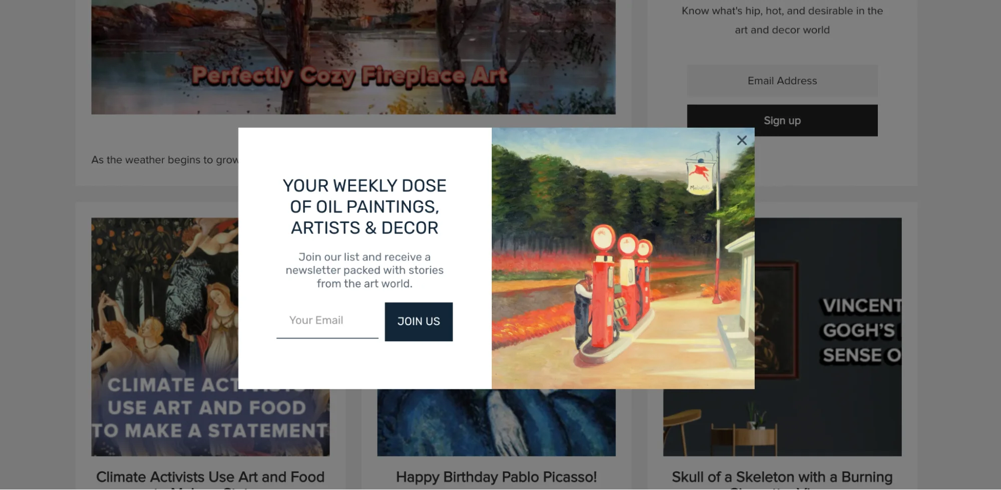
7. Overstockart.com
Popups can even help sell reproductions of Van Gogh and Monet.
This popup window includes a painting itself (a great idea!) and invites visitors to “get a weekly dose of oil paintings, artists & decor.” And the design is only part of the story: pop-up campaigns helped Overstockart.com triple their active lead base.
8. Snif
“What? Oprah’s favorite candle?”
That could easily be the first reaction to this website popup message example. One of Snif’s products was chosen for Oprah’s Favorite Things—definitely something to use to attract the attention of potential customers!
If your brand or product has been mentioned somewhere, consider sharing the news in your website popups, too!

Related guide:
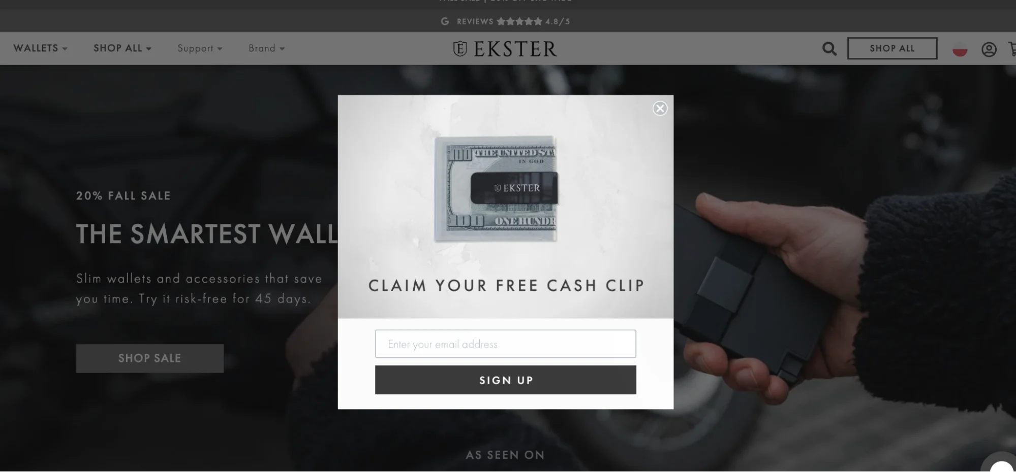
9. Ekster
This is not just an ordinary website popup window asking for an email, but a sales maker (because who would say no to a free cash clip?) This way, Ekster lets visitors have a free product for purchases over $100, and the pop-up ad is sharing the offer with everyone.
Want to see great examples of successful store designs?
10. Vepsäläinen
This example of a popup campaign comes from a furniture retailer. It shows how businesses can use popups to share news about opening new brick-and-mortar stores.
What also makes this example special is that Vepsäläinen targeted only visitors from the town where the new store opened (Tampere), keeping the message relevant. Geolocation targeting like this is a best practice for popup campaigns!
In fact, Vepsäläinen's visitors responded 6x better to targeted messaging than to generic ones: learn their popup strategy.

Offering free shipping in a certain country? Or maybe some local deals? Learn how to use popups to target website visitors from a particular city, country, or region:


11. NUOO
NUOO nails the design of this popup ad on their website. There’s a really cool image of a few products, a simple message with a 10% discount for the first order, and only one field to fill out. And, of course, this popup message matches the overall website design beautifully.
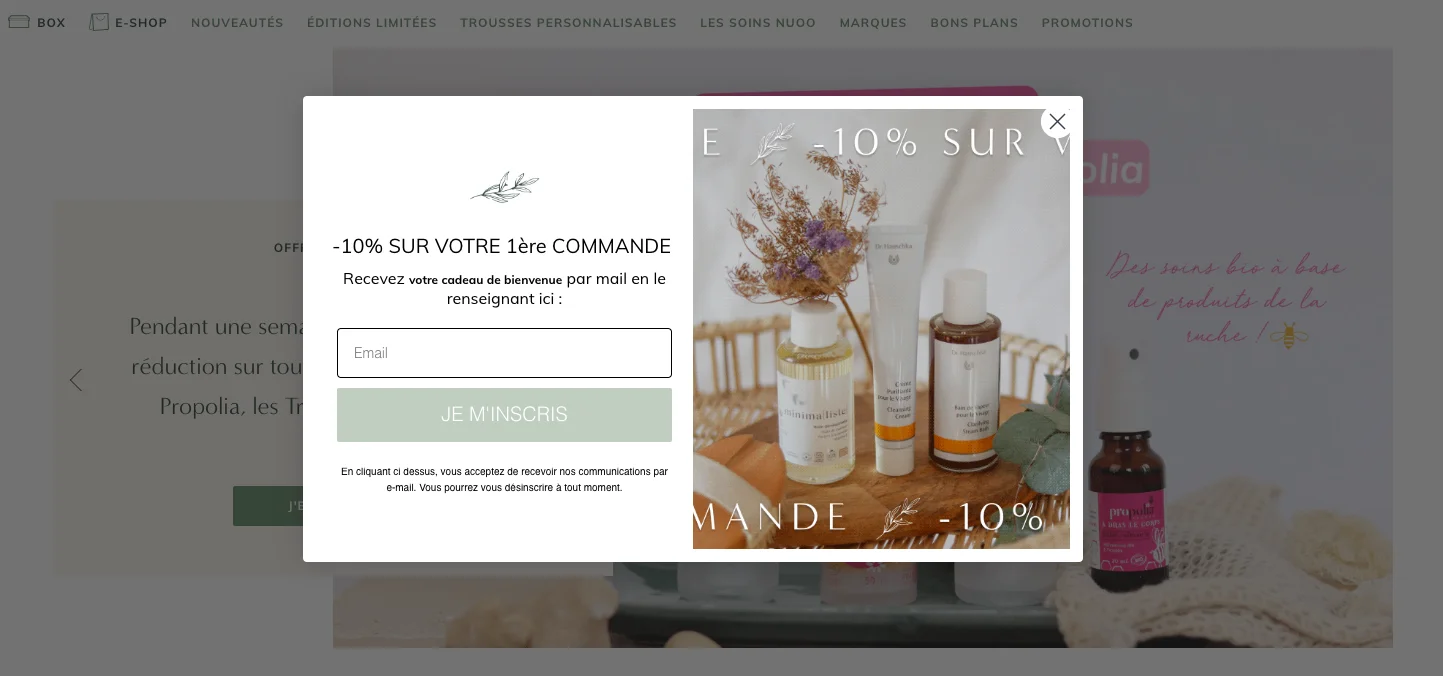
NUOO also has cross-sell campaigns for increasing sales of particular items.
See Wisepops popup contest to learn more about that campaign.
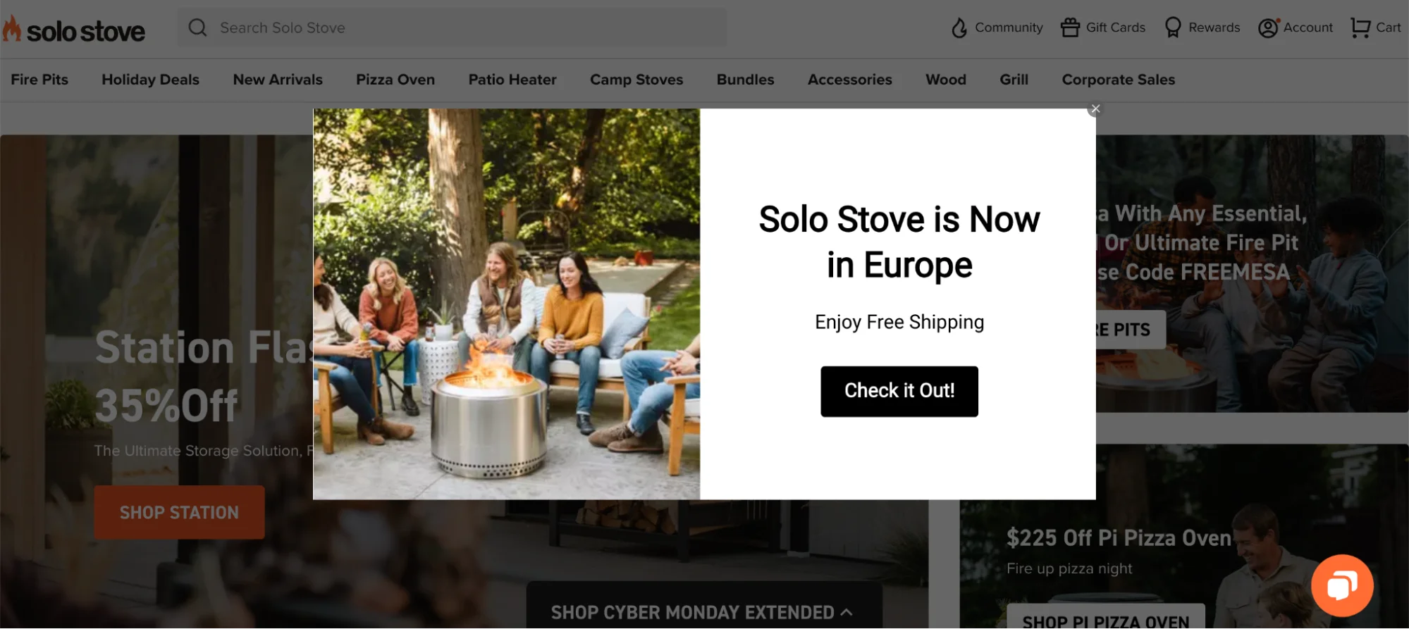
12. Solo Stove
This online store uses a popup ad to let their Europe-based visitors know they can now buy their products. That’s a cool example of a website pop-up that displays only to viewers from a certain geographical area.
13. Adore Me
This pop-up window example is interesting because it’s got a countdown at the top. Countdown timers are great for generating a bit of urgency and focusing the attention of visitors. Plus, this countdown timer popup covers just a small part of the screen, letting us see good-looking products we can buy for a lower price if we sign up.
Fact: popup campaigns with countdown timers can increase conversion rate from 4.63% to 7.34%.

14. Ben & Jerry’s
Ben & Jerry’s is a great example of big companies using popup campaigns on their websites. See the small campaign in the right bottom corner?
Thanks to that popup, the company drives traffic to the page where customers can browse flavors by category (Cinnamon bun dough, chocolate chip cookie, or maybe caramel?)

Offering discounts in your popups?
See why $10 off instead of 10% off to first customers is a better idea to protect profits: Discount code examples & ideas
15. Stella & Chewy’s
Just like Ben & Jerry’s, this popup message also appears in the right bottom corner of the website. It’s a great design decision for sure—the ad covers just a little area of the screen, so it’s not very intrusive. Plus, the colors make this website pop-up look so natural!

Related:
Website popup mistakes (+how to fix them)
16. Dolce & Gabbana
Another example of a famous brand using popup boxes on their websites.
Dolce & Gabbana is letting us know about a popular product that most probably was sold out and has been recently restocked. That’s a very smart engagement strategy—drive visitors to best sellers with such a small and elegant popup ad.

Managing onsite marketing for a luxury brand?
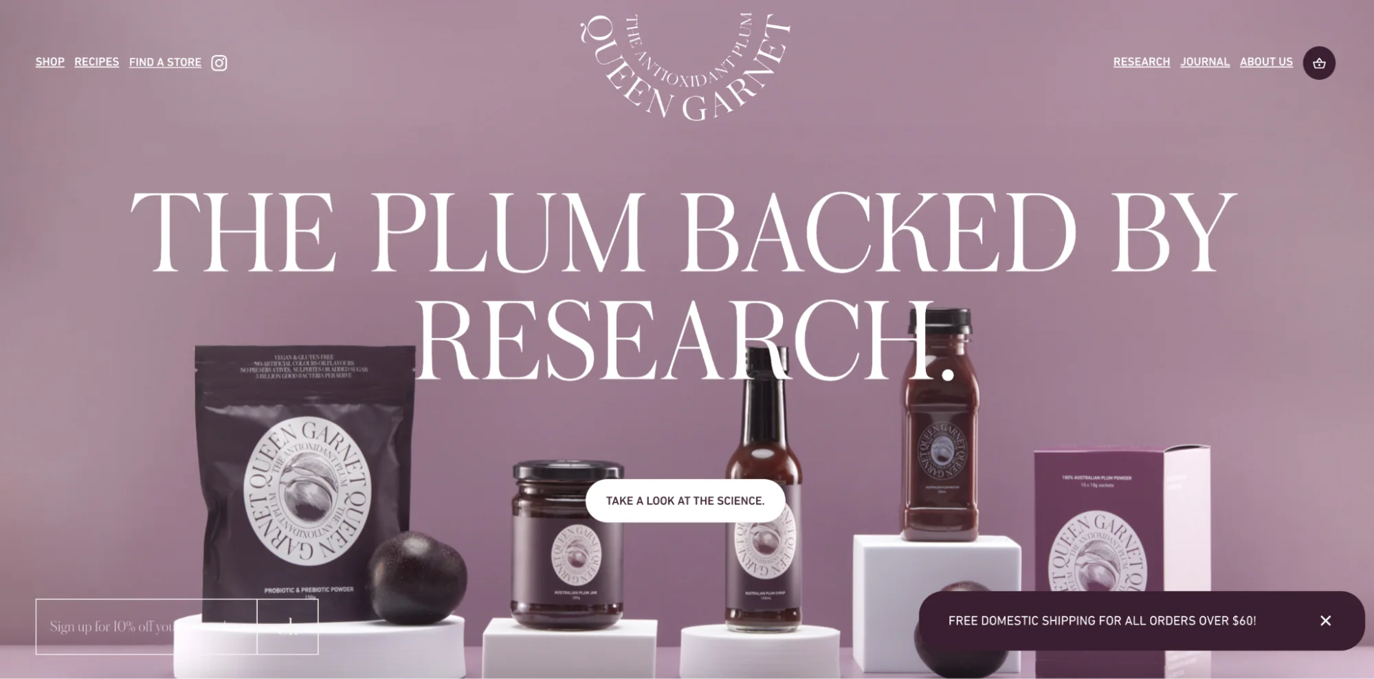
17. Queen Garnet
Now, we’re getting even smaller. This website popup window is perhaps the smallest on our list—but it’s also a very cool example.
Thanks to this size (the width of 324px and the height of 15px), the campaign conveys the marketing message (the free shipping offer) without interfering with the browsing experience on the page:
Creating such small pop-up boxes for websites is easy, by the way.
Here’s me making a website popup exactly like Queen Garnet's in a few minutes inside a popup builder:

18. Brooklinen
How about we go even smaller? Take a look at that tiny pop-up ad in the left bottom corner—it appears only on product pages (where the buying intent is the highest). The text says that all purchases over $200 will include a free tote, motivating us to go ahead and buy something.

Here's the view up close:

19. OddBalls
Spin to win popups are an effective way to boost email list building efforts. Online stores use mostly them to collect emails with product giveaways, discounts, and free shipping.
In this one, OddBalls offers two different discounts in exchange for emails and phone numbers:

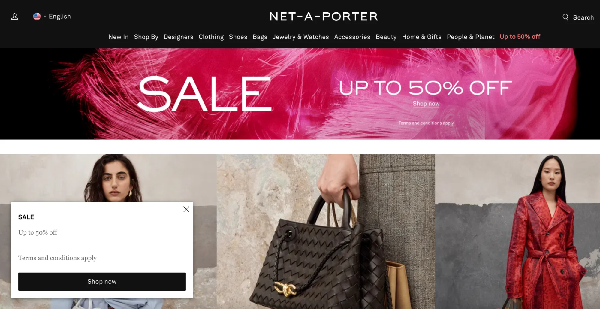
20. Net-A-Porter
This website popup message is similar to the previous few examples. The biggest difference is the position—it appears in the left bottom corner. Also, it’s a sale promotion example, showing us how we can drive visitors to sales to maximize engagement.
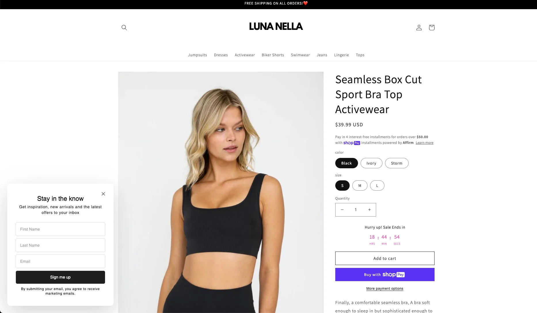
21. Luna Nella
This brand’s website features this non-intrusive popup box that shows up on product pages—exactly when visitors are learning about products (or even considering buying them).
And, if they see the popup window asking them to sign up, they might be more likely to do so—why not get some inspiration once in a while?
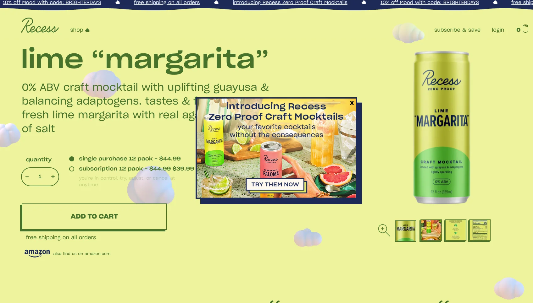
22. Recess
One more product announcement popup window example. Since Recess often makes a series of cocktails, they need to drive traffic to them. Although the background image is quite colorful, the text is perfectly readable (kudos to the designer!)
23. Marigold Coffee
Want your website pop-up to be simple and to the point? If yes, take a look at this pop-up ad example: two sentences of text, simple yellow and white form, and only one field to fill in. And it’s also a great example of “benefits over features” copywriting in website pop-ups.
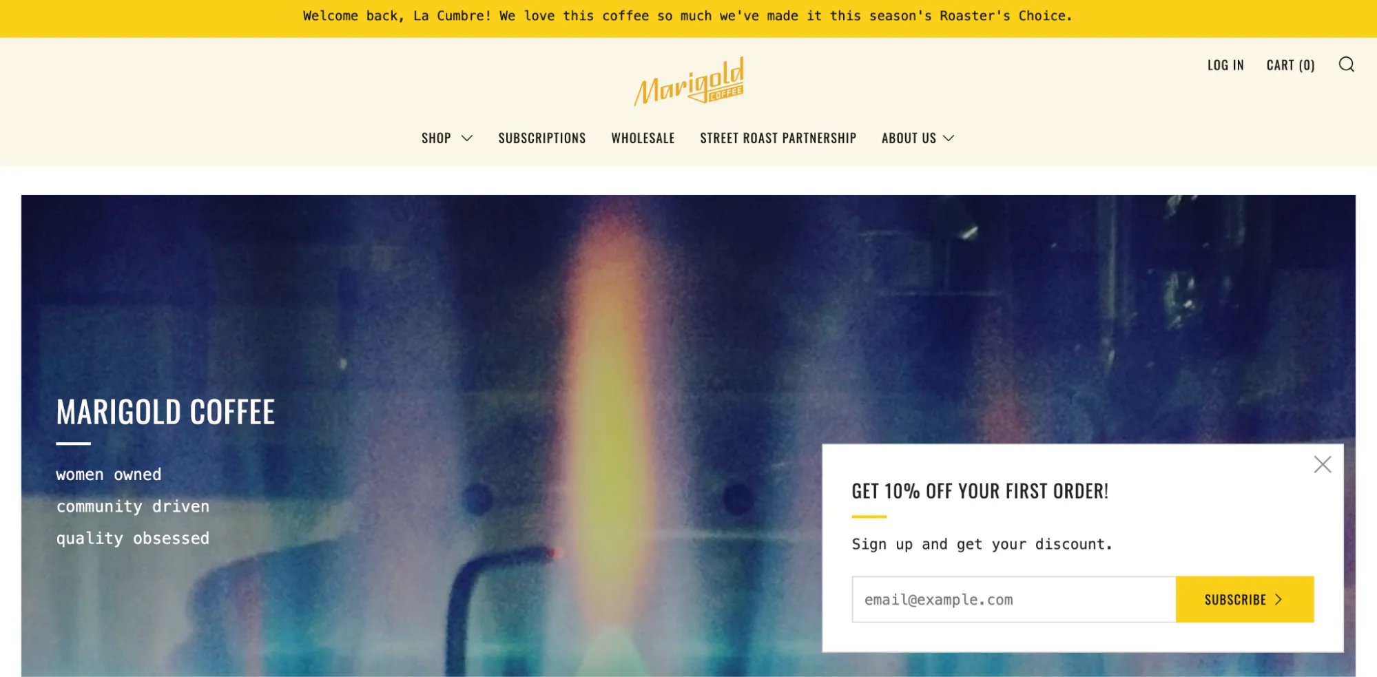
Learn how to write engaging texts for popups on your site?
24. Hardgraft
If you're looking for a non-intrusive alternative to traditional exit popups, consider this example. The "NEW MATERIAL, NEW DESIGNS" banner blends seamlessly with the backpack layout while highlighting Italian craftsmanship and weatherproof materials.
This popup approach avoids interruptions while capturing attention through strategic placement and contrasting dark imagery. The understated "VIEW GOODS" CTA matches Hard Graft's premium positioning, prioritizing user experience.

25. JUST Egg
This popup message takes over the entire screen—which is a bit of a risky move since the visitor can’t see the website.
Yet, the design of this full-screen popup campaign is perfectly in line with the website’s design thanks to the yellow and black color scheme. Plus, this popup window is scroll-based: it appears only when you reach about 50% of the homepage’s length (another best practice).

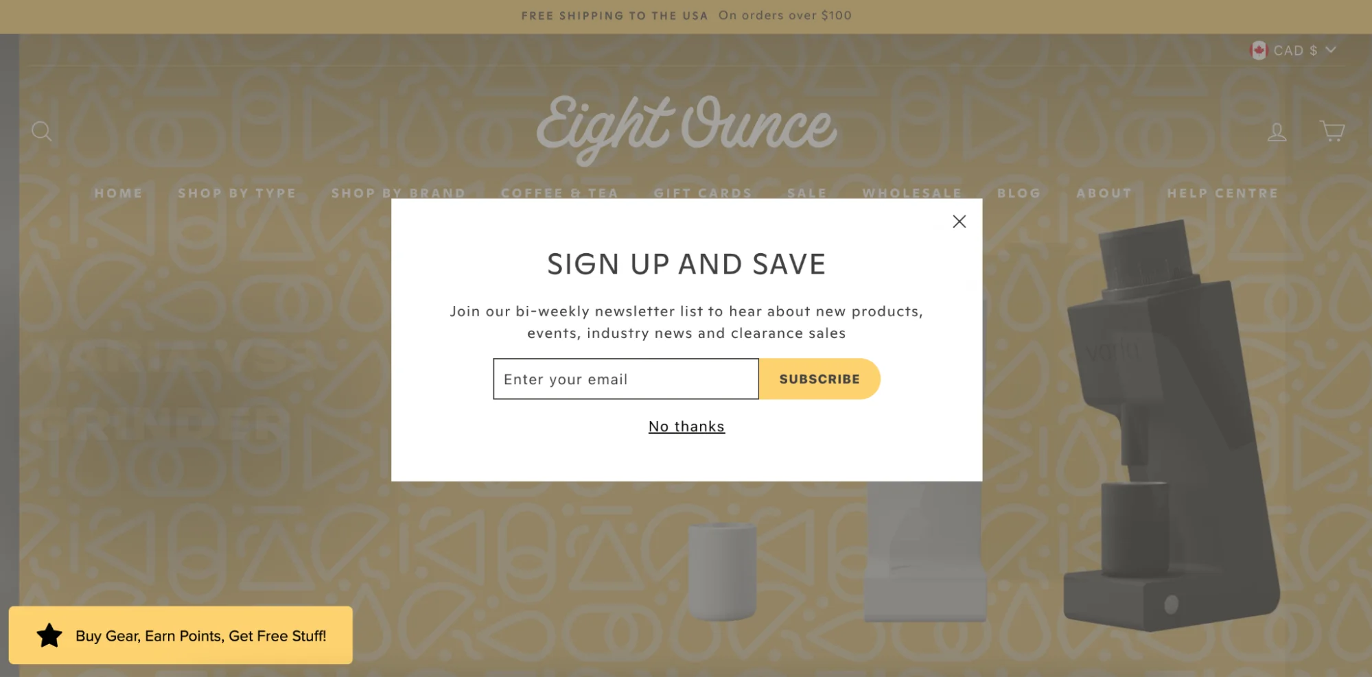
26. Eight Ounce Coffee
What do customers want? Get the best deals possible for products they want. The “Sign up and save” headline tells visitors that this is exactly what they will be able to do if they subscribe.
Besides, there’s also a chance to get notified of new coffee specialties as well as clearance sales—that’s just music to the ears of a coffee lover.
27. Fits Socks
A highlight of this web popup design is that Fits keep the copy super short yet informative.
While Fits is a known business so they may not need to write a long list of benefits, one of the takeaways for you is that you don’t have to fill the space on the popup window with words just for the sake of it.

28. Nora
A clean, nice-looking, and stylish website popup example—I would expect nothing less from a fashion store like Nora.
While it might seem like a pretty ordinary design, there’s one thing that makes this popup message stand out. It’s the built-in links to Nora's Facebook and Instagram pages, which indicates that social media is important for Nora’s marketing strategy.

29. Charles & Company
Wondering if you can apply Nora’s popup box design on a website with a dark color theme?
No problem.
Here’s a very similar corner popup (except for the social media links). Looks very cool + the window does not block the visitor from exploring the store.

30. Hooray Foods
This website popup, although placed in a similar place as the two previous examples, has a different shape. There’s also a bit of a lightbox effect (the darkened background) to focus our attention on the message.

31. TOMS Shoes
This website pop-up example shows targeting at work. I visited TOMS a few days before and signed up to get their emails.
Now, upon my second visit, I saw this SMS popup message inviting me to subscribe to text alerts. That’s better than being slapped with another popup asking to do that I’ve done already!

TOMS is also known as a company with unique marketing campaigns (in one, they asked people to take photos of bare feet and post them on social media to raise awareness of the lack of available footwear to children in developing countries).
Result: 296,243 photos posted and the same amount of shoes was donated.
Learn more: Examples of ethical marketing
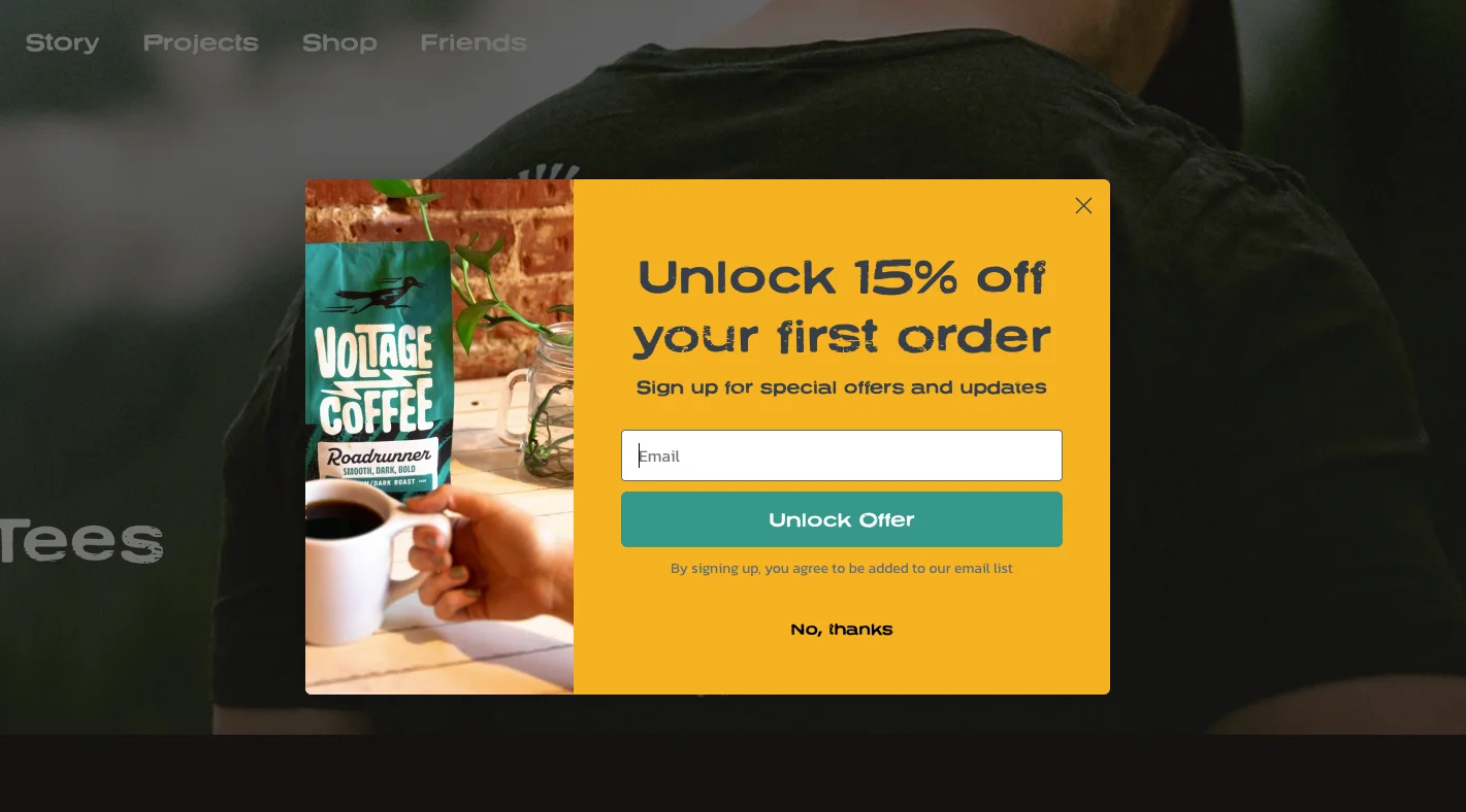
32. Voltage Coffee Project
I’d like to take a closer look at this one.
Voltage Coffee had two pop-up messages running on their website to generate leads from visitors.
The first one is a cool-looking popup window offering us 10% off our first order (looks solid: a nice branded design and short copy):

Next—
The second popup window is a bit different. It still has all the same colors, but now it also gets a nice image, one button instead of two, and a more attractive 15% discount:
When I signed up, I got this second pop-up window (so it's a multi-step popup), giving me the discount code to copy.
That’s a unique coupon code, which allows the brand to actually track the performance of this campaign (by checking how many codes were used in shopping carts):
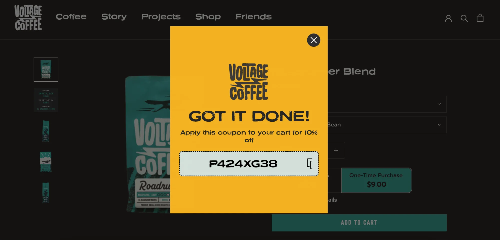
These two examples of popups show us an effective optimization practice: A/B testing different popup campaigns. By showing two separate campaigns to different visitors, it’s possible to learn what generates more conversions.
Doing the A/B testing requires duplicating the original popup campaign and making changes to it:

One good idea for an A/B test is exactly what Voltage Coffee Project did: adding an image. According our research, website popups with images convert almost 50% more visitors.
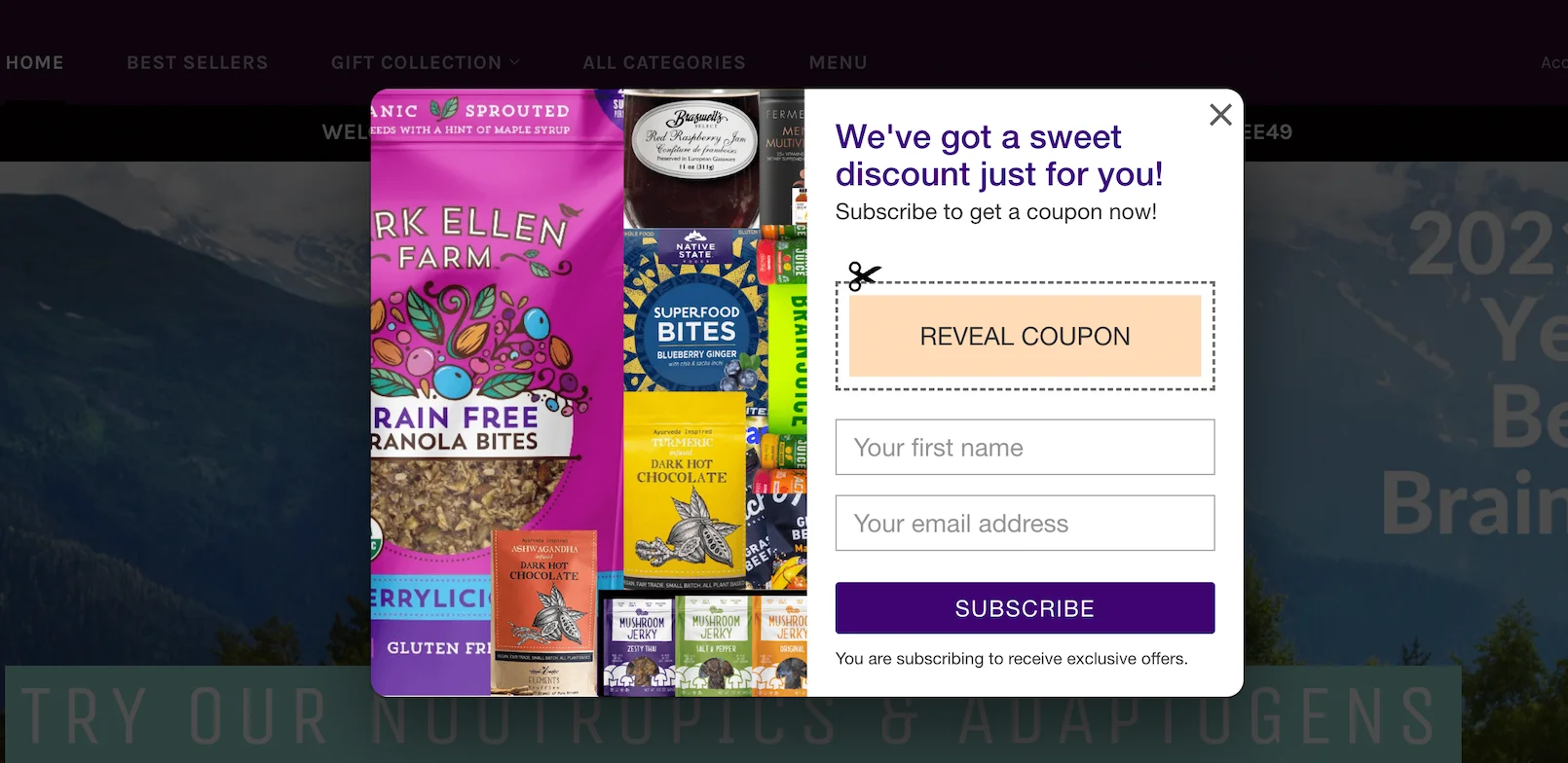
33. Appalachia Store
This popup window takes the design one step further. To motivate the visitor to subscribe, the coupon field is included, and available only after subscribing. This reminded me a little bit about paper coupons, too!
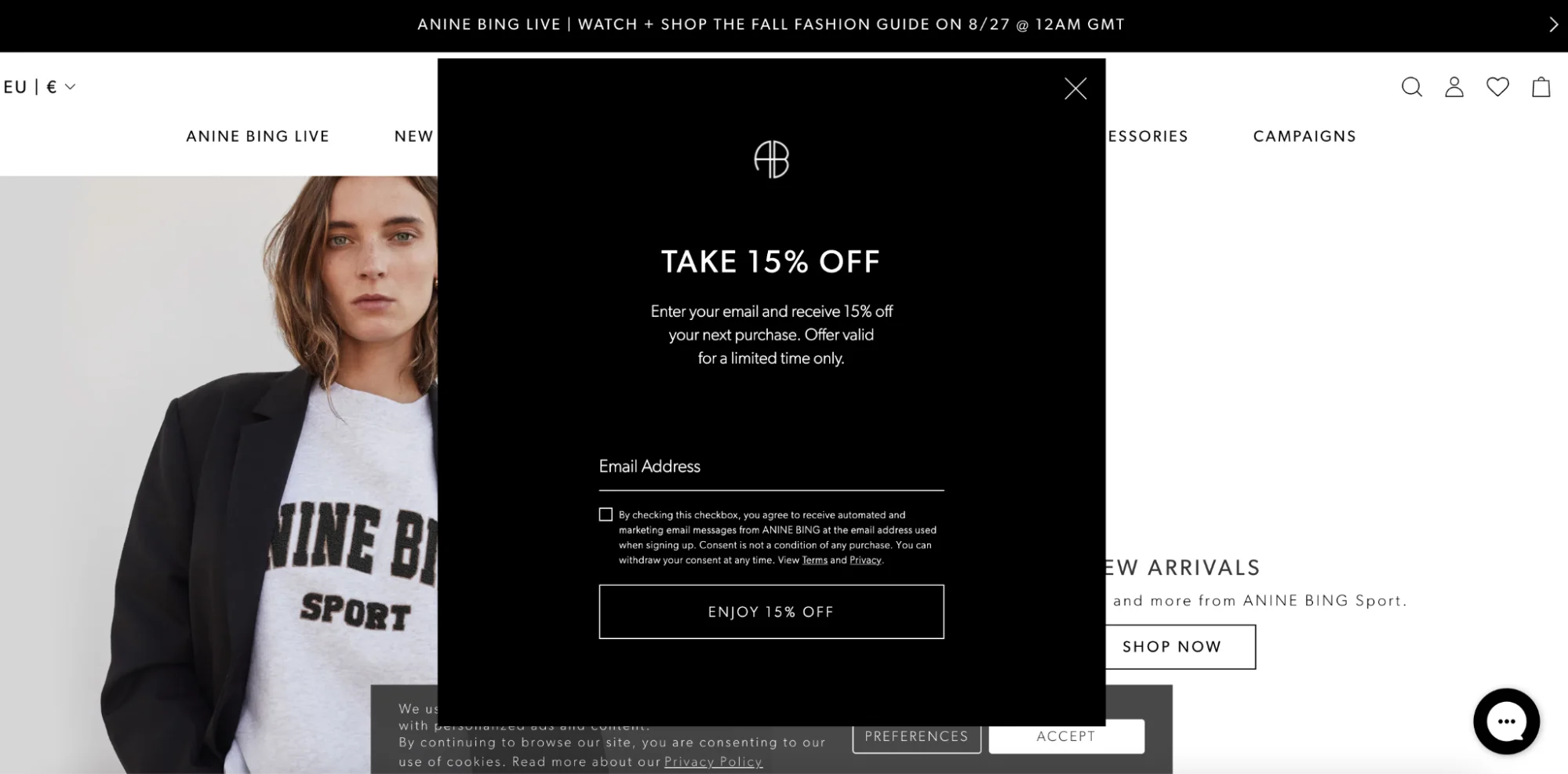
34. Anne Bing
Dark, beautiful, and stylish—those are the best words to describe this website pop-up example. Thanks to the black background, this one draws our attention easily.
Black gives this popup ad a sophisticated and elegant appearance (which is the actual reason why companies selling luxury goods—remember Dolce & Gabbana’s example?—favor black for pop-up windows on their websites).
Also, note how the text says “Offer valid for a limited time only”—a good way to create the sense or urgency and increase conversions.
35. Scott’s Protein Balls
This website greets us with a friendly welcome popup with a generous discount. The text takes center stage for this design and the “Unlock Offer” CTA tells us what we should do next. Overall, this popup ad example feels very fresh and modern.

36. Magic Spoon
This pop-up message is an interesting example because it appears after the visitor adds a product (a box of cereal) to the shopping cart.
As you can see, we’re offered to buy a subscription instead of a single product—so the message highlights the benefits of the deal. So, this upsell popup campaign is interaction-based and speaks directly to the visitor’s intent.

37. Sundays for Dogs
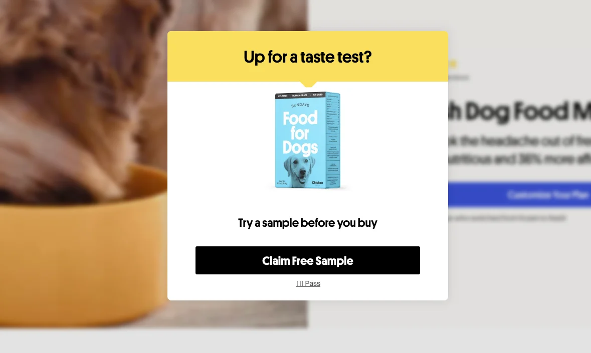
Let’s see one more popup message example from a subscription business. To encourage visitors to convert, this store offers a free sample in this ad. So, if somebody is hesitating about whether to buy a subscription, getting this offer might be exactly what it takes to become a customer.
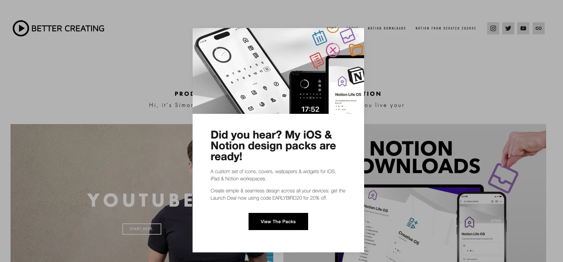
39. Better Creating
Running a personal blog? Then this website popup example should be interesting. It invites us to get iOS and Notion design packs—basically, lead magnets. The popup CTA button really stands out, which is a great design move:
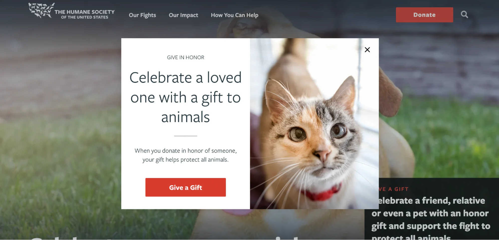
40. The Humane Society of the United States
A website pop-up is also a helpful visitor engagement tool for nonprofits. This one, for example, is motivating visitors to make a donation in honor of someone else. The combination of the heartwarming image and strong copy makes up a truly powerful message.
41. Perfect Keto
A good-looking, colorful popup window example with a first order discount. Note that Perfect Keto is asking for a phone number, not an email (which is the case with most web page pop-ups). Perhaps collecting phone numbers is one of the brand’s marketing goals at the moment.

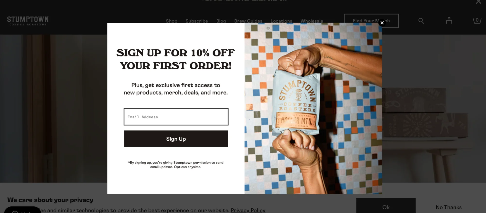
42. Stumptown Coffee Roasters
We featured Stumptown’s popup campaign in our list of signup form examples, and here goes one more. One thing I especially like about this one is a cool product visual—something that all online stores need to have (especially in welcome popups like this):
43. Black Ember
This time, it’s a gift card giveaway popup campaign. For online businesses like Black Ember, giveaway ideas are a quick way to accelerate email list building as well as improve overall visitor engagement. Indeed, website popups like this one have a lot of value for customers (and don’t require a lot from them to participate).

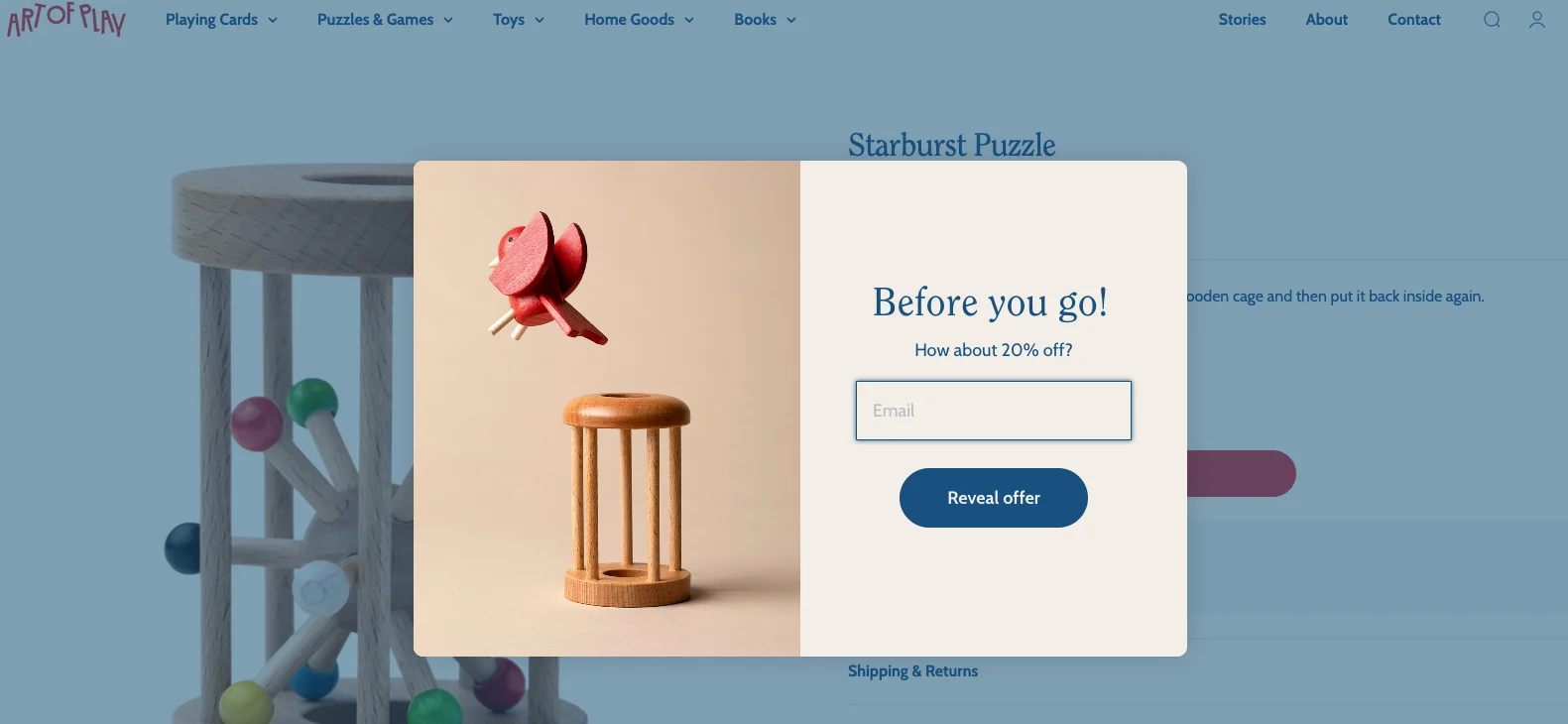
44. Art of Play
Acting as an exit-intent popup, this pop-up ad example appears when the visitor tries to close the website. Its goal is, obviously, to prevent the visitor from leaving without converting—so a generous bonus is offered to us. Wisepops research suggests that exit campaigns like this one can convert up to 19.6% of traffic.
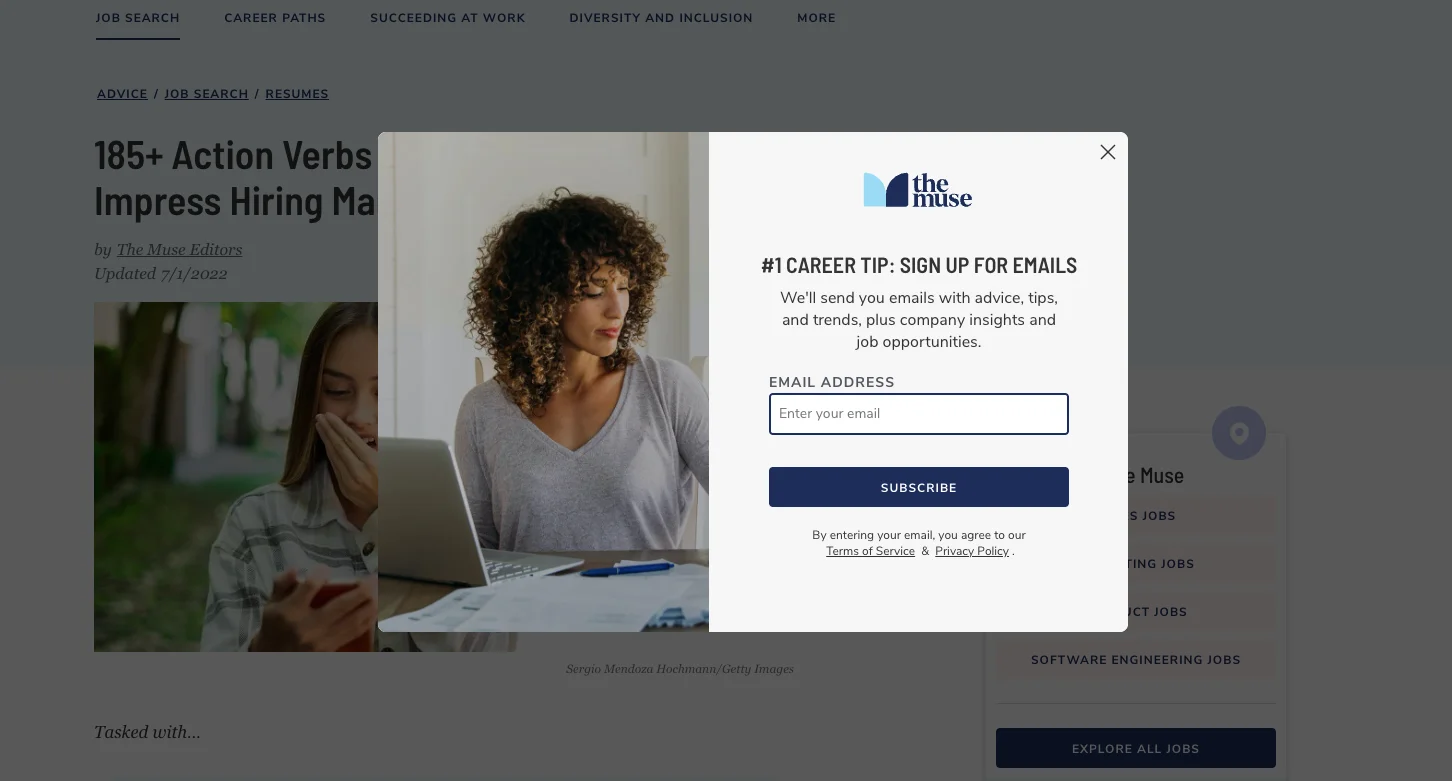
45. The Muse
This pop window example is displayed to those engaging with the site’s content. Since getting quality career advice is the biggest goal of its target audience, the text says that the subscribers will get exactly that.
46. Empire Skate
This is the so-called “on-click” popup (it appears when the visitor clicks on a button on the website). Empire Skate’s online store shows this popup up box when you click on the “create an account” button placed throughout the website.

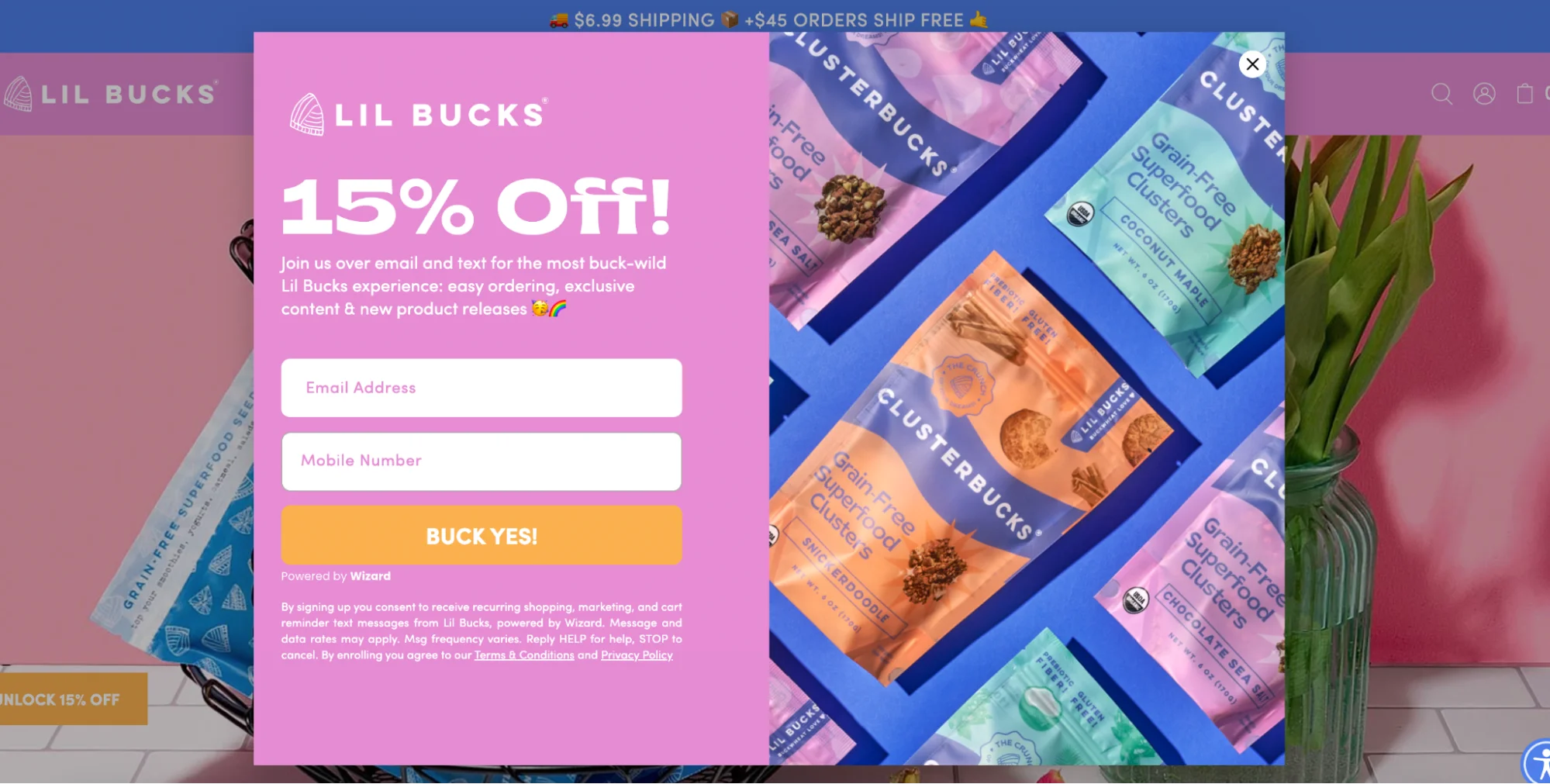
47. Lil Bucks
This popup window is beautifully made! It manages to stay easily readable thanks to a smart choice of colors as well as the colorful visual of nicely arranged products. Also—there are a few emojis in the popup copy—something we don’t see very often.
48. Partake Foods
A pretty unique web popup example. While it’s not particularly exciting design-wise, it shows us a great marketing technique: digital coupons.
Since Partake Foods sells its products at retail stores, the business uses this campaign to encourage buying there:

49. Virtuance
Visitors coming to Virtuance are interested in getting their real estate sold faster with the help of photography and video. That’s why the website offers a discount for this service in a pop-up box. The promo code is sent to subscribers’ inboxes.

50. PRESS Foods
One more website pop-up example from a subscription business. This time, we don’t know what kind of discount we can get, so we need to click the popup window to find out. That’s a smart strategy that can increase the visitor engagement by introducing the element of surprise.

51. Meow Meow Tweet
Colors play an important role in our buying decisions, which is especially true for popups on websites. If you make your popup match your business’s colors, it can help with attracting attention of visitors, brand recognition, and visual consistency. This example shows just that. Combined with a playful copy, this one is simply a treat for the eye.

52. Only Natural Pet
We see ordinary examples of email popups everywhere, so this store decided to make the signup process a bit more interesting. Instead of getting an email field to fill out right away, we get three paw prints:

You need to click on one of the prints to get your discount (or something else).
Here’s how this works:

Also, note that the last popup window with the results also contains a choice of a pet (a dog, a cat, or both). This way, Only Natural Pet collects data from visitors to be able to send them relevant marketing messages via emails later.
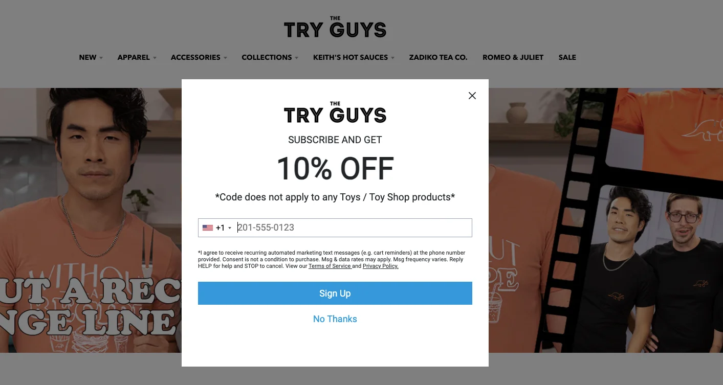
53. Try Guys
Sometimes, website pop-ups collect phone numbers instead of emails. Like this example from Try Guys, a merchandise store of a group of famous YouTubers. It’s simple, focuses our attention well, and states the main benefit clearly.
54. Recess (again)
As I’ve mentioned, website pop-ups can appear as an opt-in bar. We’ve seen that Recess uses the traditional window popups for product announcements, so another format, the bar, was chosen for building the email list. The design of this campaign is just as cool and fits the overall vibe of the store—nice work!

55. Brooklinen
Here's an example of a website popup that is optimized for mobile devices (mobile popup). As you can see, it covers about 30% of the screen (that's the max allowed space, according to the best practices) and allows us to easily continue navigating.

Website popups: summary
If you’d like to learn more about how to use popups on your website to achieve your marketing goals, check out these resources from our blog:
Get started
in minutes
Start converting more visitors today.
Get started in minutes and see results right after.