


Read summarized version with
 ChatGPT
'%3e%3cpath%20fill-rule='evenodd'%20clip-rule='evenodd'%20d='M16.4875%200V6.06H18.75V14.6833H16.3042V20L10.44%2014.8383V19.9592H9.53083V14.8325L3.66%2020V14.6125H1.25V5.99H3.65333V0L9.53083%205.41167V0.158333H10.4392V5.56667L16.4875%200ZM10.44%207.53667V13.6358L15.395%2017.9975V12.0333L10.44%207.53667ZM9.52417%207.47L4.56917%2011.9683V17.9975L9.52417%2013.6358V7.47083V7.47ZM16.3042%2013.7867H17.8408V6.9575H11.2167L16.3042%2011.5742V13.7867ZM8.81917%206.88667H2.15833V13.7158H3.65833V11.5692L8.81833%206.88583L8.81917%206.88667ZM4.5625%202.06333V5.98833H8.825L4.5625%202.06333ZM15.5783%202.06333L11.3158%205.98833H15.5783V2.06333Z'%20fill='black'/%3e%3c/g%3e%3cdefs%3e%3cclipPath%20id='clip0_4212_18220'%3e%3crect%20width='20'%20height='20'%20fill='white'/%3e%3c/clipPath%3e%3c/defs%3e%3c/svg%3e) Perplexity
Perplexity'%3e%3cpath%20d='M9.996%2019.992C9.996%2018.6068%209.73182%2017.3074%209.19632%2016.0936C8.68224%2014.8798%207.96824%2013.8159%207.0686%2012.9163C6.16896%2012.0166%205.11224%2011.3098%203.89844%2010.7957C2.68464%2010.2602%201.38516%209.996%200%209.996C1.38516%209.996%202.68464%209.73896%203.89844%209.21774C5.11224%208.68224%206.1761%207.96824%207.0686%207.0686C7.96824%206.16896%208.6751%205.11224%209.19632%203.89844C9.73182%202.68464%209.996%201.38516%209.996%200C9.996%201.38516%2010.253%202.68464%2010.7743%203.89844C11.3098%205.11224%2012.0238%206.1761%2012.9234%207.0686C13.823%207.96824%2014.8798%208.68224%2016.1007%209.21774C17.3145%209.73182%2018.614%209.996%2019.9991%209.996C18.614%209.996%2017.3145%2010.2602%2016.1007%2010.7957C14.8869%2011.3098%2013.823%2012.0166%2012.9234%2012.9163C12.0238%2013.8159%2011.3098%2014.8726%2010.7743%2016.0936C10.2538%2017.327%209.98905%2018.6533%209.996%2019.992Z'%20fill='url(%23paint0_radial_4212_18233)'/%3e%3c/g%3e%3cdefs%3e%3cradialGradient%20id='paint0_radial_4212_18233'%20cx='0'%20cy='0'%20r='1'%20gradientUnits='userSpaceOnUse'%20gradientTransform='translate(-1.13275%205.96185)%20rotate(18.68)%20scale(21.2772%20170.46)'%3e%3cstop%20offset='0.07'%20stop-color='%239168C0'/%3e%3cstop%20offset='0.34'%20stop-color='%235684D1'/%3e%3cstop%20offset='0.67'%20stop-color='%231BA1E3'/%3e%3c/radialGradient%3e%3cclipPath%20id='clip0_4212_18233'%3e%3crect%20width='20'%20height='19.992'%20fill='white'/%3e%3c/clipPath%3e%3c/defs%3e%3c/svg%3e) Gemini
Gemini'%3e%3cpath%20d='M3.92888%2013.2962L7.86008%2011.0903L7.92585%2010.8981L7.86008%2010.7918H7.66782L7.01009%2010.7513L4.76369%2010.6906L2.81581%2010.6097L0.928632%2010.5085L0.453044%2010.4073L0.0078125%209.82039L0.0533475%209.52694L0.453044%209.25879L1.02476%209.30939L2.28962%209.3954L4.18692%209.52694L5.56309%209.60789L7.60204%209.82039H7.92585L7.97138%209.68884L7.86008%209.60789L7.77407%209.52694L5.811%208.19631L3.68603%206.78978L2.57295%205.98027L1.97088%205.57045L1.66731%205.18593L1.53577%204.34607L2.08219%203.74399L2.81581%203.79459L3.00301%203.84518L3.74674%204.4169L5.33541%205.64634L7.40979%207.1743L7.71335%207.42727L7.83478%207.34126L7.84996%207.28055L7.71335%207.05287L6.5851%205.01391L5.38095%202.93954L4.84465%202.07943L4.70298%201.56337C4.65239%201.35087%204.61697%201.17379%204.61697%200.956236L5.23928%200.111308L5.58332%200L6.41307%200.111308L6.76218%200.414875L7.27824%201.59373L8.11305%203.45054L9.40827%205.97521L9.78773%206.72401L9.9901%207.41715L10.066%207.62965H10.1975V7.50822L10.3038%206.08652L10.5011%204.34101L10.6934%202.09461L10.7591%201.46218L11.0728%200.703263L11.6951%200.293448L12.1808%200.526183L12.5805%201.0979L12.5249%201.46724L12.2871%203.01037L11.8216%205.42879L11.5181%207.04781H11.6951L11.8975%206.84543L12.7171%205.75765L14.0933%204.03744L14.7005%203.35441L15.4088%202.60056L15.8641%202.24134H16.7242L17.3567%203.18239L17.0733%204.15381L16.1879%205.277L15.4543%206.22818L14.4019%207.64483L13.7442%208.77814L13.8049%208.86921L13.9618%208.85403L16.3397%208.34809L17.6248%208.11536L19.1578%207.85226L19.851%208.17607L19.9269%208.50493L19.6537%209.17784L18.0144%209.5826L16.0918%209.96711L13.2282%2010.6451L13.1927%2010.6704L13.2332%2010.721L14.5234%2010.8424L15.0749%2010.8728H16.4257L18.9403%2011.06L19.598%2011.4951L19.9926%2012.0263L19.9269%2012.4311L18.915%2012.9471L17.5489%2012.6233L14.3615%2011.8644L13.2686%2011.5912H13.1168V11.6823L14.0275%2012.5727L15.6972%2014.0804L17.7867%2016.0233L17.893%2016.5039L17.6248%2016.8834L17.3415%2016.8429L15.5049%2015.4617L14.7966%2014.8394L13.1927%2013.4885H13.0865V13.6302L13.4558%2014.1715L15.4088%2017.106L15.51%2018.0066L15.3683%2018.3L14.8624%2018.4771L14.3058%2018.3759L13.1624%2016.7721L11.9835%2014.9658L11.0324%2013.3468L10.916%2013.4126L10.3544%2019.4586L10.0913%2019.7673L9.48416%2020L8.97821%2019.6155L8.71006%2018.9932L8.97821%2017.7637L9.30202%2016.1599L9.56511%2014.8849L9.80291%2013.3013L9.94457%2012.7751L9.93445%2012.7397L9.81808%2012.7549L8.62405%2014.3941L6.80771%2016.848L5.37083%2018.386L5.02679%2018.5226L4.42977%2018.214L4.48542%2017.6625L4.81935%2017.1718L6.80771%2014.642L8.0068%2013.0736L8.7809%2012.168L8.77584%2012.0364H8.7303L3.44824%2015.4667L2.50718%2015.5882L2.10242%2015.2087L2.15302%2014.5864L2.34528%2014.384L3.93394%2013.2912L3.92888%2013.2962Z'%20fill='%23D97757'/%3e%3c/g%3e%3cdefs%3e%3cclipPath%20id='clip0_4212_18270'%3e%3crect%20width='20'%20height='20'%20fill='white'/%3e%3c/clipPath%3e%3c/defs%3e%3c/svg%3e) Claude
Claude'%3e%3cpath%20d='M7.77353%2012.0388L14.278%207.23827C14.5972%207.00347%2015.0534%207.09396%2015.205%207.46044C16.0048%209.38782%2015.6469%2011.7045%2014.0559%2013.296C12.4648%2014.8862%2010.2512%2015.2348%208.22684%2014.4407L6.01614%2015.4643C9.18686%2017.631%2013.0375%2017.0949%2015.4431%2014.6885C17.3517%2012.7811%2017.9424%2010.1807%2017.3896%207.83507L17.3941%207.83956C16.5927%204.39408%2017.5906%203.01744%2019.6366%200.202196C19.6839%200.135341%2019.7332%200.0676703%2019.7821%200L17.0908%202.6901V2.68113L7.7719%2012.04M6.43072%2013.2047C4.15521%2011.0323%204.54778%207.66916%206.48861%205.72874C7.92395%204.29299%2010.2773%203.7076%2012.3307%204.56815L14.5369%203.55024C14.1398%203.26326%2013.6303%202.95507%2013.0453%202.73738C10.4045%201.65058%207.24114%202.19113%205.09403%204.3362C3.02927%206.40055%202.37948%209.57493%203.49441%2012.2838C4.32765%2014.3078%202.9616%2015.7407%201.58578%2017.185C1.097%2017.6966%200.609043%2018.2098%200.214844%2018.752L6.42787%2013.2047'%20fill='black'/%3e%3c/g%3e%3cdefs%3e%3cclipPath%20id='clip0_4212_18265'%3e%3crect%20width='20'%20height='18.752'%20fill='white'/%3e%3c/clipPath%3e%3c/defs%3e%3c/svg%3e) Grok
GrokKey takeaways:
A micro-commitment popup starts with a low-friction first action — a button click, a yes/no question, a preference choice — before asking for an email or phone number
The first step creates a small psychological commitment that makes visitors significantly more likely to complete the next step
In a Wisepops study of 1.8 million visitor sessions, micro-commitment and multi-step formats drove up to 8–9× more interactions and doubled signups vs. standard single-step popups — with no increase in bounce
Multi-step popups average a 5.64% conversion rate vs. 3.07% for single-step — an 84% increase
Timing matters as much as format: the same popup shown too early can increase bounce up to 5 times.
Set up micro-commitment popups on your website in 30 minutes
Use templates with lead capture and AI product recommendations to show the right offer at the right moment.


What is a micro-commitment popup?
A micro-commitment popup (also called a yes/no or quiz popup) is a popup format with two or more steps, where the first step is a question or a simple action: a yes/no choice, a preference selector, a single button rather than a form. The email or phone field appears only on the next step.
The idea is that someone who has already clicked something is more likely to complete the next step than someone who hasn't engaged at all. The first step lowers the perceived cost of interacting without asking for anything personal.

Micro-commitment popup templates
Survey branching popup
Ask visitors what they want to learn or shop for and route them to tailored offers.
Ice breaker SMS signup popup
A popup that learns what visitors want to recommend the right products.
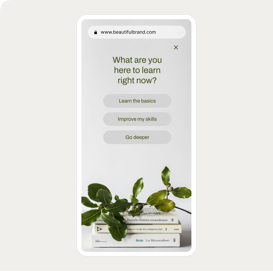
Branching education popup
Ask visitors what they want to learn or shop for and route them to tailored offers or content.
Use cases for micro-commitment popup campaigns
Email list building
A micro-commitment popup leads with a single question or yes/no request rather than a form. The visitor clicks, the email field appears on step two. Because step one requires no personal information, the barrier to engaging is low.
In Wisepops data, simplified first steps — removing non-essential fields or leading with a text-only screen before any form — produced 2–3× more leads without any increase in bounce.
Audience segmentation
A preference question in step one captures data you can use downstream. A visitor who selects "Skincare" in a beauty store gets routed to a different offer than one who selects "Haircare." A visitor who picks "Running" in a sports store sees different follow-up than one who picks "Gym."
The answer tells you something useful, and the signup that follows reflects a known preference rather than a blank contact.
Abandoned cart recovery
Exit-intent popups are one of the highest-stakes moments on any ecommerce site. A micro-commitment step makes sense here because visitors who are about to leave aren't ready to fill out a form — but they may respond to a single, low-friction question.
Leading with a clear value statement and one button ("Before you go, want to see your offer?") creates a moment of re-engagement before the email field or discount appears.
Product discovery and quizzes
Multi-step popups that guide visitors through 2–3 preference questions before surfacing a recommendation work as a lightweight product finder.
Each answered question feels like progress, which keeps engagement high across steps. This format works best for stores with a wide or complex product range where self-selection helps visitors find relevant products faster.
Popup campaign ROI from 5 ecommerce brands
See how successful Shopify stores use popups to grow email lists and sales.

How micro-commitment popups perform
The data below comes from a Wisepops study of popup A/B tests across 1.8 million visitor sessions.
Conversion rate:
Single-step popups: avg. 3.07% CVR
Multi-step popups: avg. 5.64% CVR — an 84% lift
Top 10% of multi-step campaigns: 20.65% CVR
Engagement and signups:
Best-performing yes/no and multi-step A/B tests increased interactions up to 8–9×
Signups doubled in the top experiments
Bounce rate remained flat — more leads without more disruption
Timing:
Popups displayed within 5 seconds of landing: bounce increased up to 5×
Delayed display (20–50 seconds): bounce reduced up to 45%, email capture up 20–43%
Pushing the trigger to the next page or adding a delay: median conversion uplift of 39–52%
Worth noting 
The micro-commitment format creates a better condition for conversion but it doesn't cause it.
What you ask in step one, what you're offering, and how the popup is designed all determine whether the structure actually helps.
A poorly framed question or a weak incentive will underperform regardless of how many steps the popup has.
The main formats
Yes/No gateway
The first step presents a single benefit statement with two buttons — a clear yes and a way to decline. Visitors who click "Yes" see the signup form; those who don't exit the flow. The binary framing makes the offer feel like a choice rather than an imposition.
Two-step opt-in (click-to-open)
The first step is a single CTA button — "Get my 15% off," "Claim your discount" — with no form visible. Clicking the button opens step two, which contains the email field. The button click is the micro-commitment. Because the visitor has already expressed intent, the form feels like a natural next step.
Preference-based selector
The first step asks a question relevant to what the visitor is shopping for or trying to achieve. Options are buttons, not form fields. The visitor selects one, which both qualifies them and routes them to a tailored offer on the next step. Particularly effective for stores with distinct product categories or customer types.
Progressive multi-step
A sequence that collects information incrementally: a preference or question first, email second, phone number or additional detail third. The perceived cost of abandoning increases with each completed step — by the time the phone field appears, the visitor is invested enough to be more likely to finish.
Quiz-based
Two or more questions about the visitor's goals, preferences, or situation, leading to a personalized product recommendation. The email field at the end feels like the natural final step to receive the result. Works best when the questions are genuinely useful to the visitor.
Exit-intent with a micro-commitment step
An exit-intent trigger combined with a multi-step format. Instead of leading with a form, the popup leads with a value statement and a single action — a button click, a yes/no question, or a question. The micro-commitment step creates a moment of re-engagement before the offer appears.
Examples of micro-comment popup campaigns
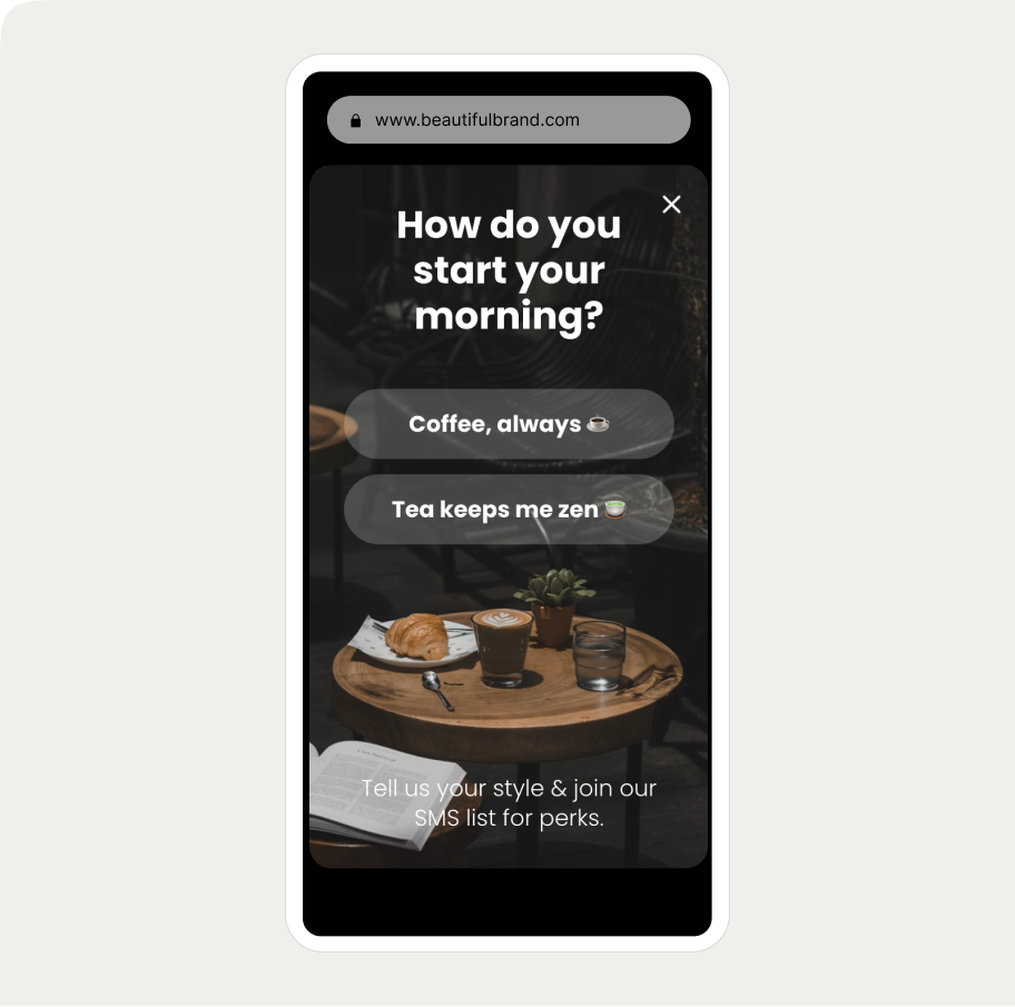
Nordic Wave — preference-based segmentation

Design:
Step one asks what the visitor is most interested in about cold plunging: Physical Recovery, Mental Clarity, Longevity, or Immune Support
The answer segments the visitor for tailored follow-up
"Unlock Your Mystery Offer" adds a curiosity hook that makes the first click feel worth taking
A "Skip" option in the first step keeps the experience non-confrontational — visitors can bypass step one without closing the popup entirely
Why it works:
The question is relevant to anyone on the site, requires a single tap to answer, and captures zero personal data. By the time the email field appears, the visitor has already engaged.
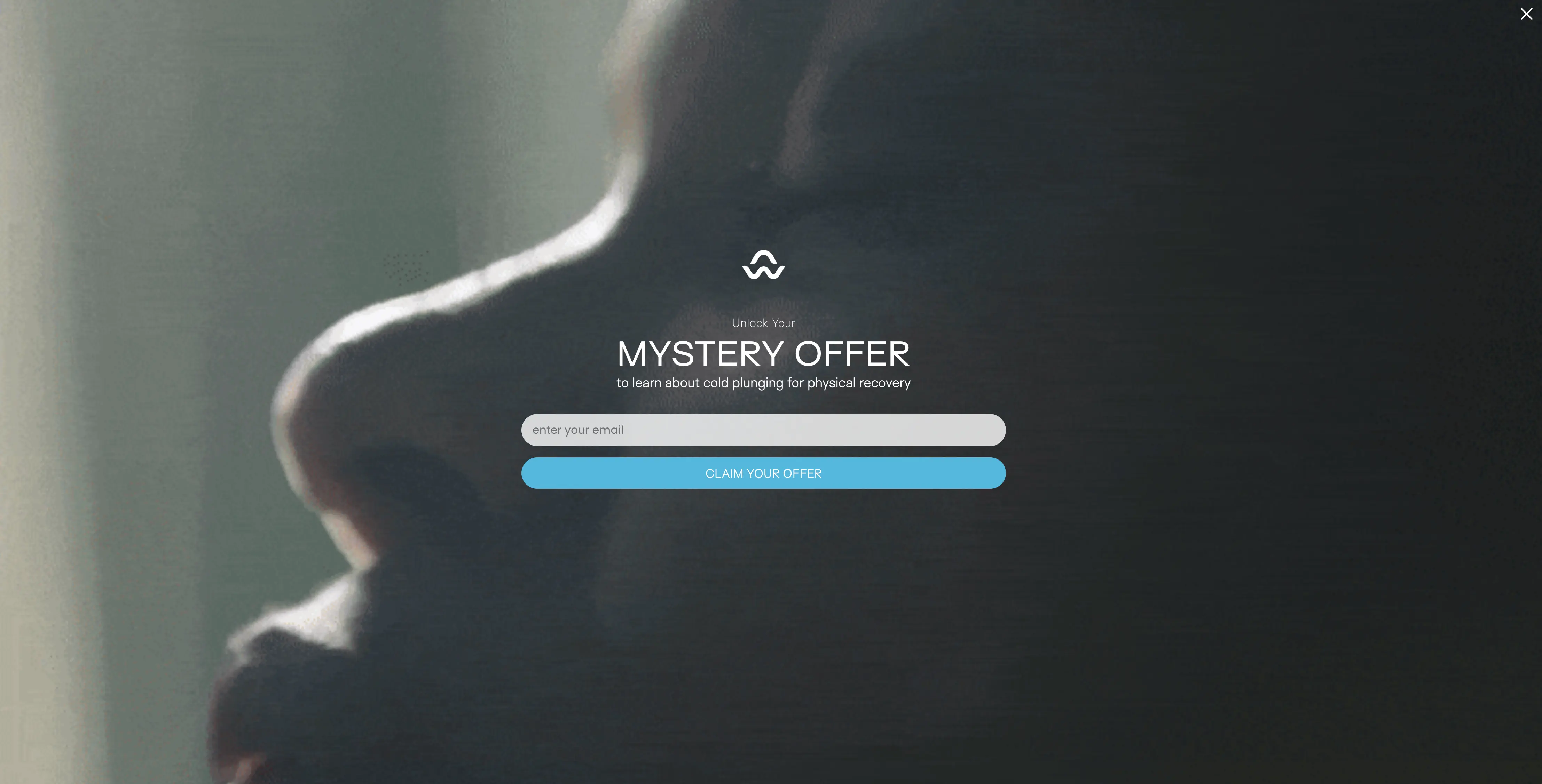
Emma Sleep — preference selector with stated value

Design:
States the offer upfront: a seasonal giveaway plus 5% off
Asks visitors to identify what they're shopping for: Mattresses, Pillows, Beds, or Others
The four buttons function as both the micro-commitment step and a segmentation mechanism
Why it works:
The offer is declared before the question is asked, so the first click feels like progress toward something specific. The segmentation data collected is usable for personalizing the Klaviyo flow that follows.
Add some more interactivity to your campaigns?
Factors that affect conversion rates of micro-commitment popups campaigns
The first step has to earn the click
A yes/no question with a clear benefit, a preference selector tied to a real offer, or a specific curiosity-driven headline all give the visitor a reason to engage. A generic question like "Want to join our newsletter?" does not. If there's no obvious answer to "why would I click?", the step won't work.
The question should be easy to answer and relevant to the visit
One question with 3–4 button options is the standard. Avoid open text fields in step one — they reintroduce the friction the format is meant to reduce. The question should reflect what the visitor is actually there to do: a store selling supplements might ask "What's your main goal?" A Shopify clothing store might ask "Who are you shopping for?"
Keep the form on step two or three
If the first step contains a form field, the friction reduction is gone. Step one should require nothing more than a click or two.
Deliver the reward immediately
If the popup promises a discount code, show it in the popup after signup — not in a follow-up email. In Wisepops research, in-popup discount reveal increased code applications compared to email delivery.
Timing determines whether the format helps or hurts
A micro-commitment step doesn't offset the damage caused by appearing too early. Wait at least 20–50 seconds, or trigger on the second page view. The format amplifies a well-timed campaign; it doesn't rescue a poorly timed one.
More inspiration:
How to set a micro-commitment popup
Wisepops supports micro-commitment multi-step popups natively in the campaign builder.
Here's what the setup looks like:
Step 1: Create a new campaign
In Wisepops, go to Create popup campaign in the Popups main menu:

Step 2: Choose a micro-commitment template
Choose Branching in the popup library to see pre-made micro-commitment templates:

Step 3: Customize the design
You have full control over the look and feel of your upsell popup—no coding needed.
Just click on any element to tweak it.
You can customize fonts, colors, layout, images, buttons using the personalization menu on the top of the campaign preview:

Customize each step by choosing it in the branhing menu just above the campaign preview.
Need help? Here's how to create branching campaigns.

Step 4: Delay campaign display
In Display rules > triggers choose to show your campaign 10 seconds after a visitor lands on your website.

Thinking about testing different discounts or designs?
Do an A/B test with control group and find what works and how much your really earned. Find this feature in Experiments in the main menu in Wisepops.

Summary
Micro-commitment popups outperform standard single-step formats because they lower the barrier to the first interaction — but the format is only part of the equation. A relevant, easy-to-answer first question, a clear incentive, and the right timing all determine whether the structure actually converts.
Used well, the format works across most ecommerce goals: growing an email list, segmenting an audience, recovering carts, or guiding visitors to the right product. The data and examples in this guide are a starting point — what works depends on your store, your offer, and how well the popup fits the moment it appears.
Get started
in minutes
Start converting more visitors today.
Get started in minutes and see results right after.